


 will appear in the header, providing access to Code configuration. For more information on MedDRA Coding, refer to


 icon in the header bar. Then, click the item or items you want to filter by. These include:
 button in the header in Study Designer.
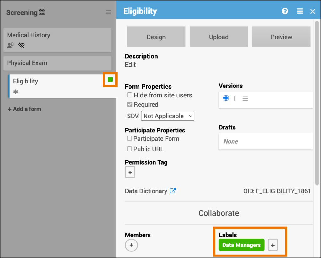
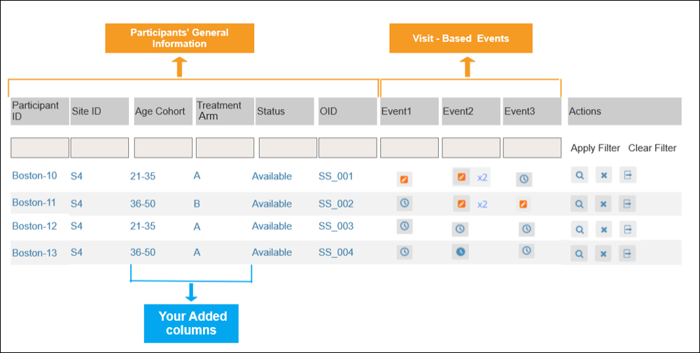
2.4.1 Events & Forms
Use Study Designer to create, configure, and manage Events and Forms for your study. These components define when data is collected and what information is captured for each participant.
Definitions
- Study Designer – The tool used to configure Events and Forms for your study.
- Event – A group of forms used to collect data during a specific point or activity in your study. Events may or may not correspond to real-world visits.
- Form or electronic Case Report Form (eCRF) – A structured collection of data fields used to capture participant information.
Examples
- An Event could represent a Follow-Up Visit or Early Termination.
- A Form might capture Vital Signs, Informed Consent, or Drug Accountability data.
Event Types
Each Event can be defined as one of the following:
Visit-Based Event 
An Event linked to the study protocol schedule. Each visit has a defined timepoint and set of forms.
Example: Week 2, Week 6, or Monthly Follow-Up.
Common Event 
An Event that can occur at any time in the study.
Example: Adverse Event (AE), Concomitant Medication (ConMed), or Early Termination.
💡 Tip: The appropriate icon appears next to the Event name.
Event Frequency
Both Visit-Based and Common Events can be configured as repeating or non-repeating.
Repeating Event 
Occurs multiple times, either a known or unknown number of times.
Example: Adverse Events or Concomitant Medications.
💡 Tip: The repeating icon appears next to the Event name.
Non-Repeating Event
Occurs once per participant.
Example: Early Termination.
⚠️ Warning: After a study is published to Production, the following Event properties cannot be changed:
- You cannot change an Event from Visit-Based to Common (or vice versa).
- You cannot change an Event from Repeating to Non-Repeating.
- You can change a Non-Repeating Event to Repeating, but use caution—this may affect data collection and scheduling.
Calendar Configuration
Calendaring automates Event scheduling and notifications based on other Event statuses.
For more information on calendaring, refer to Basic Calendaring.
Manage Events
Use the Manage Events tools in Study Designer to add, edit, and configure Events in your study.
Add an Event
- Click +Add an Event.
- Enter a Name for the Event.
- Click the Event name to open its details.
- Complete the required fields.
- Click Save.
💡 Tip: Choose clear, descriptive Event names (for example, Baseline Visit or Month 6 Follow-Up) to help users identify the Event easily in Study Runner.
Edit an Event
- Click the Event Name to open the Event details.
- Update settings as needed.
- Click Save.
You can update the Event name directly in the name field.
- Changing the name updates how the Event appears in Study Runner.
- The Event OID (object identifier) does not change when the Event name is updated.
To edit the Event description:
- Click Edit next to the Description field.
- Add or update the description as needed.
- Click Save.
ℹ️ Note: The Event description is optional. It can be displayed on the Participant Dashboard for Events used in Participate or eConsent.
Copy an Event
- Click the Menu (⋮) next to the Event name.
- Select Copy.
ℹ️ Note: Any updates you make to one Event are applied to its copy.
Archive an Event
Archiving removes the Event and all associated Forms from the study. Archived Events can be restored at any time.
- Click the Menu (⋮) next to the Event name.
- Select Archive.
Restore an Event
- Click Archived Items in the header bar.
- Click Restore next to the Event you want to restore.
Collaborate
Use the Collaborate feature to view and manage team members involved in study design. You can assign collaborators to specific Events.
To manage collaborators:
- Click Collaborate in the Study Designer header.
- View all members with design access.
- Assign or remove collaborators from Events as needed.
Collaborators can comment directly on Events and Forms to streamline study design communication.
Members
Shows the users involved in designing the study who can be associated with specific Events.
Labels
Use Labels to visually group Events by color or text. Labels help organize Events but do not affect study behavior.
💡 Tip: Label Events that require review.
For more information on labels, refer to Design a Study – Labels.
Activity Log and Comments
The Activity Log tracks design actions related to Events, including:
- User
- Action performed
- Timestamp
You can also leave Comments to collaborate with other Study Designers.
For more information on activity log, refer to Design a Study – Activity Log.
Forms
Forms define the data collected during each Event.
You can create forms using either:
- Form Designer
- Form Template (XLS)
Form Designer
The Form Designer provides a drag-and-drop interface for building and editing forms.
- Click the Form Card.
- Click Design to open Form Designer.
For more information on form designer, refer to Using Form Designer.
Form Template
A pre-formatted spreadsheet (XLS) for defining form content.
Download the Form Template
- In Study Designer, click Form Template in the header.
- Save the XLS file locally.
💡 Tip: Always download the latest version before editing.
Upload a Form Definition
- Click the Form name.
- Click Upload to upload your XLS Form.
- (Optional) Click Preview to test the form.
For more information on form template, refer to Using the Form Template.
💡 Tip: You can use both methods together, but formatting will differ when re-downloading an edited Form Template.
Manage Forms
Preview a Form
Click Preview on the Form Card to test form logic, calculations, and conditional fields.
If the form is configured for Participate, the button appears as Preview (as a Participant).
ℹ️ Note: Cross-form logic and Save/Complete actions are disabled in Preview mode.
Copy a Form to Another Event
- Click the Form name.
- Click the Menu (⋮).
- Select Copy To.
Add a Form to an Event
- Click + Add a form within the Event.
- Search for the desired form.
- Click + next to the form in the results.
You can add forms from:
- The current study
- The Form Library
Search for Forms from the Library
When you click + Add a form, a search field appears to locate forms stored in the Library.
As you type, matching Form Templates appear in a results panel.
The results panel includes:
- Results header
- Matching templates
If space is limited, the results panel may appear on either side or below the search field.
Clicking outside the search field or results panel closes the search interface.
Empty Search Results
If no matching templates are found, a message indicates that no templates match the search criteria.
Create a New Form from the Search Field
If a form does not exist in the results, you can add it as a new form.
Create the Form
- Enter the desired form name.
- Click the + button next to Add as a new form.
A new Form Card appears on the Study Designer board.
ℹ️ Notes:
- If the entered name matches an existing form, the Add as a new form button is disabled.
- If the form name is not already in use in the study, the button to add a new form becomes available.
Form Metadata in Search Results
Search results display metadata under the form name:
- Form version
- Created by (username)
- Last modified date
The metadata appears in the following format:
V.: (version_number) · (username):(last_modified_date)
Example: V.: 2 · AnnabelLee:20-Mar-2025
Form Collections
If a template belongs to a Form Collection, the collection name appears as a badge in the search results.
If no collection exists, no badge appears.
Form Template Labels
Labels assigned in the Library also appear in the search results.
If no labels exist, none are displayed.
Template Version Requirement
If a template does not have a defined version in the Library:
- The + button is disabled.
- The tooltip displays: “Cannot add form without a version.”
ℹ️ Note: Contact the administrator to add a version to the template so it can be used.
Preview a Form Template from Search Results
When you search for a form while adding a form to an Event, you can preview the template before adding it to your study.
Preview a Form Template
- In the search results list, click anywhere on the form row except the + button.
- A Form Preview overlay appears displaying the selected form template.
The preview displays the form layout and content using the same format as Form Designer Preview.
Close the Preview
- Click outside the preview window to close it.
Click the X in the upper-right corner of the preview window. - The overlay closes and returns you to the search results.
ℹ️ Note: Clicking the + button adds the form to the Event instead of opening the preview.
Forms from the Current Study
Forms already used in the study appear in search results with a label showing:
Study Name : Event Name
This helps identify where the form already exists.
Duplicate Form Restrictions
If a duplicate name exists:
- The + button is disabled.
- A tooltip indicates the form name is already in use.
Add a Current Study Form to Another Event
When adding a form from the same study:
- A copy of the Form Card is created.
- All versions are copied.
- Form properties must be configured separately.
Archive or Restore Forms and Form Versions
Use the Archive and Restore options to manage the availability of forms and form versions in your study.
Archiving a form removes it from its associated Event but keeps it available within the study. Archived forms are viewable but cannot be edited, and their data is excluded from extracts.
Archived forms appear in search results. They remain searchable even though they are not active on the board.
Archive a Form
- Click the Menu (⋮) next to the form name.
- Select Archive.
ℹ️ Note:
- Archiving a form removes it only from the selected Event. If the same form is used in multiple Events, those instances are unaffected.
- You must republish the study for archiving changes to take effect.
⚠️ Warning: If a Form Card is archived, you cannot add a Form Template from the Library to the Study Designer board with the same name as the archived form.
Restore a Form
- Click Archived Items in the header.
- Select Forms.
- Click Restore next to the form you want to restore.
💡 Tip: Restoring a form returns it to its previous Event with all configurations intact.
Archive a Form Version
- Click the Form Name.
- Click the Version Options Menu (⋮) next to the version you want to archive.
- Select Archive.
⚠️ Warning:
If the selected version is set as the default, the Archive option is unavailable.
To proceed, first select a different version as the default, or archive the entire form if it has only one version.
Restore a Form Version
- Click Archived Items in the header.
- Select Forms.
- Click Restore next to the form version you want to restore.
Summary
| Action | Effect | Requires Republish? |
|---|---|---|
| Archive Form | Removes form from Event; keeps in study | ✅ Yes |
| Archive Form Version | Removes selected version only | ✅ Yes |
| Restore Form | Returns form to its Event | ✅ Yes |
| Restore Form Version | Returns version to active state | ✅ Yes |
Form Properties
Form properties can be edited on the form card.
| Icon | Property | Description | Example |
|---|---|---|---|
 | Hide from Site Users | Form is hidden at the site level but accessible at the study level. | Used for forms with imported data or review forms. |
 | Required | Must be completed for the Event to be marked complete. | Consent Form must be signed. |
| – | Allow Add Another | Enables multiple form entries in a repeating Event. | Multiple ConMed entries. |
 | Participate Form | Allows participants to complete the form through OpenClinica Participate. For more information, refer to OpenClinica Participate. | Self-reported symptom diary. |
 | Public URL | Allows participant self-registration via a public link if OpenClinica Participate is enabled. For more information, refer to Configure Forms for Offline Mode and Public URL. | Social media recruitment. |
 | Offline Capable | Enables offline data entry through Participate. For more information, refer to Configure Forms for Offline Mode and Public URL. | Field research in remote areas. |
💡 Tip: Use Permission Tags instead of Hide from Site Users for greater flexibility.
Source Data Verification (SDV)
Use Source Data Verification (SDV) to control which data items on a form must be verified against source documents. With Item-Level SDV, you can specify verification requirements for each individual item on a form.
When Item-Level SDV is enabled, each item on the form can be independently marked as Verified or Not Verified. If an item’s data changes, only that item becomes unverified—other verified items remain unaffected.
ℹ️ Note: Item-Level SDV is available for all forms created or first published after Stack 15 (December 2021).
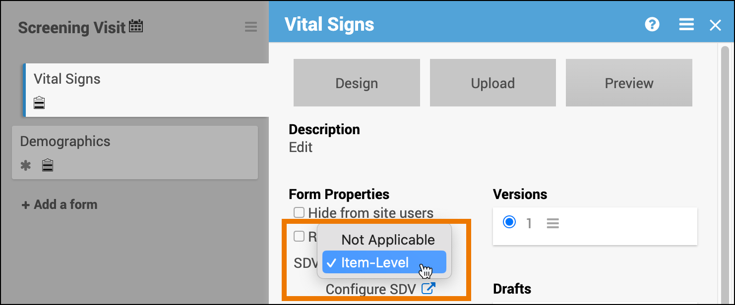
Set SDV Requirements
- Open the Form Card.
- From the SDV dropdown, select Configure Item-Level SDV.
- The Form Card displays the Item-Level SDV icon

- The Form Card displays the Item-Level SDV icon
- Click Configure SDV.
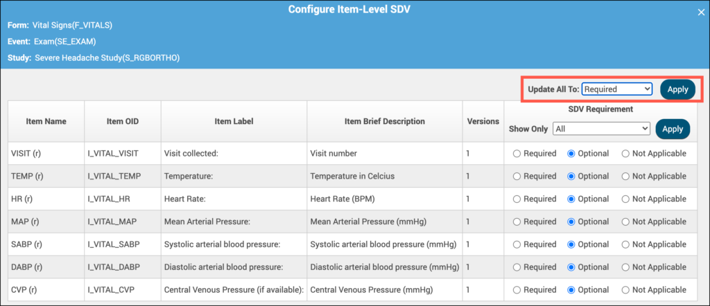
- Define SDV requirements for each field using the following options:
- Not Applicable: items cannot be verified
- Optional: items can be verified
- Required: items must be verified for the form to be fully verified and get Verified status
- The Form Card displays the Item-Level SDV icon.

💡 Tip: If all items should have the same requirement, use the Update All To menu to apply a setting to all items at once.
Validation Rule
⚠️ Warning: When using Item-Level SDV, at least one item must be set to Required or Optional.
If all items are set to Not Applicable, change the form’s SDV Requirement to Not Applicable before publishing.
Form Drafts and Versions
Use Drafts and Versions to manage updates to your forms during study design. Drafts are unpublished, while Versions are finalized and published to Study Runner when you publish your study.
Overview
- Form Versions are the published, active forms included in your study.
- Form Drafts are editable forms created in Form Designer that are not yet part of a published study.
- Only Versions are pushed to Study Runner upon publication.
💡 Tip: Create and edit forms as Drafts during development, and promote them to Versions when ready to include in your study.
Upload and Manage Versions
When you upload a Form Template (XLS), the system automatically creates a Version that appears under Versions on the Form Card.
A Form Template must have at least one Version in the Library before it can be added to an Event. If no Version exists, the Form Template cannot be added to the Study Board.
You can upload new versions or overwrite existing ones:
- If the version number on the Form Template matches an existing version, the system overwrites that version upon upload.
- If the version number is different, the system creates a new version automatically.
⚠️ Warning: Once a form has been published to Production, it cannot be overwritten. To make changes, create a new version instead.
Manage Drafts
When you create or edit a form in Form Designer and save it, it becomes a Draft. The most recent draft appears at the top of the list, labeled (latest).
Drafts:
- Do not create new versions
- Do not appear when you publish your study
- Do not appear in the Audit Log
Promote a Draft to a Version
To include a Draft in your published study:
- Click the Menu (⋮) next to the draft you want to promote.
- Select Add to Study.
This action converts the draft into a new version.
⚠️ Warning: To prevent a new form from overwriting an existing one:
- In Form Designer: Change the version number in the Layout & Settings panel.
- In the Form Template: Update the Form Version field on the template’s Settings tab.
Draft Actions
| Action | Steps |
|---|---|
| Access Drafts Menu | Click the Menu (⋮) under Drafts. |
| Edit Draft in Form Designer | Click the Menu next to the draft → Design. |
| Upload Media or External Lists | Click the Menu next to the draft → Upload. |
| Download Draft | Click the Menu next to the draft → Download. |
| Permanently Delete Draft | Click the Menu next to the draft → Discard. |
⚠️ Warning:
If you upload a Form Template, edit it in Form Designer, and then download it again, the spreadsheet format will differ from the original.
Version Actions
| Action | Steps |
|---|---|
| Access Versions Menu | Click the Menu (⋮) under Versions. |
| Edit Version in Form Designer | Click the Menu next to the version → Design. |
| Preview Version | Click the Menu next to the version → Preview. |
| Download Version | Click the Menu next to the version → Download. |
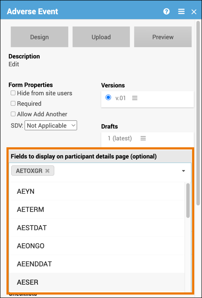
Fields to display on Participant Details Page (Optional)
When a form is part of a Common Event, you can choose which fields appear in the Common Event table on the Participant Details Page (PDP).
Configure Display Fields
- Open the Form Card within the Common Event.
- Click the Fields to Display on Participant Details Page dropdown.
- Select the form items you want to display on the PDP.
💡 Tip: Choose key summary fields—such as status, date, or outcome—to help users quickly review important information without opening the full form.
Permission Tags
Use Permission Tags to control which User Roles can view or edit data from specific forms in Study Runner. Permission Tags provide flexible, form-level access control beyond role defaults.
Configure Permission Tags
To define or update Permission Tags, refer to Permission Tags.
Assign Permissions
To grant or modify user access for forms configured with Permission Tags, refer to User Access & Sharing.
💡 Tip: Use Permission Tags instead of hiding forms from site users for greater control and auditability.
Data Dictionary
The Data Dictionary provides detailed, form-specific metadata to help you understand each form’s structure and configuration.
You can access the Data Dictionary from each Form Card in Study Designer. It includes:
Form Metadata – Form name, version, and properties
Item Metadata – Item OID, Item Group Name, Item Group OID, Item Type, and Insight Table mappings
Export the Data Dictionary
Open the Form Card.
Click the Data Dictionary link.
Download the CSV file to view or analyze the data outside Study Designer.
ℹ️ Note: Data Dictionary files are useful for validation, reporting, and Insight table alignment.
2.4.2 Using Form Designer
Designing Forms is easy with Form Designer. You can still upload a Form Template spreadsheet (which is required for some of the more complex functions) but with Form Designer, you can create a form right in the user interface. See Using the Form Template for information about using the spreadsheet method of building forms.
Note: You can also upload a Form Template and then make changes in Form Designer. However, if you do this and try to download the form template again, you will lose some formatting inside the spreadsheet file (but it will still be fully functional).
Quick Start
1. Enter Form Designer:
- Click the Design button under your study card on the My Studies screen.
- To add a new Form, click +Add a Form. If you want to use an existing Form, go to the next step.
- Click the Form Card.
- Click the Design button to enter Form Designer.
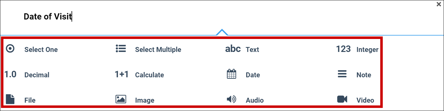
2a. Add an Item to the Form:
- Click the + button.
- Enter the text of your question.
- Click +Add Question.
- Select the icon for the type of response you want for the question.
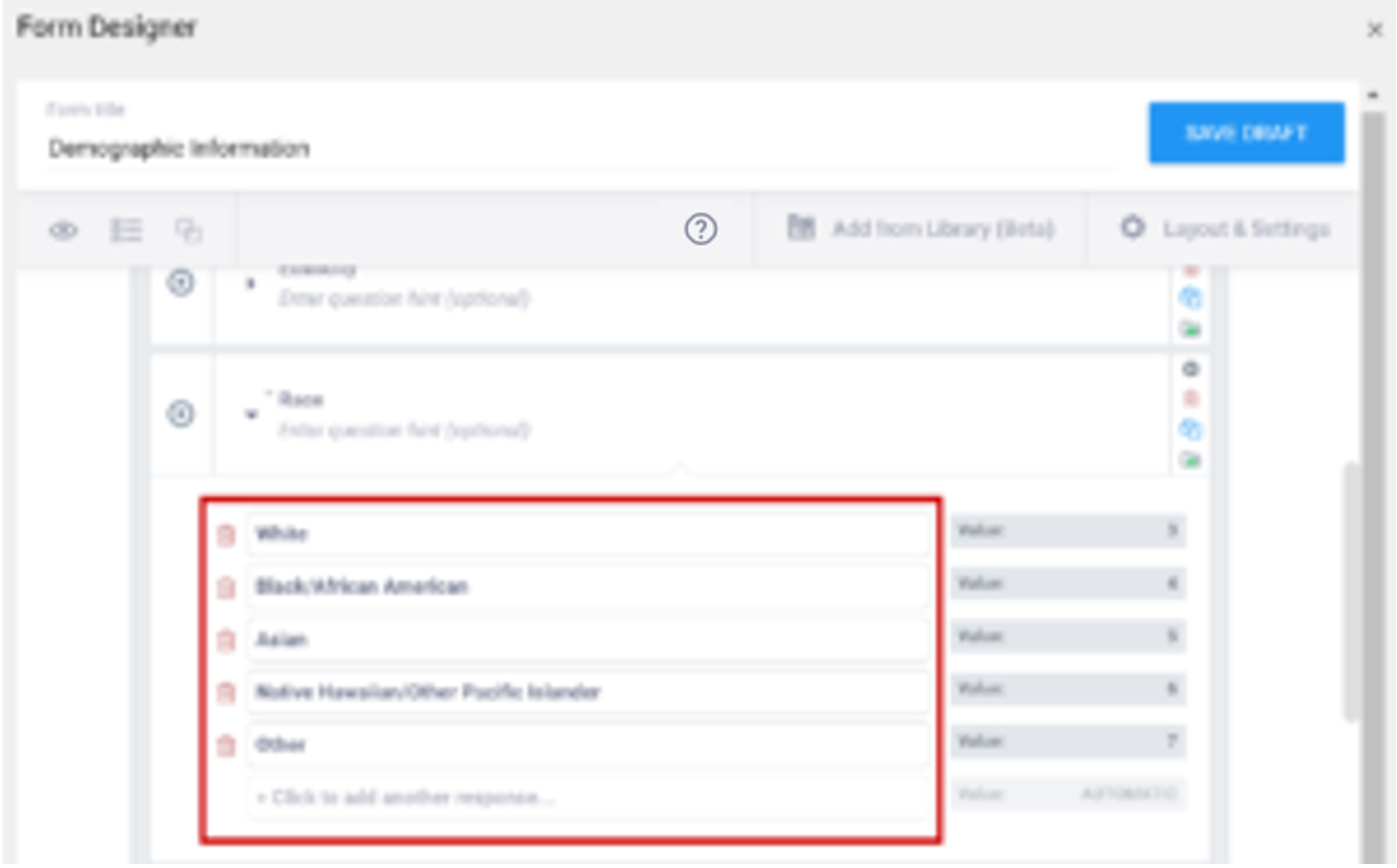
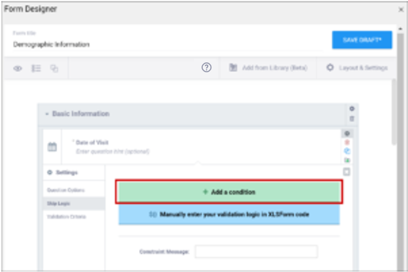
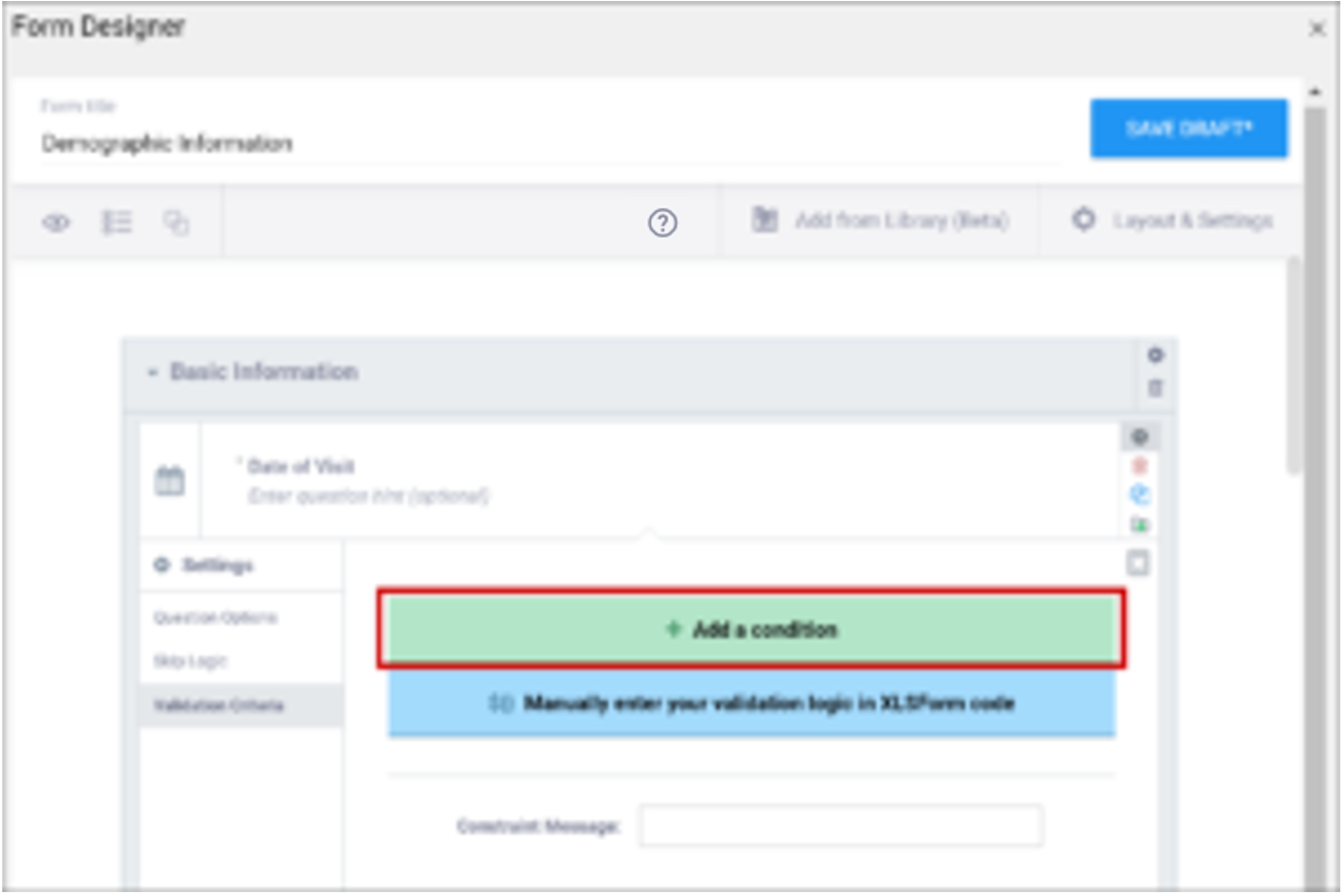
- Customize your question settings, skip logic, and validation criteria as needed. For multiple choice questions, replace Option 1, Option 2, etc. with your choices.
- Repeat as needed.
2b. Create a Group of Items:
- Click the item to select it. A blue outline appears to indicate that the item is selected.
- Click the Create group with selected questions button.
- Click the + button within the group to add a new item or drag and drop an item into the group.
- Repeat as needed.
Note: You can also hold the Ctrl button, select multiple items, and then click the Create group with selected questions button. If you start to drag something and then decide not to move it, click the Esc button.
3. Save Your Work
Click Save Draft to save your Form.
4. Preview Your Form
Click the Preview icon to preview your Form.
5. Exit Form Designer
Click the X to exit Form Designer.
6. Add the Form to Your Study
- Click the Menu icon next to your draft.
- Select Add to Study.
Form Designer Details
Layouts
A Layout determines the appearance of a Form, specifically, how items appear on the Form.
You Can Specify a Layout to Display:
- A single item per page or multiple items per page
- Each item in a separate line or items in a grid
To Select a Layout:
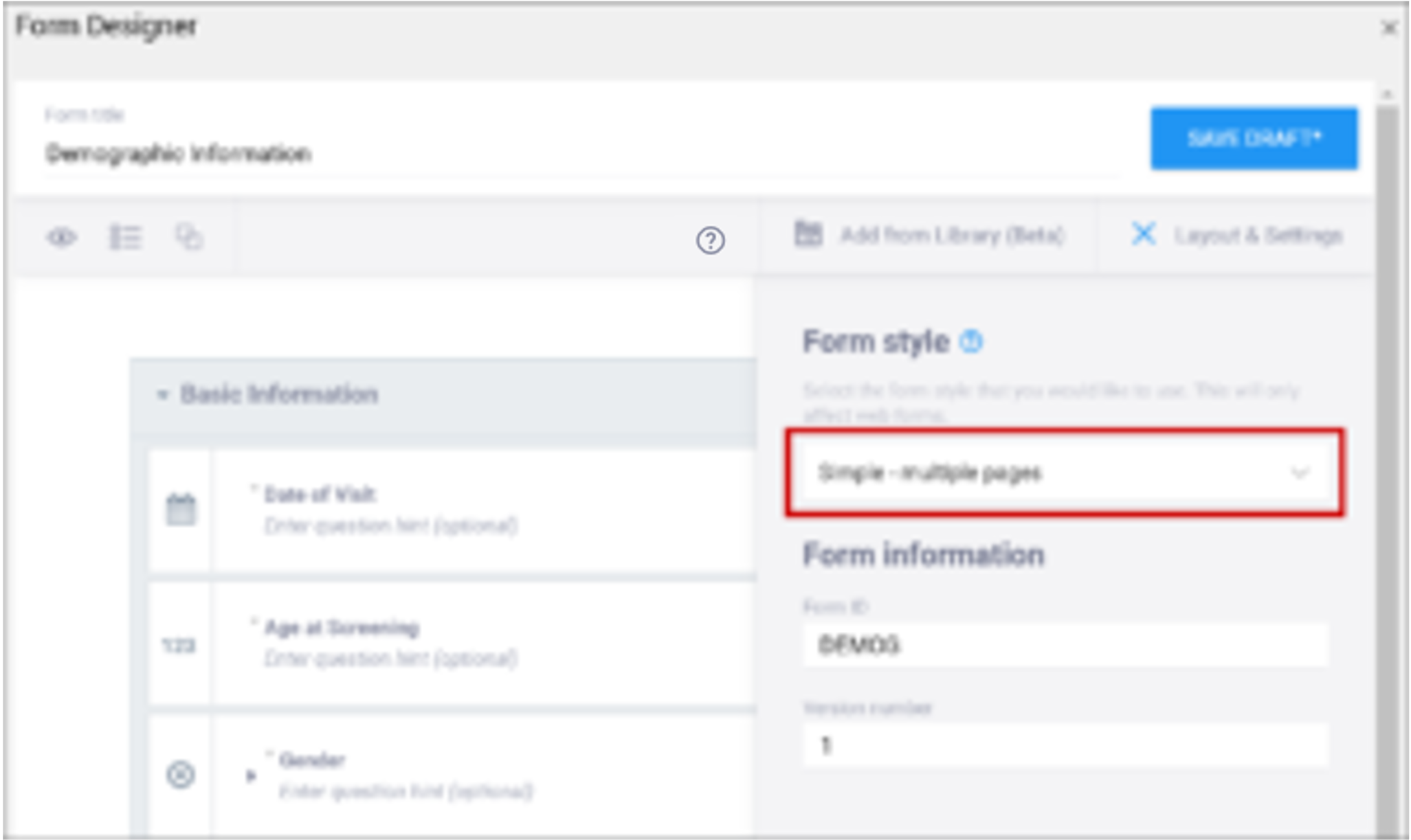
Click Layout & Settings.
New Forms are set to Grid – multiple pages by default. Grids are ideal for adding multiple items in a single line.
Best Practices:
- In general, the Simple style is best for participant-facing Forms. The Grid style is useful for Forms with a lot of information and can deliver a better user experience for research professionals.
- If you are not sure how many pages you want the Form to have, consider using the multiple page layout, as you can specify the number of pages (including a single page) while the single page layout restricts you to one page.
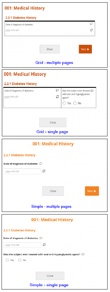
Layout Options:
- Simple – single page: Items appear in rows on a single page. In the Form Definition spreadsheet, this is configured by leaving the Style column blank.
- Simple – multiple pages: Items appear in rows with each item on a separate page. In the Form Definition spreadsheet, this is configured by entering pages in the Style column.
- Grid – single page: Items appear in columns on a single page. In the Form Definition spreadsheet, this is configured by entering theme-grid in the Style column.
- Grid – multiple pages: Items appear in columns with each on a separate page (default). In the Form Definition spreadsheet, this is configured by entering pages theme-grid in the Style column.
Icons
The following icons appear on in the upper-left corner of the Form Designer screen:
| Icon | Action |
|---|---|
 | Preview Form |
 | Expand/Collapse Questions |
 | Create Group with Selected Questions |
 | Delete Selected Items |
 | Duplicate Selected Questions |
The following icons appear on the right-hand side of each item:
| Icon | Action |
|---|---|
 | View/Change Question Settings Note: You can also click this icon to expand/collapse settings |
 | Delete Question Note: This action cannot be undone |
 | Duplicate Question |
 | Add Question to Library |
Layout Groups
Layout groups are a set of items that are grouped together on a Form. This feature is optional, and you can decide to include/exclude layout groups based on how you want the Form to look. These should not be confused with item groups, which are internal groups used in the database and data extracts.
To group items together, select each item on the top left item type icon, and then click the Group button. Once a group has been created, you can drag-and-drop items into that group.
To use group settings, click the Settings (Gear) button in the group header.
Within Group Settings, You Can:
- Make items in the group appear on the same page
- Specify the number of columns of items in the group
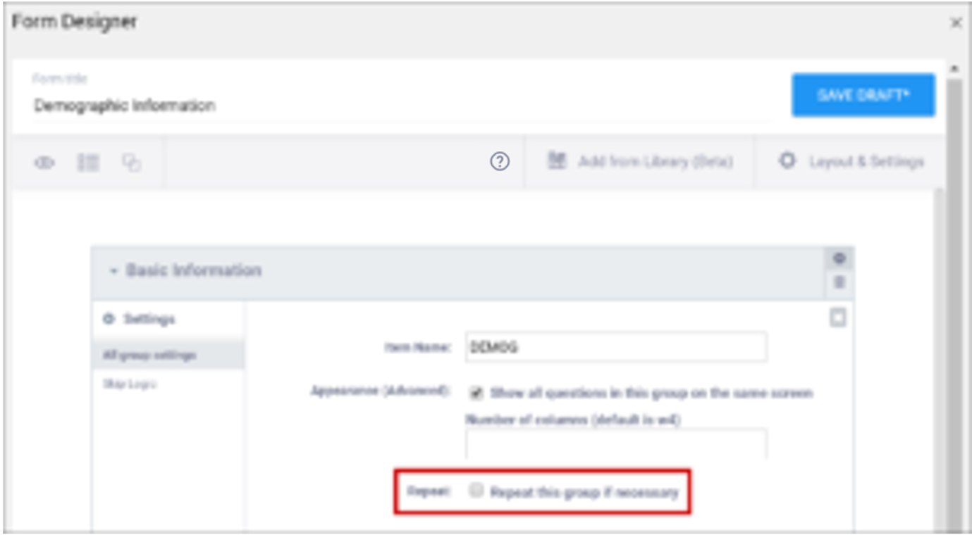
- Create a repeating group
- Define skip logic for the entire group
Content Library
Use the Content Library to add pre-made items to your forms. Instead of creating the same item each time you want to add it to a form, save the item or group of items in the Content Library to add it to the form instantly. For more information, see: Content Library.
Preview
Click the Preview button to preview your form.
Versions and Drafts
Click the Save Draft button in the upper right-hand corner to save your Form. This does not:
- Create a new version
- Include the draft when you publish your study
- Appear on the Activity Log
Your updated design appears on your Form card in Study Designer under Drafts. Your draft is labelled (latest), and if you have multiple drafts, it is moved to the top of the list.
To Create Multiple Drafts:
- Open the Form in Form Designer.
- Click Layout & Settings, and change the value in the Version number field.
- Click Save Draft.
- Repeat the process for each draft.
To Discard a Draft:
Click the Menu button next to the draft you want to delete, and selecting Discard.
Note: Discarded drafts are not retrievable.
To Save a New Version:
- Click Layout & Settings, and change the number in the Version number field.
- Click Save Draft.
- Exit Form Designer.
- Click the Menu icon next to the draft you want to make a version.
- Select Add to Study. Your Form becomes a version, and is no longer displayed in the Drafts section of the Form Card in Study Designer. This version is included when you publish your study.
To Overwrite an Existing Version:
- Do not change the version number.
- Click Save Draft.
- Exit Form Designer.
- Click the Menu icon next to the draft you want to make a version.
- Select Add to Study. Your pre-existing Form version is replaced by your new version, and is no longer displayed in the Drafts section of the Form Card in Study Designer. This version is included when you publish your study.
Note: If you want to make a new version of a Form (and not overwrite an existing Form), make sure to change the version number in the Layout & Settings panel.
Form Designer Limitations
Currently, Form Designer does not support all of the functionality that is available in OpenClinica Forms. Instead, use the Form Template to take advantage of these features. Specifically:
- You cannot use cross-form logic in Form Designer.
- You can add edit checks in Form Designer but hard edit checks must be defined in the Form Template.
- There is no functionality for cascading selects (i.e. you cannot restrict the list of options available in the next item based on the previous selection. You can still add conditional fields to determine whether the next item appears at all.)
Form Designer and Form Template Fields
Click the images to enlarge them.
| Field | Form Designer | Form Template |
|---|---|---|
| Form Title The form title appears at the top of the data entry page. | You can use alphanumeric characters, special characters (e.g. & # $ ^ _), and spaces | You can use alphanumeric characters, special characters (e.g. & # $ ^ _), and spaces. |
| Form ID A unique identifier used as an internal reference when the form is uploaded. This value is not visible to end-users. | Alphanumeric characters and underscores are permitted; no spaces. | Alphanumeric characters and underscores are permitted; no spaces.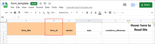 |
| Form Version A unique identifier for an iteration of a given form (including changes to items, form logic, etc.). | You must change the version number if you want to create a new version of your form. Otherwise, in the TEST environment, the new version overwrites the existing version except for changes to the item types, the item groups, or moving an item in or out of a repeating group. In the PRODUCTION environment, you can not overwrite a version of a form and must have a unique identifier for each version. Saving your form as a draft does not create a new version, but you can later promote a draft to a version using the Add to Study menu option on the form card in Study Designer. | In the Test environment you can overwrite versions for changes to anything except the following features (these require a new form or a new item name):
In the Production environment, you must have a unique version identifier each time you upload a modification to the form. |
| Form Style This specifies the layout and appearance of the form, primarily dealing with how the items are displayed (each question on a separate line, or a grid, and whether on a single page or multiple pages by groups). | There are four styles to choose from:
Note: If you group items together and click the “Show all questions in this group on the same screen” check box, items in the group appear on the same page, overriding a multiple pages setting. | You can leave this column blank or select from three options: If left blank: Each question is on a separate line on the same page. [Simple – single page]
Note:
|
| Question Text/Label | This is the text that appears in the Form for an item/question. | The name of your code list. The same name is used for each value combination of a list. Alphanumeric characters and underscores are permitted; no spaces. If you have a yes/no codelist and name it YN, there would be two rows referencing the same list_name: list_name label name |
| Enter Question Hint/Hint | Informative text that appears on the Form to help the user. For example, “Please provide weight in kilograms.” Hints appear in italics under the question label. | Informative text displayed on the form to help the user. For example, Please provide weight in kilograms. Hints display in italics under the question label. |
| Item Name/Name | The internal name of the item, as used in the database. This is used to generate the item object identifier (OID)This does not appear during data entry. Alphanumeric characters and underscores are allowed.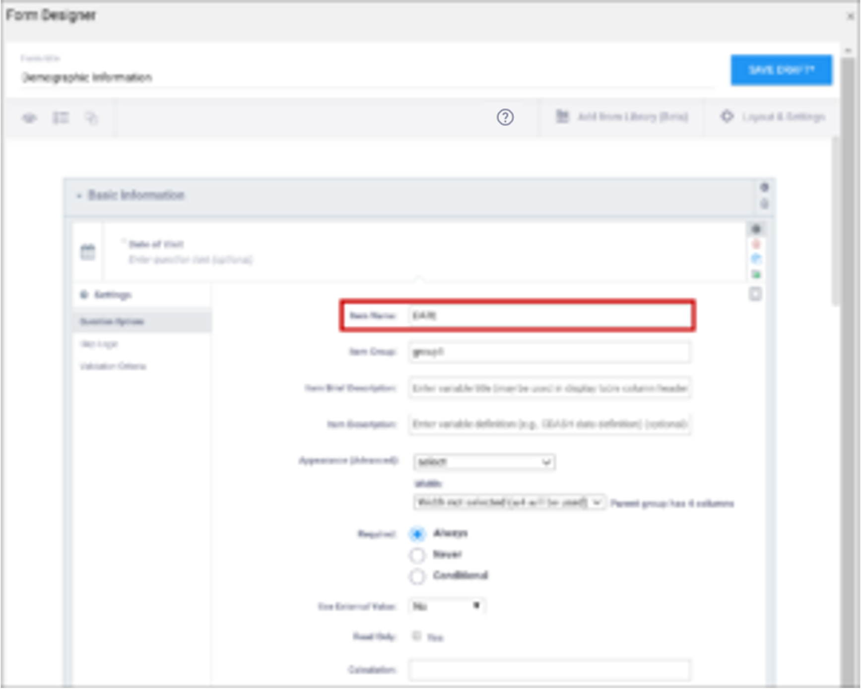 | The unique name of the item. This is not displayed during data entry, but is how the data is referenced in the database. Allows alphanumeric characters and underscores; spaces are not allowed. It is recommended that only lowercase letters, digits, and underscores are used in item names. Once an item name is defined in this spreadsheet and the form is uploaded into OpenClinica, the name should not be changed to use different letter case when the form is uploaded again. For example, if item1 is part of the first form upload, this name should not be changed to ITEM1 or Item1 when the form is subsequently uploaded. Any change from/to upper/lower case in an item name will result in a form or publish error. |
| Item Group | The internal name of the group that the item is in, as used in the database. This is used to generate the item object identifier (OID). Alphanumeric characters and underscores are allowed; spaces are not allowed. | The name of the group to which you are assigning the item in the underlying database. This becomes the item group object identifier (OID). Alphanumeric characters and underscores are allowed; spaces are not allowed. It is recommended that only lowercase letters, digits, and underscores are used in itemgroup names. The itemgroup name does not have to correspond to the begin/end group names defined in the type column. Begin group/repeat, end group/repeat, and note types should not have a value in the bind::oc:itemgroup cell. All items in a repeating group must have the same itemgroup name. That itemgroup name cannot be used by other items that are outside that repeating group. Once an itemgroup name is defined in this spreadsheet and the form is uploaded into OpenClinica, the itemgroup name should not be changed to use different letter case when the form is uploaded again. For example, if group1 is part of the first form upload, this should not be changed to GROUP1 or Group1 when the form is subsequently uploaded. Any change from/to upper/lower case in an itemgroup name will result in a form or publish error. |
| Type | The data type of the item (e.g. select one, select multiple, etc.)
| The data type of the item (e.g. select one, select multiple, etc.)
|
| Item Brief Description | A short description of the item that can be used to reference it in tables. This description can be up to 40 characters. You cannot use special characters. If this is not defined for an item in a table, the Item Name appears instead. | A short description of the item that can be used to reference it in tables. This description can be up to 40 characters. You cannot use special characters. If this is not defined for an item in a table, the Item Name appears instead. |
| Item Description | A long description of the item that can be used to define the data that the item/question contains. This is not displayed on the Form during data data entry. The text can be up to 3,999 characters. You cannot use special characters. The description is included in some data extract formats. | A long description of the item that can be used to define the data that the item/question contains. This is not displayed on the Form during data data entry. The text can be up to 3,999 characters. You cannot use special characters. The description is included in some data extract formats. |
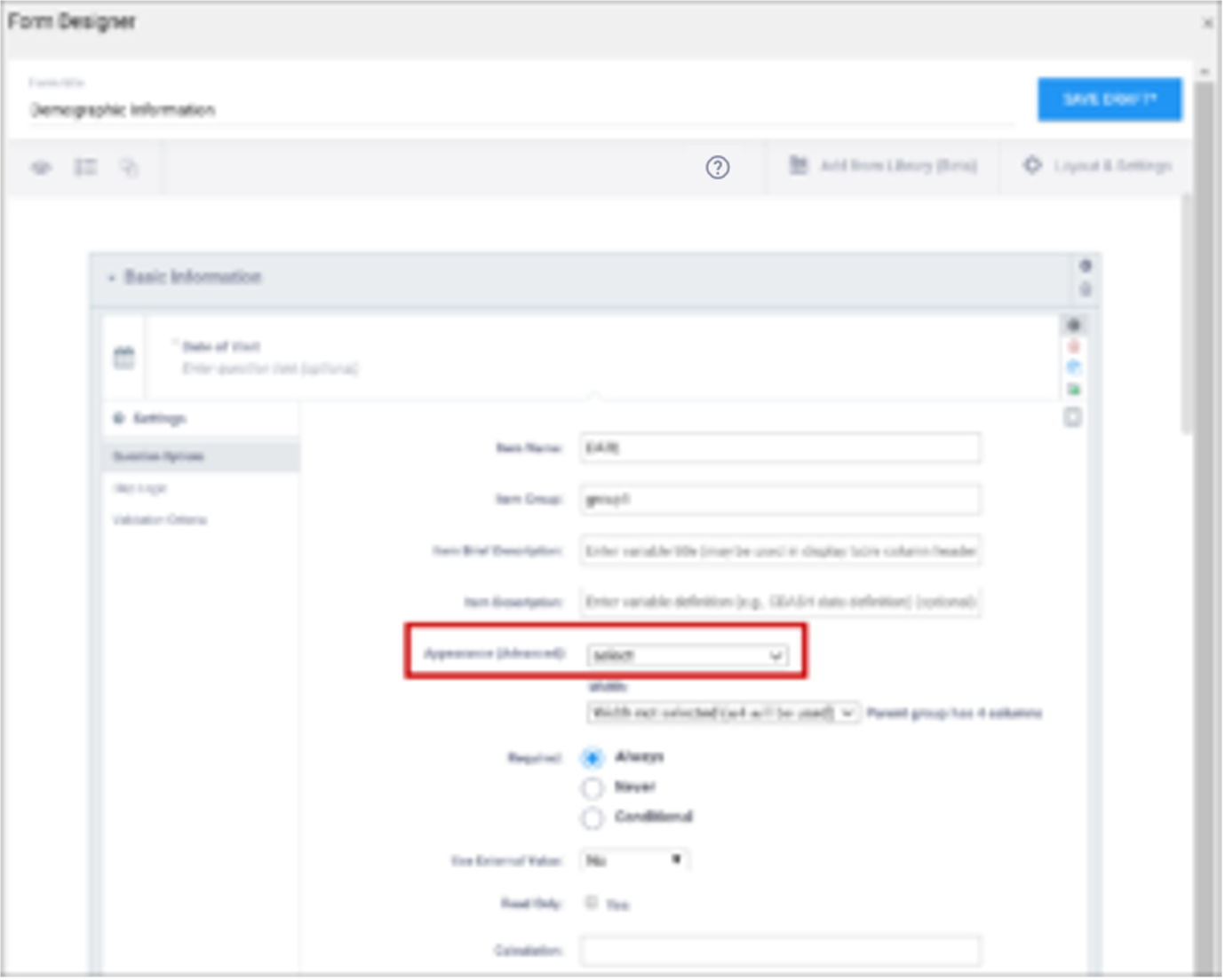
| Appearance | This determines how each item appears based on its Type. Items do not have a specific appearance by default. This setting is optional. Note: the type,other indicates that instead of selecting the option, other, you can enter the appearance directly in the field. other also appears as an option for the item types indicated. You can specify width for any item. (See Width) Single select / Multi-select
text
integer
decimal
calculate
Date
note
file
image
audio
video
Layout groups
Note: Items with no label or hint are treated as background calculations.
| This determines how each item appears based on its Type. Items do not have a specific appearance by default. This setting is optional. Note: the type,other indicates that instead of selecting the option, other, you can enter the appearance directly in the field. other also appears as an option for the item types indicated. You can specify width for any item. (See Width) Single select / Multi-select
text
integer
decimal
calculate
Date
note
file
image
audio
video
Layout groups
Note: Items with no label or hint are treated as background calculations. |
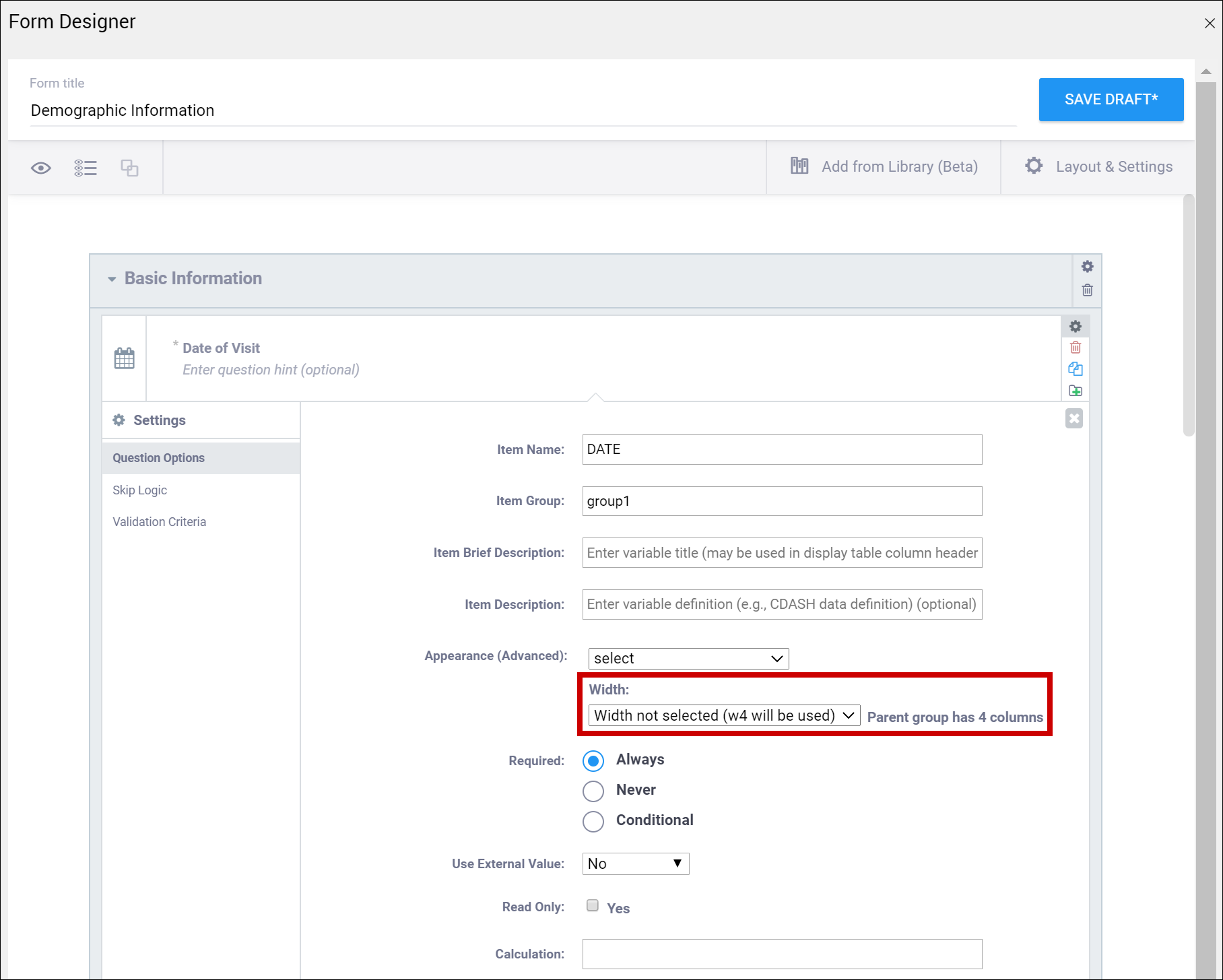
| Width | For an item or group of items on a grid form, you can control how many columns appear on each row by specifying the width w#. If you specified a width of w6 for a layout group, it takes up the entire width of the grid. If you specified w1 for a single item in the group, there would be one small column (1) and another large column (5). | For an item or group of items on a grid form, you can control how many columns appear on each row by specifying the width w#. If you specified a width of w6 for a layout group, it takes up the entire width of the grid. If you specified w1 for a single item in the group, there would be one small column (1) and another large column (5). |
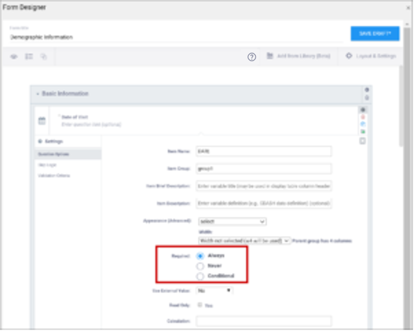
| Required | This specifies whether a user is required to enter a response to the item to proceed with data entry. Select Always, Never, or Conditional to specify whether/when a response to this item/question is required. If you select Conditional, you must enter a conditional value. | This specifies whether a user is required to enter a response to the item to proceed with data entry. For required fields, type yes in the required column on the survey sheet. For conditionally required fields, enter a condition, as defined in the relevant column of the survey sheet. For example, if Number of packs per day is required if Does the subject smoke? is answered yes, enter: ${smoke} = 1 Note: This column supports the syntax as defined in the calculation, constraint, or relevant columns of this worksheet. Refer to those column comments for additional examples. |
| Use External Value | This item is a value used for logic or calculations. clinicaldata is used for cross-Form, cross-event, or event level calculations. contactdata displays contact data on a form. If you enter contactdata, you must add a column called instance::oc:contactdata. That column must contain one of the following values to indicate which contact information it is collecting: firstname, lastname, email, mobilenumber, secondaryid. | This item is a value used for logic or calculations. clinicaldata is used for cross-Form, cross-event, or event level calculations. contactdata displays contact data on a form. If you enter contactdata, you must add a column called instance::oc:contactdata. That column must contain one of the following values to indicate which contact information it is collecting: firstname, lastname, email, mobilenumber, secondaryid. |
| Read Only | This specifies that you cannot enter data for an item. This can be used for the types of text, calculations, etc.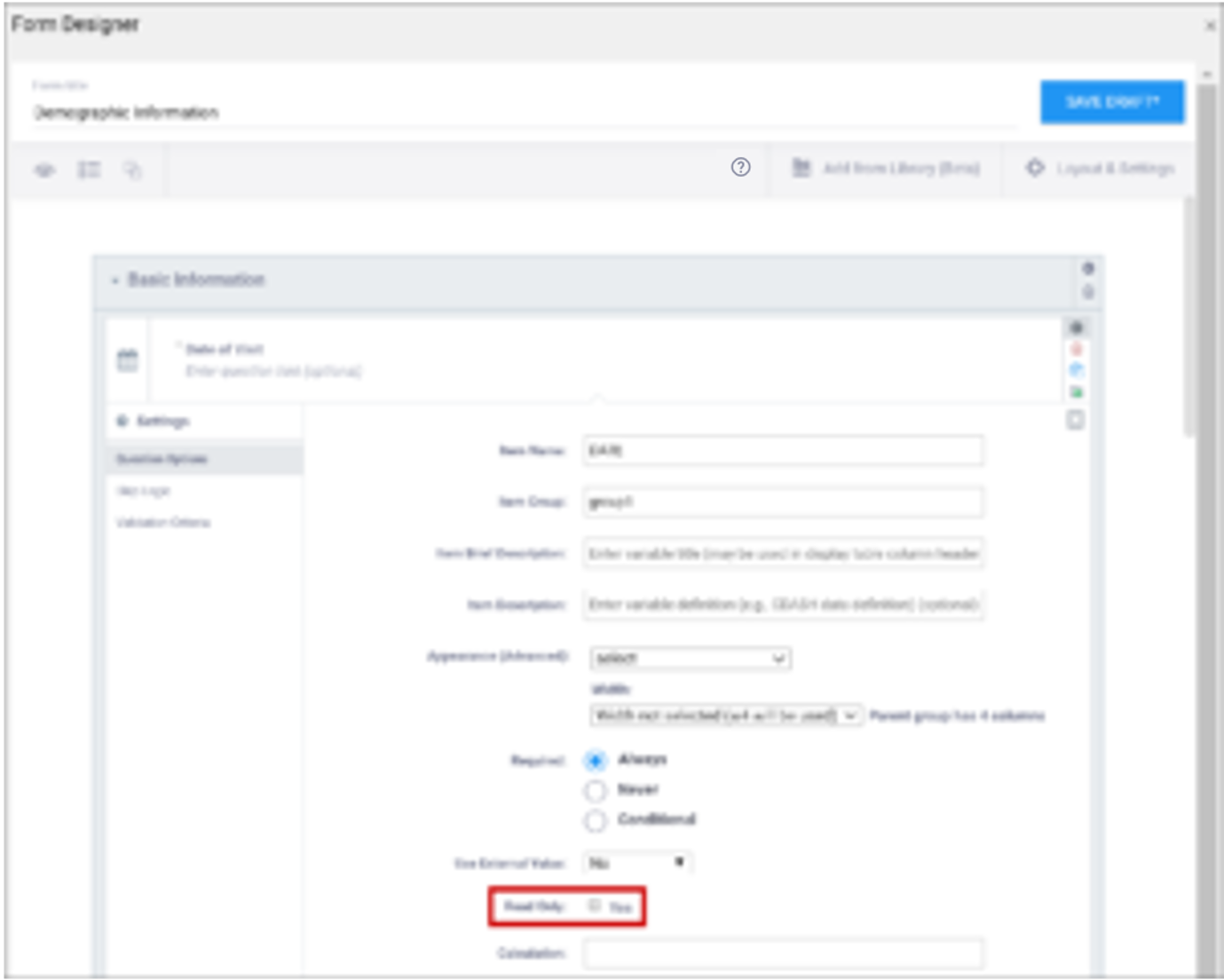 | This specifies that you cannot enter data for an item. This can be used for the types of text, calculations, etc.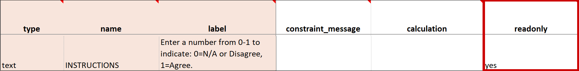 |
| Calculation | An expression used to calculate a value, usually using the values of preceding questions on the current Form. This can also be used for Cross-form calculations. . is used to represent the current field’s value. ${name} is used to reference a different item value on this Form, where name is the name of the other item. You can use parentheses. The following operators can be used:
or For example, to calculate Mean Arterial blood Pressure (MAP) based on the items systolic and diastolic: (systolic + (2*diastolic)) div 3 Calculations cannot be used for items with type of note. If calculation is used for any type except calculate, that field must have Read Only set to yes. | An expression used to calculate a value, usually using the values of preceding questions on the current Form. This can also be used for Cross-form calculations. . is used to represent the current field’s value. ${name} is used to reference a different item value on this Form, where name is the name of the other item. You can use parentheses. The following operators can be used:
or For example, to calculate Mean Arterial blood Pressure (MAP) based on the items systolic and diastolic: (systolic + (2*diastolic)) div 3 Calculations cannot be used for items with type of note. If calculation is used for any type except calculate, that field must have Read Only set to yes. |
| Response Text/Label | The question text to be displayed on the data entry form. This field allows alphanumeric characters. Add a line break where you want using Ctrl-Enter or Ctrl-Alt-Enter (Windows) Option+Enter (Mac). Styling prompts can be added to format your text as follows: *text* displays as italics **text** displays as bold ***text*** displays as bold italics Increase font size by preceding the text with one to six hash tags. # makes the text the largest possible size, ## makes the text the smallest possible size. Sizes that display may vary for note vs. item vs. group labels. Colors can be added as follows: text for red text. You can use the hex code for the color of your choice. (You can look up hex codes by searching for css codes on the internet.) | The question text to be displayed on the data entry form. This field allows alphanumeric characters. Add a line break where you want using Ctrl-Enter or Ctrl-Alt-Enter (Windows) Option+Enter (Mac). Styling prompts can be added to format your text as follows: *text* displays as italics **text** displays as bold ***text*** displays as bold italics Increase font size by preceding the text with one to six hash tags. # makes the text the largest possible size, ## makes the text the smallest possible size. Sizes that display may vary for note vs. item vs. group labels. Colors can be added as follows: text for red text. You can use the hex code for the color of your choice. (You can look up hex codes by searching for css codes on the internet.) |
| Value/Name | The unique code value stored in the database that corresponds to each answer choice (e.g. 1=Yes). These codes are generated automatically but can be changed. | The unique code value stored in the database that corresponds to each answer choice (e.g. 1=Yes).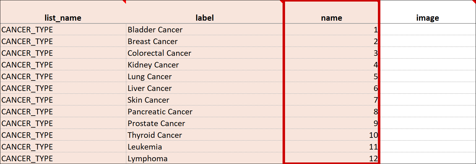 |
| Item Name/Name | The unique internal name of the layout group used in the database. This is not displayed during data entry. Alphanumeric characters and underscores are allowed.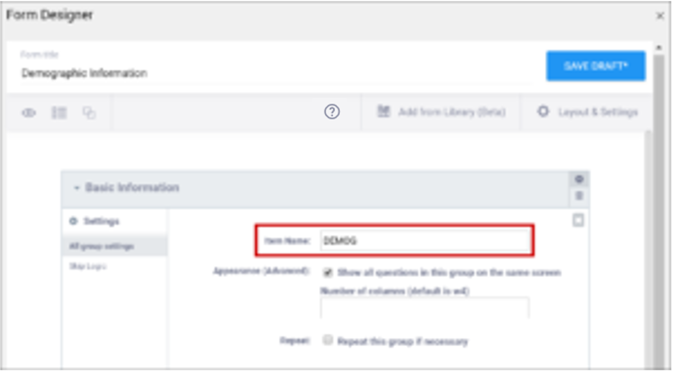 | The unique internal name of the layout group used in the database. This is not displayed during data entry. Alphanumeric characters and underscores are allowed. |
| Show All Questions in this Group on the Same Screen/Appearance | Click this check box to make all items appear on the same screen (regardless of your layout selection.)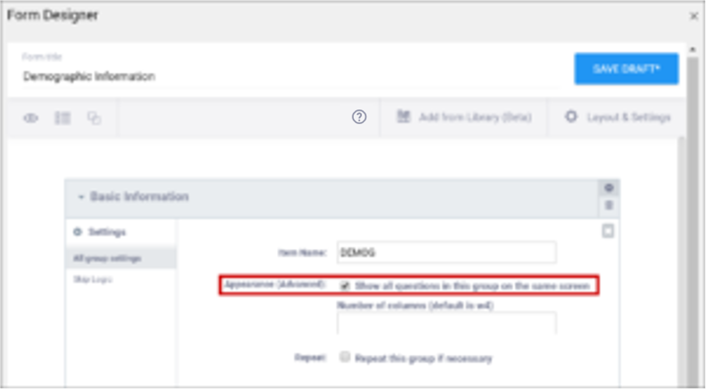 | N/A |
| Repeat this group if Necessary | This specifies that the group of items should be repeated. Click this check box to make the selected group of questions a repeating group. | This uses begin repeat and end repeat in the Type column to specify that the group of items should be repeated. |
| Skip Logic / Relevant | This is a condition under which an item is skipped. Enter a condition under which this item/question appears or is required. | This is a condition under which an item is skipped (as defined in the relevant column). The item or group is only displayed if the provided expression evaluates to TRUE. Use the following syntax: ${other question name} = value (for a numeric value) or ${other question name} = ‘value’ (for a character value) If the lead-in question uses a code list defined in the choices worksheet, use what is in the name column for that code list as the value. For example, if you have two questions: Does the subject smoke? (item name = smoke) and How many packs per day? (item name=packs), the second question should only display if the answer to the first question is Yes. If the first question (smoke) uses a code list defined in the choices worksheet as: list_name label name The relevant syntax for How many packs per day would be: ${smoke} = 1 For multi_select items, use the following syntax: selected(${question name},value) (for a numeric value) selected(${question name},’value’) (for a character string) Note: This column supports the syntax as defined in the required, calculations, or relevant columns. |
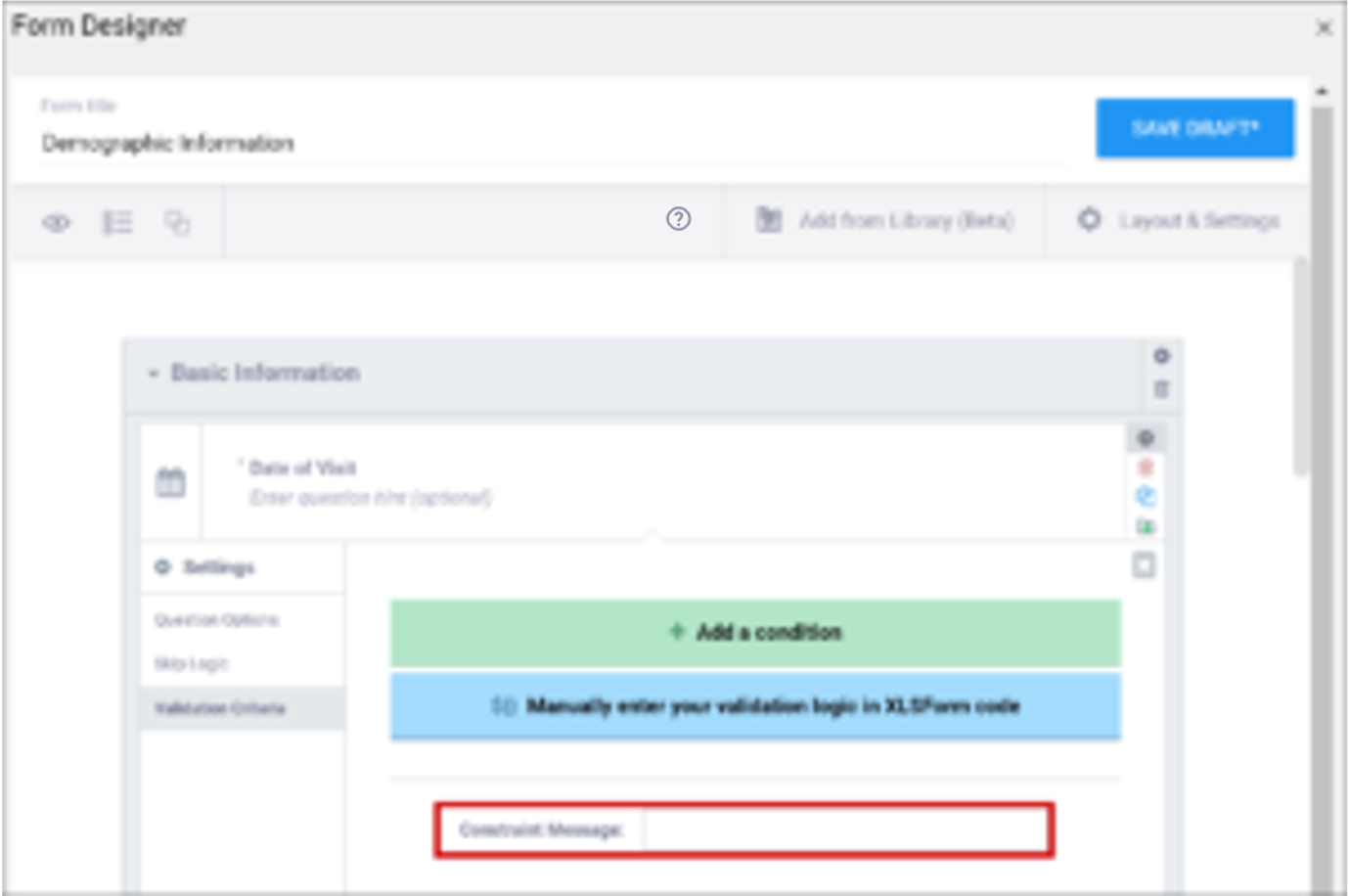
| Validation Criteria / Constraint | This is a condition under which an a response is considered invalid. Validation Criteria prevents users from entering invalid data. (e.g. “a Participant’s pulse must be >=60 and <=100.”)
| This is a condition under which an a response is considered invalid (as defined in the constraint column). Validation Criteria determines whether data is valid. This allows for edit checks, which you can define as soft checks or hard checks. If the expression provided in this cell is FALSE, the constraint_message displays. For example, if this item value must be between 10 and 60, enter the following (in expressions, . (dot) represents the current item value): . >= 10 and . <= 60 To reference other item values, use the following syntax: ${item_name} operator value Use and/or logic as needed. For example: ${sysbp} >=130 and . >= 10 and . <= 60 You can also compare date fields against today(). For example, to display a message if the date of an adverse event (AEDATE) is in the future, the constraint on the AEDATE field would be: .<=today() Note: This column supports the syntax as defined in the required, calculations, or relevant columns. |
| Constraint Message | A message stating that data is invalid and/or explaining why it is invalid (e.g. “Pulse is outside normal range.”) If you provide a constraint, you can include a message that explains why the answer provided is not acceptable. The message displays if the constraint expression is FALSE. For example, If you had the following constraint on the Pulse item: .>= 60 and .<=100 and a constraint_message of: Pulse is outside of the normal range. If someone entered a Pulse of 40, Pulse is outside of the normal range. would display on the form. | A message stating that data is invalid and/or explaining why it is invalid (e.g. “Pulse is outside normal range.”) If you provide a constraint, you can include a message that explains why the answer provided is not acceptable. The message displays if the constraint expression is FALSE. For example, If you had the following constraint on the Pulse item: .>= 60 and .<=100 and a constraint_message of: Pulse is outside of the normal range. If someone entered a Pulse of 40, Pulse is outside of the normal range. would display on the form. |
| Contact Data | Displays contact data on Form. In the Use as External Value field, select contactdata. Save your draft and exit. Then re-enter Form Designer, and select the types of contact data you want to display. | bind::oc:contactdata Displays contact data on Form. |


Form Title
The form title appears at the top of the data entry page.
BOTH Form Designer and Form Template – You can use alphanumeric characters, special characters (e.g. & # $ ^ _), and spaces.
Form ID
A unique identifier used as an internal reference when the form is uploaded. This value is not visible to end-users.
BOTH Form Designer and Form Template – Alphanumeric characters and underscores are permitted; no spaces.
Form Version
A unique identifier for an iteration of a given form (including changes to items, form logic, etc.).
2.4.3 Designing Contact Data Forms
This page provides step-by-step instructions for incorporating participant contact details (e.g., name, email, mobile number, address, etc.) into a form in OC4, using both the Form Designer and the Form Template.
Overview
When you capture contact information in a form (for example, allowing a participant to update their phone number or email), OpenClinica 4 supports this through the special contactdata mechanism.
⚠️ Important: Contact data items behave differently from ordinary form data. They are stored in a participant contact record rather than in the study’s clinical data set, and they are subject to stricter access controls.
For more information on how contact data behaves in Study Runner, refer to Understanding Contact Data.
Access & Role Considerations
- If any version of a form includes a contactdata item, the form is treated as a contact form.
- By default, Clinical Research Coordinators (CRCs) and Investigators can view and edit contact forms. Manual permission tags can be used to override this default, granting access to non-CRCs/Investigators or revoking access for CRCs/Investigators.
For details, see Managing Form Access and Permissions. - Contact data is stored as part of the participant record rather than as form data. Because of this, including contact data in form outputs would be redundant and may create a misleading impression of what was entered on a specific form. As a result, extract and API behavior differ from standard data forms.
- See Understanding Contact Data for retrieving participant contact and clinical data.
Using Form Designer for Contact Data Items
For general instructions, see Using Form Designer.
- In Study Designer, open your form in Form Designer.
- Add a Text or other suitable item for each contact field you want to collect (for example, First Name, Email Address, Mobile Number).
- Remove Item Group Name—contact-data items cannot be placed in an item group.
- Set Use as External Value to contactdata.
- Select the type of contact data you are collecting from the available options:
- firstname
- lastname
- mobilenumber
- secondaryid
Using Form Template for Contact Data Items
For general instructions, see Using the Form Template.
- In the Survey sheet, add a row for each contact field.
- For each row, set:
- type = the data type (for example, text)
- label = the question text (for example, Mobile Phone Number)
- name = the internal variable name (for example, mobile_number)
- Used for referencing the item within the form (for example, relevant logic on another item to check whether it is blank or filled in)
- bind::oc:external = contactdata
- bind::oc:itemgroup = blank. Contact data items cannot be included in item groups.
- Add the column instance::oc:contactdata and enter one of the allowed values shown below.
- Configure other columns as needed (for example, required, relevant, etc).
ℹ️ Note: Constraints for contact-data items are automatically applied by the system. - Upload the file through the Form Card > Upload button and preview the form.
Formatting and Automatic Constraints
When a field is defined as contactdata, OpenClinica automatically applies type-specific constraints to ensure format and data quality.
These constraints are system-enforced—you do not need to define them manually in the Form Template.
| Data Type | Item Type | Automatic Constraint |
| firstname | text | String length ≤ 35 characters |
| middlename | text | String length ≤ 35 characters |
| lastname | text | String length ≤ 35 characters |
| text | String length ≤ 255 characters and must match the following regular expression: ^[A-Za-z0-9!#$%&’*+/=?^_`{|}~-]+(?:\.[A-Za-z0-9!#$%&’*+/=?^_`{|}~-]+)*@(?:[A-Za-z0-9](?:[A-Za-z0-9-]*[A-Za-z0-9])?\.)+[A-Za-z0-9](?:[A-Za-z0-9-]*[A-Za-z0-9])?$ | |
| mobilenumber | text | String length ≤ 17 characters and must match the following regular expression: ^\+[0-9]{1,3} [0-9]{1,14}$ Accepts either a full international format (e.g., +1 5551234567) or a 10-digit number (assumed country code +1). |
| streetaddress1 | text | String length ≤ 155 characters |
| streetaddress2 | text | String length ≤ 155 characters |
| country | text | String length ≤ 155 characters |
| city | text | String length ≤ 155 characters |
| state | text | String length ≤ 155 characters |
| postalcode | text | String length ≤ 35 characters |
| fulldob | date | (Date field; format defined by system locale—no explicit length constraint.) |
| secondaryid | text | String length ≤ 35 characters |
| hospitalnumber | text | String length ≤ 35 characters |
ℹ️ Note: Mobile phone number is stored internally along with country code (for example +123 456789012345). Once a value has been collected, on either the form or from the Participant Details screen, it will be displayed in that format with country code (including +1 before US phone numbers).
Participants can enter phone numbers in either of the following formats:
- + followed by country code, space, and number (e.g., +1 5551234567)
- A 10-digit number (automatically assumed to be U.S. +1)
Notes on Constraints
- The constraint, constraint message, and constraint type are automatically populated when the item is identified as contactdata.
- If additional validation is needed (for example, regional phone number formats), use a separate constraint expression and validate thoroughly.
- For mobile numbers, OpenClinica automatically stores the number with a “+” prefix and country code.
Example: Template Configuration
| type | name | label | bind::oc:external | instance::oc:contactdata | required |
| text | first_name | First Name | contactdata | firstname | yes |
| text | last_name | Last Name | contactdata | lastname | yes |
| text | email_address | Email Address | contactdata | yes | |
| text | mobile_phone | Mobile Phone Number | contactdata | mobilenumber | no |
| text | mailing_street1 | Street Address Line 1 | contactdata | streetaddress1 | no |
| text | mailing_city | City | contactdata | city | no |
| text | mailing_postal | Postal / ZIP Code | contactdata | postalcode | no |
Summary and Best Practices
- Use bind::oc:external = contactdata and the appropriate instance::oc:contactdata code for each contact data item.
- Do not group contact-data items within an item group.
- Validate key fields (e.g., email format, phone number) and mark required appropriately.
- Do not add custom constraints that conflict with the system’s automatic rules.
- Test the form in a test environment using the same role permissions that will apply in production.
2.4.4 Using the Form Template
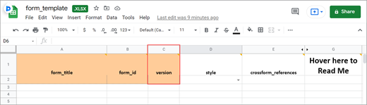
The form template is an Excel spreadsheet (compatible with most modern spreadsheet programs: Microsoft Excel, Open Office, Numbers, etc.) that can be used to create form definitions in OpenClinica. It is best practice to download the latest form template from OpenClinica (see steps below). The form template can also be found here: form_template.
Note: Form creation is usually easiest using the drag-and-drop Form Designer, but sometimes it is helpful to use the Form Template for forms with more form logic or specific features. See Using Form Designer for information on Form Designer.
As a general rule, the more complicated the form, and its logic, the more likely you’ll have to use Form Template. While Form Designer accommodates skip logic (on relevant fields) and validation criteria (constraints), it does not support features such as cascading selects, hard edit checks, etc.
Definitions
- Original Form Template: The blank spreadsheet file downloaded from OpenClinica.
- Form Template: A pre-formatted spreadsheet downloaded from OpenClinica. This could be blank for a new form, or a form you download to edit or copy an exiting form that would already rows filled in.
- Form Definition File: A completed spreadsheet uploaded, or ready to load, into OpenClinica.
Good Advice: Keep in mind that loading times for end-users are affected by the number of items on the form and the amount of form logic you use, OpenClinica recommends having no more than 100-200 items on a form and no more than 50 items on a Participate form, specifically when it is likely to be accessed from a mobile device.
The Excel Spreadsheet Contains Five Sheets:
- Settings
- Choices
- Survey
- Cross-Checking Examples
- Other Examples
The first three are the primary pages (Settings, Choices, and Survey sheets) you will utilize.
Quick-Start Guide
To Download the Form Template:
Click the Download Form Template button in the header bar of Study Designer.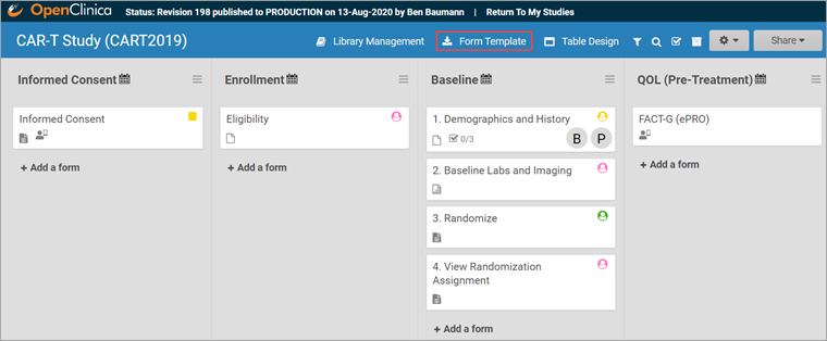
To Create the Form:
- Open the downloaded template.
- Enter a name for the form in the form_title column.
- Create a unique form id in the column form_id that will be used to identify your form internally (i.e., will not be visible to end-users).
To Add an Item to the Form:
- Click the survey tab to move to the survey spreadsheet.
- Enter the type of item you want in the type column (For example, text, integer, date, etc.).
- Enter the item text in the label column.
- Enter a unique alphanumeric string for the item in the name column.
- Enter text into the label column that will be displayed on the form as the question text.
If your item type is select_one or select_multiple, you must enter choices.
To Enter Choices for Select One or Select Multiple items:
- Click the choices tab in the Form Template spreadsheet.
- Enter the text for the option in the label column.
- Enter a unique alphanumeric string for the option in the name column. Do not include commas, spaces, or other non-alphanumeric characters in the choice name.
- Enter the unique id you entered for the question on the Survey tab (in the name column) to link options in the list_name column.
- Continue to add options as needed (by repeating steps 2-4).
- Click the survey tab in the Form Template spreadsheet.
- In the type column next to select_one or select_multiple, enter the list name from the choices sheet (For example, if the list name is YN, the type cell contents would be select_one YN)
Important: The spacing and underscores in select_one [listname] and select_multiple [listname] need to be exact.
To Create a Group of Items:
- Click the survey tab in the form template.
- Enter begin group in the type column at the top of all the items you want to put into a group.
- Enter end group in the type column at the bottom of all of the items you want to put into a group.
- In the bind::oc:itemgroup column, across from begin group and end group, enter an internal name for the group of items.
Note: If you want to make a repeating group, instead of begin group and end group, enter begin repeat and end repeat.
Best Practice: In the bind::oc:itemgroup column, you are using repeating groups, which must be kept separate, it is ideal to keep items in the same group. These groups do not have to correspond to the begin/end groups. Keeping items in the same group allows for better data visualization in Insight because participant data is displayed on tables by item group, not by form.
To Upload a Form Template in Study Designer:
- Click the name of the Form in Study Designer.
- Click the Upload button.
- Select the Form Template/Form Definition File you want to upload for that given form.
- Click the open button in the dialogue box.
Note: You can download a blank copy of the form template from within study designer (as shown above), or you can download a Form Definition File for several existing forms in the Form Library (CDASH) and modify it to suit your needs.
For helpful hints in completing the form template, hover your mouse over a column heading to read how its used, and be sure to read the example worksheets at the end (Cross-Form Examples, Custom Annotation Examples, Contact Info Examples, eConsent Examples, and Hard Checks Examples) for documentation on creating edit checks and other advanced template features.
Form Template Exclusive Features
Annotated CRFs
Annotated CRFs are useful for statisticians because they specify where in the system the data was taken from. For example, an annotated CRF might specify the dataset where the data exists.
Annotated CRFs are also a requirement for FDA data submissions and CDISC Standards.
Cascading Selects
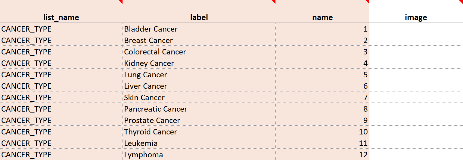
Cascading Selects (or Choice Filters) are a way of organizing hierarchical questions and filtering possible choices based on the prior selection. For Example, You Could Use Cascading Selects for the Following Set of Questions:
- Type of Cancer
- Subtype of Cancer
- Specific Cancer
When a participant responds to Type of Cancer, the choices listed for Subtype of Cancer are filtered based on that response. The responses for Specific Cancer will then by filtered by the Subtype of Cancer response. Responses for select_one and select_multiple questions can be filtered based on values of any items on the form.
To Add a Cascading Select:
- On the choices sheet, create columns for each filter you will use. For example, filter1 and filter2.
- Enter a value in a filter column to assign the choice in that row to a specific filter group. For example, filter1 might have 4 filter groups that contain different sets of choices. Use the numbers 1 through 4 to assign each choice to a distinct filter group.
- On the survey sheet, add a choice_filter column.
- In the choice_filter column, enter an expression for an item that must be true for a choice for that item in order to show that choice. Filter values are referred to by the title of the filter column. For example, filter1 = ${cascade1} would show a choice only if the value for that choice in column filter1 were equal to the value of item cascade1. If item cascade1 were 1, only choices with filter1 = 1 would be displayed on the form.
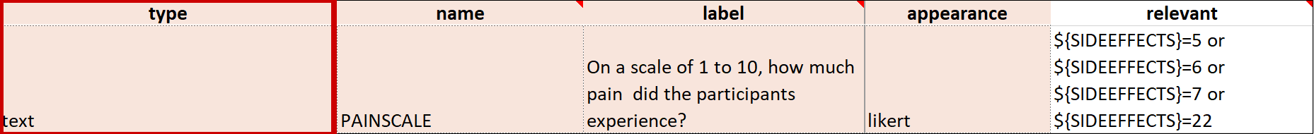
Crossform References
Using Crossform References optimizes loading forms by specifying the events that the system needs to reference for cross-checks. Instead of the system loading all of a participant’s information, it only loads the information necessary for the cross-check. This enhances form performance and data privacy.
Add the necessary OIDs in the crossform_references column of the settings sheet. See “Crossform References” below.
Referencing Long Lists
The choices worksheet of the form template restricts the combination of labels and names to a maximum of 4,000 characters. If you have a long list of choices to reference in a form, you can maintain that list in a separate CSV file where the number of characters is not restricted.
Best Practice: OpenClinica recommends that any items that reference long lists are defined with minimal autocomplete in the appearance column. In the form, this filters list choices in the dropdown list as you type.
E.g. instead of uploading a normal Form Definition File with a medications list, the medications were entered into a separate spreadsheet and saved as a CSV file named medication_list.csv. This file has more than 14,000 rows of entries.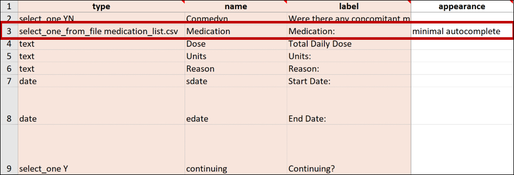
Note: To reflect any changes in the list of choices made in the .csv file, you must upload it again. If this occurs on a study that has been published to the Production environment, you must also update the version of the form on the settings page of the Form Definition File.
Repeat Count
If you enter begin repeat and end repeat in the type column, you can use the repeat_count column to specify the number of times the group of questions can be answered. If you specify the number of repeats available to the user, they cannot add or remove any of the repeating groups.
Note: If the repeat_count value decreases due changes on the form, any existing repeat instances exceeding the new repeat_count value will be deleted from the end of the repeating group.
To Add a Repeat Count:
- Click the survey tab in the form template.
- Add a repeat_count column.
- In the repeat_count column, across from begin_repeat and end_repeat, enter the number of repeats to allow.
Select_One From File
You can upload a CSV file with the Form Template for items that have a long list of choices that you can create with various external spreadsheet programs (consult the program’s documentation for assistance with this step).
To Reference the CSV File in the Form Template:
In the form template, on the survey sheet, enter select_one_from_file filename.csv in the type column. For example, if the name of the CSV file is painlocation, enter select_one_from_file painlocation.csv.
To Upload a Form Template with a CSV File:
In Study Designer, upload the Form Template and the CSV file at the same time by selecting both files (PC: ctrl+click; Mac: cmd+click) and clicking open.
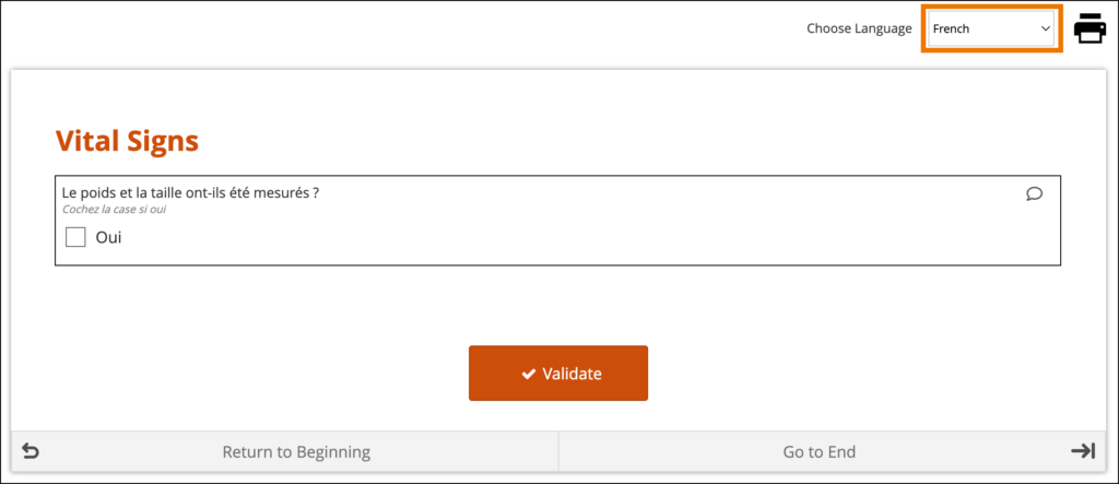
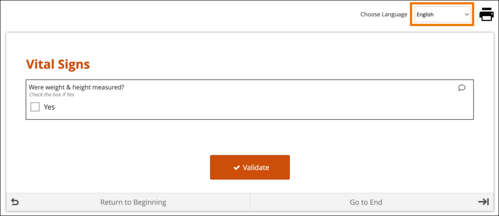
Languages and Translations
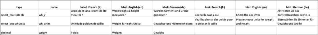
You can add multiple languages to your form by adding language columns to the choices and/or survey sheet, each with the title label::language (locale code), into your Excel spreadsheet. It is vital that the column header is correct, otherwise the system may not be able to determine the correct language to use for a given participant.
For example, if you want to add Spanish language support to the form content, add a label column(s) label::Spanish (es).
You can define languages for items, including the following:
Survey Sheet:
- label
- hint
- constraint_message
- required_message
- image (file name)
- audio (file name)
- video (file name)
Choices Sheet:
- label
- image (file name)
Enter translated text for every field you want to be translated. If you leave any text blank for a language, users in that language will not see any text for it.
Note: The only text-based item you cannot define language(s) for is the Form Title.
If the translations are labeled correctly and the user’s system language in Study Runner or the Participant Dashboard is a valid option for the form, the form initially loads using the user’s browser language selection. If there are additional languages for the form, they will be available to change between in the dropdown menu as needed.
System-Level Language Packs:
The Study Runner interface (outside of your forms) can also be displayed in multiple languages that have already been professionally translated. To learn which languages are supported by OpenClinica, see Language Support. To have OpenClinica enable a language pack for your study, please reach out to your Customer Success Manager, or contact support.
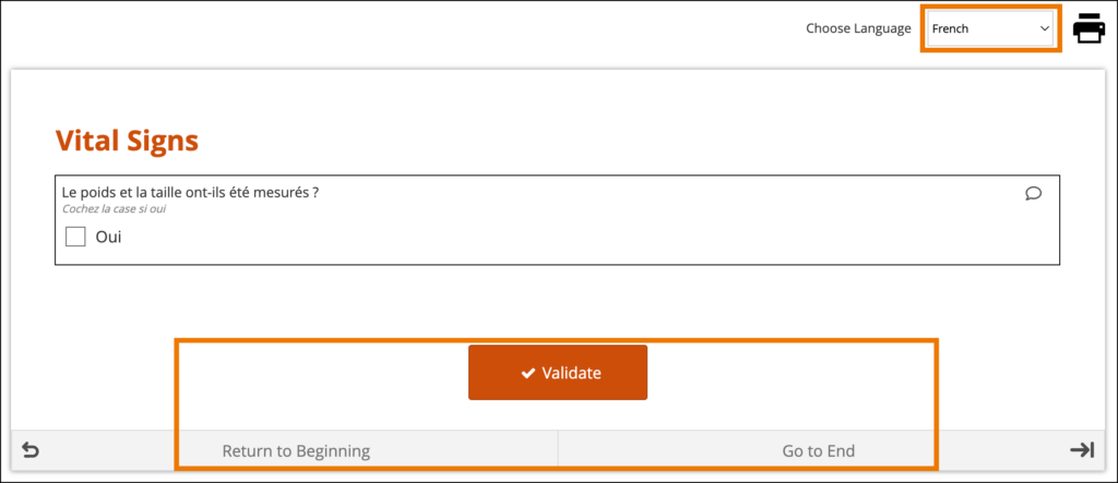
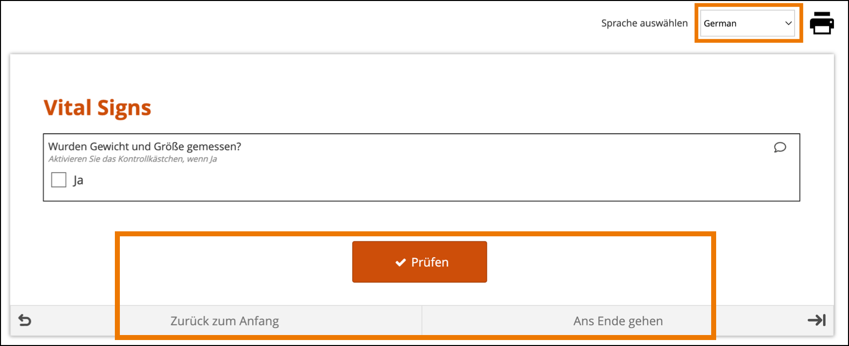
The form’s user interface (buttons and text set by OpenClinica rather than configured on the form template) will only display in supported languages. Other languages will only display the text that was configured on the form template for that language and will otherwise display the user interface in English (en). For example, when using German (de) as a language on the Form Template, the user interface remains in English (Close, Complete, Return to Beginning, Go to End, etc.) unless the study has had German language support enabled.
When a system-level language pack is installed for your study, the language presented to your users is based on their web browser’s settings.
Limitations with Study Runner Translations (set at the Study level by OpenClinica):
- Areas of Study Runner that display an Item Label or Brief Description (including custom columns in the Participant Matrix, Queries Table, and PDP common events tables, Data Review Table columns, and Item-Level SDV rows) will always display the Item Label or Brief Description only in the default language, regardless of the language a user is utilizing in a multi-language study.
- Areas of Study Runner that display single select or multi-select item values as choice labels (same component list as the above bullet plus the Audit Log) will always display the choice labels in the same language regardless of the user’s browser’s language settings.
For more information on Language Support, see Language Support.
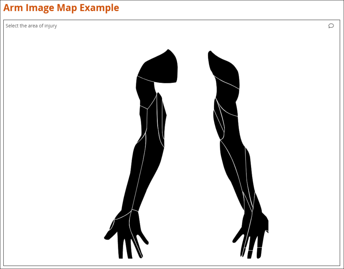
Image Maps
OpenClinica also has a feature that allows you to upload vector graphics (SVG images) and select areas in the image that correspond to responses to a query. Instead of selecting from a drop-down list, you can select an area in the image. For example, instead of looking through a list of potential pain locations to find the correct one, users can select the location on a picture of the human body.
To Set Up Image Links in an SVG File:
- Open the spreadsheet for your form.
- On the Survey tab, add a row with the following values in the specified columns:
- Type: Enter select_one listname, for example, select_one armregion
- Appearance: Enter image-map.
- Image: Enter the name of the SVG file you are using as your image map, for example, armregions.svg
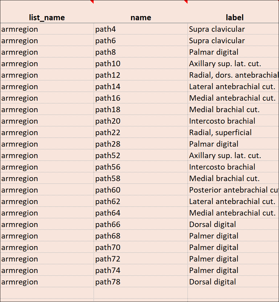
- In the Choices tab, add rows with the following values in the specified columns:
- List_name: Enter a name for your list of codes in each cell for the number of regions in your image.
- Label: Enter labels for each region you want to be able to select. These are the labels you see when you hover over a region in the image.
- Name: Enter an ID for each label. These are the path IDs you will use in Step 4.
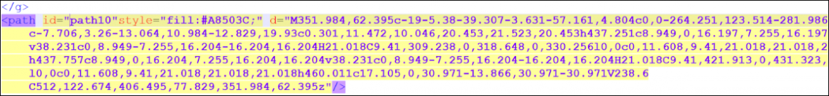
- Open the SVG file in a text editor. Next to <path, for each region, enter a path id you chose in step 3c, for example, id=path10 When you have added an id for each path, save the file.
- In OpenClinica, click +Add a form on the event to which you want to add the image.
- Enter a name for the form.
- Select the form card, and click Upload.
- Select BOTH the Excel file AND the SVG file at the same time, and click Open.
- Once the image has loaded, click Preview. Hover over regions to view labels or click on a region to select it.
Custom Annotations
This feature allows custom annotations to appear alongside standard item annotations in Annotated Form and Annotated Casebook PDFs. Standard annotations are automatically included for all item configurations defined on the survey worksheet. Custom annotations can be added to items as needed. Custom annotations do not have any effect in OpenClinica other than to appear on Annotated Form and Annotated Casebook PDFs.
If you want to add a custom annotation, add a column to the Survey tab and enter the column heading text as “bind::oc:oc_annotation_CUSTOMANNOTATIONLABEL“; where “CUSTOMANNOTATIONLABEL” is the text you would like to be displayed on the form as the custom annotation label. It can only contain uppercase letters, lowercase letters, digits, hyphens, and underscores, but the first character must be a letter or digit. Underscores will be converted to spaces for display on the annotated form.
The text entered for a row in the bind::oc:oc_annotation_CUSTOMANNOTATIONLABEL will be the custom annotation text on the Annotated Form and Casebook. There is no restriction on the characters that can be used in custom annotation text.
Ex: If a column is added called “bind::oc:oc_annotation_Data_Manager_Comment” and an item has “Reused on follow-up form” in that column, then that item will have the following annotation “[Data Manager Comment: Reused on follow-up form]“

Each custom annotation can have text defined per item or be left unused per item as needed. If a custom annotation is not used for a particular item, the custom annotation will not be displayed on the annotated form for that item.
Multiple custom item annotations can be defined within a form definition spreadsheet. They will be displayed on the Annotated Form and Annotated Casebook PDFs in the order the custom annotation columns are listed on the survey worksheet.
Form Template Fields with No Form Designer Equivalent
Due to the nature of a form template, some fields will only exist in one or the other. Here are all the form template fields that don’t exist inside the form designer and any special instructions.
Namespace
The value in this field should remain as it is. If you inadvertently delete the value, it should be as follows (the quotes and spaces are required):
- oc=”http://openclinica.org/xforms”
- OpenClinica=”http://openclinica.com/odm”
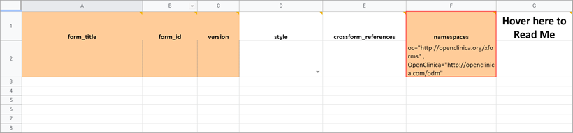
Crossform References
As noted earlier you can use this column to decrease the form’s loading time by specifying a list of events to be used in the form’s cross-form logic. If the form does not use cross-form logic, then this column should be left blank in which case this column will have no effect.
If the form uses cross-form logic, and this is left blank, then all data for a given participant will be available for the form to access. The form will open more slowly as the full participant record is processed through the browser.
To improve form performance and enhance data privacy, you can include a comma-separated list of Event OIDs. Only data from these events will be processed through the browser and made available to the form’s cross-form logic. This can improve form loading times significantly. You must, however, ensure that all events referenced in the cross-form logic are listed here or the desired values will not be pulled in as expected. You can also include “current_event” in the list. That will allow the form to access data from the event occurrence it is in. This is useful for forms that are used in multiple events. It allows the form to access data that is relevant based on its event context when it is opened.
Example:
If you want to allow your form to access data from Baseline event (OID “SE_BASELINE”), Visit 2 event (OID “SE_VISIT2”), and the current event occurrence (“current_event”), you would put the following value in this cell: SE_BASELINE,SE_VISIT2,current_event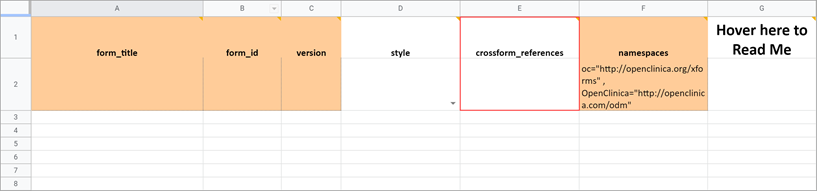
Note: If you enter an invalid value in this cell, it will act as if you hadn’t entered a value, thus all data for the current participant will be available for the form to access. This will ensure that the logic works as expected, but performance will not be optimized.
Required Message
If the item is required, you can include a message that explains why the answer is needed. This can include a helpful hint to the data entry user as to why the item is required such as noting that an item is a primary data point, or that an item is required due to a prior response. If this field is left blank on a required item, the default message, This field is required, will be used.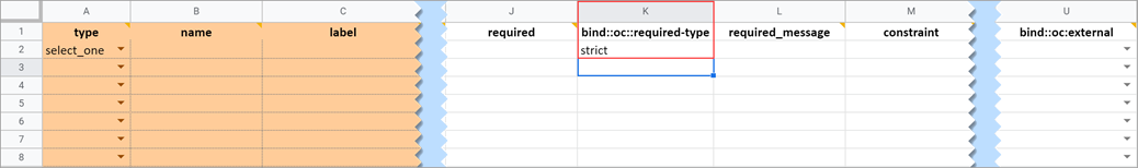
Required Type
This field determines whether a data entry user can override a required field and save the form as-is. To prevent this you must add a column to the survey sheet with the heading bind::oc::required-type and type strict on the field for that item. If left blank or not included, the user can override the requirement. For more information refer to the form logic section under “Hard Edit Checks”.
Image (Choices)
Allows you to display an image in your form. You must upload the valid image file (e.g., files with an extension of .png or .jpg) at the same time that you upload the Form Definition File or you can add it to a draft using the Upload Media & External Lists option. For example, Wong-Baker face images for pain scale choices.
Choice Filter
An expression for using filters for cascading selects (i.e. items are filtered based on responses to other items) see the section on Cascading Selects for more information.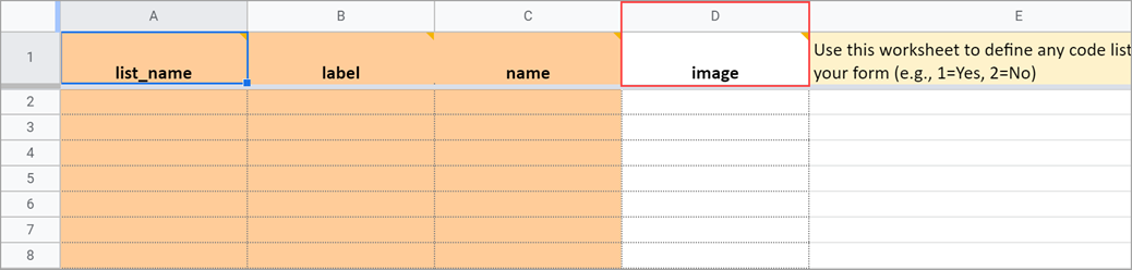
List Name
The name of your code list. The same name is used for each value combination of a list (alphanumeric characters and underscores are permitted; no spaces). If you have a yes/no codelist and name it YN, there would be two rows referencing the same list_name:
| list_name | label | name |
|---|---|---|
| YN | Yes | 1 |
| YN | No | 2 |
Repeat Count
When added to a begin_repeat type, this allows you to specify an exact number of repeats available to users. If used, the option to add or remove entries is not available.
Constraint Type
Determines whether a data entry user can override the constraint. To prevent this you must add a column to the survey sheet with the heading bind::oc::constraint-type and type strict on the field for that item If left blank or not included, the user can override the requirement.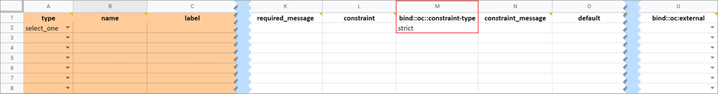
Form Template and Form Designer Fields
| Field | Form Designer | Form Template |
| Form Title The form title appears at the top of the data entry page. | You can use alphanumeric characters, special characters (e.g. & # $ ^ _), and spaces | You can use alphanumeric characters, special characters (e.g. & # $ ^ _), and spaces. |
| Form ID A unique identifier used as an internal reference when the form is uploaded. This value is not visible to end-users. | Alphanumeric characters and underscores are permitted; no spaces. | >Alphanumeric characters and underscores are permitted; no spaces. |
| Form Version A unique identifier for an iteration of a given form (including changes to items, form logic, etc.). | You must change the version number if you want to create a new version of your form. Otherwise, in the TEST environment, the new version overwrites the existing version except for changes to the item types, the item groups, or moving an item in or out of a repeating group. In the PRODUCTION environment, you can not overwrite a version of a form and must have a unique identifier for each version. Saving your form as a draft does not create a new version, but you can later promote a draft to a version using the Add to Study menu option on the form card in Study Designer. | In the Test environment you can overwrite versions for changes to anything except the following features (these require a new form or a new item name):
In the Production environment, you must have a unique version identifier each time you upload a modification to the form. |
| Form Style This specifies the layout and appearance of the form, primarily dealing with how the items are displayed (each question on a separate line, or a grid, and whether on a single page or multiple pages by groups). | There are four styles to choose from:
Note: If you group items together and click the “Show all questions in this group on the same screen” check box, items in the group appear on the same page, overriding a multiple pages setting. | You can leave this column blank or select from three options: If left blank: Each question is on a separate line on the same page. [Simple – single page]
Note: When using Form Template, question groups (referenced above) are defined on the survey worksheet. When combined with the field-list option of the appearance column on the survey worksheet, you can control the display of questions and the structure of grids. See the entry on appearance below for more information. |
| Question Text/Label | This is the text that appears in the Form for an item/question. | The name of your code list. The same name is used for each value combination of a list. Alphanumeric characters and underscores are permitted; no spaces. If you have a yes/no codelist and name it YN, there would be two rows referencing the same list_name: list_name label name |
| Enter Question Hint/Hint | Informative text that appears on the Form to help the user. For example, “Please provide weight in kilograms.” Hints appear in italics under the question label.
| Informative text displayed on the form to help the user. For example, Please provide weight in kilograms. Hints display in italics under the question label. |
| Item Name/Name | The internal name of the item, as used in the database. This is used to generate the item object identifier (OID)This does not appear during data entry. Alphanumeric characters and underscores are allowed. | The unique name of the item. This is not displayed during data entry, but is how the data is referenced in the database. Allows alphanumeric characters and underscores; spaces are not allowed. It is recommended that only lowercase letters, digits, and underscores are used in item names. Once an item name is defined in this spreadsheet and the form is uploaded into OpenClinica, the name should not be changed to use different letter case when the form is uploaded again. For example, if item1 is part of the first form upload, this name should not be changed to ITEM1 or Item1 when the form is subsequently uploaded. Any change from/to upper/lower case in an item name will result in a form or publish error. |
| Item Group | The internal name of the group that the item is in, as used in the database. This is used to generate the item object identifier (OID). Alphanumeric characters and underscores are allowed; spaces are not allowed. | The name of the group to which you are assigning the item in the underlying database. This becomes the item group object identifier (OID). Alphanumeric characters and underscores are allowed; spaces are not allowed. It is recommended that only lowercase letters, digits, and underscores are used in itemgroup names. The itemgroup name does not have to correspond to the begin/end group names defined in the type column. Begin group/repeat, end group/repeat, and note types should not have a value in the bind::oc:itemgroup cell. All items in a repeating group must have the same itemgroup name. That itemgroup name cannot be used by other items that are outside that repeating group. Once an itemgroup name is defined in this spreadsheet and the form is uploaded into OpenClinica, the itemgroup name should not be changed to use different letter case when the form is uploaded again. For example, if group1 is part of the first form upload, this should not be changed to GROUP1 or Group1 when the form is subsequently uploaded. Any change from/to upper/lower case in an itemgroup name will result in a form or publish error. |
| Type | The data type of the item (e.g. select one, select multiple, etc.)
| The data type of the item (e.g. select one, select multiple, etc.)
|
| Item Brief Description | A short description of the item that can be used to reference it in tables. This description can be up to 40 characters. You cannot use special characters. If this is not defined for an item in a table, the Item Name appears instead. | A short description of the item that can be used to reference it in tables. This description can be up to 40 characters. You cannot use special characters. If this is not defined for an item in a table, the Item Name appears instead. |
| Item Description | A long description of the item that can be used to define the data that the item/question contains. This is not displayed on the Form during data data entry. The text can be up to 3,999 characters. You cannot use special characters. The description is included in some data extract formats. | A long description of the item that can be used to define the data that the item/question contains. This is not displayed on the Form during data data entry. The text can be up to 3,999 characters. You cannot use special characters. The description is included in some data extract formats. |
| Appearance | This determines how each item appears based on its Type. Items do not have a specific appearance by default. This setting is optional. Note: the type, other indicates that instead of selecting the option, other, you can enter the appearance directly in the field. other also appears as an option for the item types indicated. You can specify width for any item. (See Width) Single select / Multi-select
text
integer
decimal
calculate
Date
note
file
image
audio
video
Layout groups
Note: Items with no label or hint are treated as background calculations.
| This determines how each item appears based on its Type. Items do not have a specific appearance by default. This setting is optional. Note: the type, other indicates that instead of selecting the option, other, you can enter the appearance directly in the field. other also appears as an option for the item types indicated. You can specify width for any item. (See Width) Single select / Multi-select
text
integer
decimal
calculate
Date
note
file
image
audio
video
Layout groups
Note: Items with no label or hint are treated as background calculations. |
| Width | For an item or group of items on a grid form, you can control how many columns appear on each row by specifying the width w#. If you specified a width of w6 for a layout group, it takes up the entire width of the grid. If you specified w1 for a single item in the group, there would be one small column (1) and another large column (5). | For an item or group of items on a grid form, you can control how many columns appear on each row by specifying the width w#. If you specified a width of w6 for a layout group, it takes up the entire width of the grid. If you specified w1 for a single item in the group, there would be one small column (1) and another large column (5). |
| Required | This specifies whether a user is required to enter a response to the item to proceed with data entry. Select Always, Never, or Conditional to specify whether/when a response to this item/question is required. If you select Conditional, you must enter a conditional value. | This specifies whether a user is required to enter a response to the item to proceed with data entry. For required fields, type yes in the required column on the survey sheet. For conditionally required fields, enter a condition, as defined in the relevant column of the survey sheet. For example, if Number of packs per day is required if Does the subject smoke? is answered yes, enter: ${smoke} = 1 Note: This column supports the syntax as defined in the calculation, constraint, or relevant columns of this worksheet. Refer to those column comments for additional examples. |
| Use External Value | This item is a value used for logic or calculations. clinicaldata is used for cross-Form, cross-event, or event level calculations. contactdata displays contact data on a form. If you enter contactdata, you must add a column called instance::oc:contactdata. That column must contain one of the following values to indicate which contact information it is collecting: firstname, lastname, email, mobilenumber, secondaryid. | This item is a value used for logic or calculations. clinicaldata is used for cross-Form, cross-event, or event level calculations. contactdata displays contact data on a form. If you enter contactdata, you must add a column called instance::oc:contactdata. That column must contain one of the following values to indicate which contact information it is collecting: firstname, middlename, lastname, email, mobilenumber, streetaddress1, streetaddress2, country, city, state, postalcode, fulldob, secondaryid, hospitalnumber.
|
| Read Only | This specifies that you cannot enter data for an item. This can be used for the types of text, calculations, etc. | This specifies that you cannot enter data for an item. This can be used for the types of text, calculations, etc.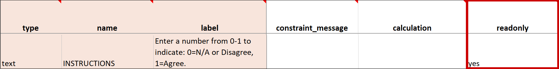 |
| Calculation | An expression used to calculate a value, usually using the values of preceding questions on the current Form. This can also be used for Cross-form calculations. . is used to represent the current field’s value. ${name} is used to reference a different item value on this Form, where name is the name of the other item. You can use parentheses. The following operators can be used:
For example, to calculate Mean Arterial blood Pressure (MAP) based on the items systolic and diastolic: (systolic + (2*diastolic)) div 3 Calculations cannot be used for items with type of note. If calculation is used for any type except calculate, that field must have Read Only set to yes. | An expression used to calculate a value, usually using the values of preceding questions on the current Form. This can also be used for Cross-form calculations. . is used to represent the current field’s value. ${name} is used to reference a different item value on this Form, where name is the name of the other item. You can use parentheses. The following operators can be used:
For example, to calculate Mean Arterial blood Pressure (MAP) based on the items systolic and diastolic: (systolic + (2*diastolic)) div 3 Calculations cannot be used for items with type of note. If calculation is used for any type except calculate, that field must have Read Only set to yes. |
| Response Text/Label | The question text to be displayed on the data entry form. This field allows alphanumeric characters. Add a line break where you want using Ctrl-Enter or Ctrl-Alt-Enter (Windows) Option+Enter (Mac). Styling prompts can be added to format your text as follows: *text* displays as italics **text** displays as bold ***text*** displays as bold italics Increase font size by preceding the text with one to six hash tags. # makes the text the largest possible size, ## makes the text the smallest possible size. Sizes that display may vary for note vs. item vs. group labels. Colors can be added as follows: < span style=”color:red” > text < /span > for red text. You can use the hex code for the color of your choice. (You can look up hex codes by searching for css codes on the internet.) | The question text to be displayed on the data entry form. This field allows alphanumeric characters. Add a line break where you want using Ctrl-Enter or Ctrl-Alt-Enter (Windows) Option+Enter (Mac). Styling prompts can be added to format your text as follows: *text* displays as italics **text** displays as bold ***text*** displays as bold italics Increase font size by preceding the text with one to six hash tags. # makes the text the largest possible size, ## makes the text the smallest possible size. Sizes that display may vary for note vs. item vs. group labels. Colors can be added as follows: < span style=”color:red” > text < /span > for red text. You can use the hex code for the color of your choice. (You can look up hex codes by searching for css codes on the internet.) |
| Value/Name | The unique code value stored in the database that corresponds to each answer choice (e.g. 1=Yes). These codes are generated automatically but can be changed. | The unique code value stored in the database that corresponds to each answer choice (e.g. 1=Yes). |
| Item Name/Name | The unique internal name of the layout group used in the database. This is not displayed during data entry. Alphanumeric characters and underscores are allowed. | The unique internal name of the layout group used in the database. This is not displayed during data entry. Alphanumeric characters and underscores are allowed. |
| Show All Questions in this Group on the Same Screen/Appearance | Click this check box to make all items appear on the same screen (regardless of your layout selection.) | N/A |
| Repeat this group if Necessary | This specifies that the group of items should be repeated. Click this check box to make the selected group of questions a repeating group. | This uses begin repeat and end repeat in the Type column to specify that the group of items should be repeated.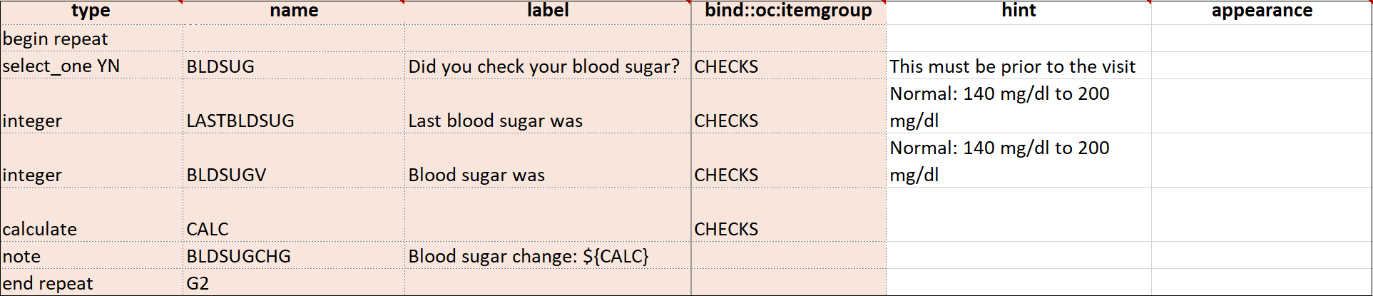 |
| Skip Logic / Relevant | This is a condition under which an item is skipped. Enter a condition under which this item/question appears or is required. | This is a condition under which an item is skipped (as defined in the relevant column). The item or group is only displayed if the provided expression evaluates to TRUE. Use the following syntax: ${other question name} = value (for a numeric value) or ${other question name} = ‘value’ (for a character value) If the lead-in question uses a code list defined in the choices worksheet, use what is in the name column for that code list as the value. For example, if you have two questions: Does the subject smoke? (item name = smoke) and How many packs per day? (item name=packs), the second question should only display if the answer to the first question is Yes. If the first question (smoke) uses a code list defined in the choices worksheet as: list_name label name The relevant syntax for How many packs per day would be: ${smoke} = 1 For multi_select items, use the following syntax: selected(${question name},value) (for a numeric value) selected(${question name},’value’) (for a character string) Note: This column supports the syntax as defined in the required, calculations, or relevant columns. |
| Validation Criteria / Constraint | This is a condition under which an a response is considered invalid. Validation Criteria prevents users from entering invalid data. (e.g. “a Participant’s pulse must be >=60 and <=100.”) Note: You can also manually add skip logic or validation logic in Excel Form Code.
| This is a condition under which an a response is considered invalid (as defined in the constraint column). Validation Criteria determines whether data is valid. This allows for edit checks, which you can define as soft checks or hard checks. If the expression provided in this cell is FALSE, the constraint_message displays. For example, if this item value must be between 10 and 60, enter the following (in expressions, . (dot) represents the current item value): . >= 10 and . <= 60 To reference other item values, use the following syntax: ${item_name} operator value Use and/or logic as needed. For example: ${sysbp} >=130 and . >= 10 and . <= 60 You can also compare date fields against today(). For example, to display a message if the date of an adverse event (AEDATE) is in the future, the constraint on the AEDATE field would be: .<=today() Note: This column supports the syntax as defined in the required, calculations, or relevant columns. |
| Constraint Message | A message stating that data is invalid and/or explaining why it is invalid (e.g. “Pulse is outside normal range.”) If you provide a constraint, you can include a message that explains why the answer provided is not acceptable. The message displays if the constraint expression is FALSE. For example, If you had the following constraint on the Pulse item: .>= 60 and .<=100 and a constraint_message of: Pulse is outside of the normal range. If someone entered a Pulse of 40, Pulse is outside of the normal range. would display on the form. | A message stating that data is invalid and/or explaining why it is invalid (e.g. “Pulse is outside normal range.”) If you provide a constraint, you can include a message that explains why the answer provided is not acceptable. The message displays if the constraint expression is FALSE. For example, If you had the following constraint on the Pulse item: .>= 60 and .<=100 and a constraint_message of: Pulse is outside of the normal range. If someone entered a Pulse of 40, Pulse is outside of the normal range. would display on the form. |
| Contact Data | Displays contact data on Form. In the Use as External Value field, select contactdata. Save your draft and exit. Then re-enter Form Designer, and select the types of contact data you want to display.
Note: If any version of the form, has a contact data item, the form will be considered to have contact data and will only be visible to users who can view contact data. | bind::oc:contactdata Displays contact data on Form.
Note: If any version of the form, has a contact data item, the form will be considered to have contact data and will only be visible to users who can view contact data. |


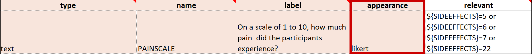


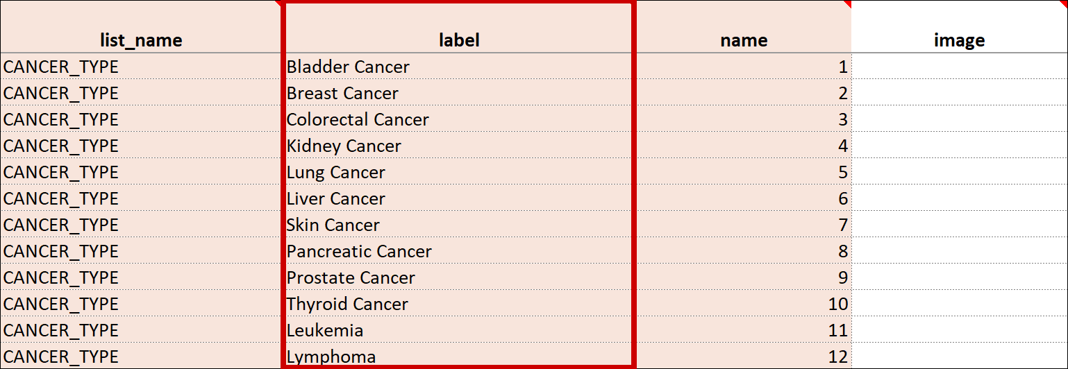
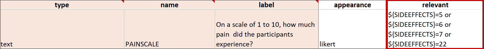


2.4.5 Form Logic
Adding logic to your forms can help make them “smart” by improving the user experience, promoting cleaner data, and automating calculations.
Form logic includes:
- calculations
- cross-form logic
- skip logic
- constraints
When writing expressions for form logic it is necessary to use the correct syntax, including punctuation and spaces. Form logic is not case-sensitive.
Referencing Items
There are two ways to reference an item on your form within a logic expression. Values can either be an item reference (e.g. age) or the literal value of an item (e.g. yes or 1).
| Syntax | Description | Example |
|---|---|---|
| . | References the current item’s value. | The expression .>= and .<=65 in an age field's constraint settings would verify that the value (age) entered is between 18 and 65. |
| ${itemname} | References the value of another item where itemname is the name of that item. | The expression ${sex} = 'female' could be used in a skip logic setting on a pregnancy question to display the question only if the participant is female. |
To use values from other forms see below.
Conditions
Note: You can use either single quotes or double quotes, but single quotes are generally preferred for clarity. You would use double quotes if the string already contained a single quote. If you want this condition to work with multiple choices, use the formula twice with and / or.
| Description | Syntax |
|---|---|
| Numeric Value | ${itemname} = value |
| String Value | ${itemname} = 'value' ${itemname} = "value" |
| Null Value [Empty String] | ${itemname} = '' |
| Multiple Select Numeric Value(s) | selected(${itemname}, choicename) |
| Multiple Select Character Value(s) | selected(${itemname}, 'choicename') |
Operators & Boolean Logic
| Description | Syntax |
|---|---|
| Addition | + |
| Subtraction | - |
| Multiplication | * |
| Division | div |
| Modulus (remainder) | mod |
| Equal | = |
| Not Equal | != |
| Less Than | < |
| Less Than or Equal to | <= |
| Greater Than | > |
| Greater Than or Equal to | >= |
| Manipulating the order of operations | ( ) |
| All must be true | and |
| Any can be true | or |
Boolean operators (and & or) return a value of either True or False. If you have a sequence of statements, all linked together with and, then to have a value of True every statement must be true; if even one is not true, then the whole expression’s value is False. With or, the threshold is much lower: only one of the statements needs to be true to evaluate to True (though any number can be true, as long as at least one is).
Parentheses control the order of operations of a statement and are often used even when not needed to clarify and to increase the readability of the code (e.g.(${enddate}-${startdate}) * 2). Lastly, modulus (mod) divides one number into another and returns the remainder. This has many uses well beyond the EDC realm, but one of the simplest examples is that many programs use it to tell when a number is even or odd (if mod 2 is 0 it’s even, 1 it’s odd), or to know if a number is equal to, or a multiple of, another number (in this case if mod-ing by say 7, any value that results in 0 would be a multiple of 7).
Calculations
Enter the formula from the syntax column in the Calculation field (Form Designer) or the Calculate column (Form Template). Replace the items in brackets with the names of your own items.
| Calculates | Key | Syntax |
|---|---|---|
| BMI (adjusting for Metric or Imperial, and rounding to 2 decimal digits) | weight = weight in lbs or kgs height = height in cm or in wh_units = weight and height units (1 for cm and kgs, 2 for in and lbs) | round(if(${wh_units} = 2 and ${weight} != '' and ${height} != '', 703 * ${weight} div(pow(${height}, 2)), if(${wh_units} = 1 and ${weight} != '' and ${height} != '', 10000 * ${weight} div(pow(${height}, 2)), 0)), 2) Alternatively: round(if(${weight} != '' and ${height} != '', if(${wh_units} = 1, 10000 * ${weight} div(pow(${height}, 2)), 703 * ${weight} div(pow(${height}, 2))), 0)) |
| Mean Arterial Blood Pressure (MAP) | systolic = systolic blood pressure diastolic = systolic blood pressure | (systolic + (2 * diastolic)) div 3 |
Required
Enter the formula from the syntax column in the field that appears when you select Conditional in the Required field (Form Designer) or the Required column (Form Template). Replace the items in brackets with the names of your own items. Required conditions are only evaluated for items that are currently null (for example, no value has been entered).
| Description | Syntax |
|---|---|
| Cancer Type shows if {cancerdiagnosis} is yes. | ${cancerdiagnosis} = yes |
Skip Logic/Relevant
Enter the formula from the syntax column in the field that appears when you select Skip Logic and click the ${} Manually enter your skip logic in XLSForm Code button (Form Designer) or the Relevant column (Form Template). Replace the items in brackets with the names of your own items.
| Skip Logic/Relvant | Syntax |
|---|---|
| Does Participant Smoke? | ${smoke} = yes |
Relevant logic is ignored if the default column is populated for an item in a form. If an item has a default value, it populates when the form is opened or when a repeat is added regardless of whether the item is relevant or not. To avoid default values displaying before an item becomes relevant, use triggered calculations so the values don’t populate until the item becomes relevant, or use an if() statement. To use an if() statement in this case, use a default that has an if() statement that sets the value to null if the relevant condition is not met and sets it to the desired default if the relevant condition is met.
Validation Criteria/Constraint
Enter the formula from the syntax column in the Constraint field (Form Designer) or the Constraint column (Form Template). Replace the items in the syntax column in brackets with the names of your own items. Constraint conditions are only evaluated for items that are currently non-null (for example, a value has been entered).
| Validation Criteria/Constraint | Syntax |
|---|---|
| No Future Dates | .<=today() [Please refer to https://docs.getodk.org/form-logic/#when-expressions-are-evaluated for an important caveat] |
| Age Must be Between 1 and 100 [Non-inclusive] | ${age} > 1 and ${age} < 100 |
| Must not exceed 100 characters | string-length(.)<=100 |
| Must be in 24-Hour Format (HH:MM) | regex(., '^(([0-1]{0,1}[0-9])|([2][0-3])):([0-5][0-9])$') |
Advanced Form Logic
Hard Edit Checks (Form Template)
Hard edit checks are exclusive to the Form Template and can be used to enforce stricter standards on data entry than soft edit checks. Because they can make data entry more difficult for users, it is recommended that they be used only when the benefits to data quality outweigh the difficulties for the study personnel.
All checks that are not explicitly defined as hard edit checks are soft edit checks in all forms. The exception to this rule are forms used in the Participate module in which case all edit checks are automatically hard edit checks.
When a value is entered and it violates a hard check on an item, the value is rejected before it is stored, and the user will see a pop-up message. If the value entered causes a hard edit check to be violated on a different item (such as one already entered and saved that passed the validation criteria at the time) then the user will see an error message displayed on the item with the violated hard check, and it will have an orange background (distinct from the soft red background used for soft check error messages).
A user cannot navigate forward in the form or mark the form complete while a hard check error message is present. The user can add a manual or automatic query to a hard check item to close the form. However, the query will not hide the hard check error message.
Important: Special care must be taken when using relevant logic (hide/show) for an item with a hard required check. Once an item has a value, a required hard check will not allow the item to be cleared. To avoid this, the item’s required logic must indicate that the item is required only when the item’s relevant logic is met. If this is not implemented properly, the user may get into a state where they cannot clear an item even though that is the only way to make the data consistent with the relevant logic.
For example, if the item (or the group it is in) has relevant logic ${yn_item} = 1, then the hard required logic must also include ${yn_item} = 1 to ensure that the form works as intended. That will enforce the hard required check when the item is relevant, but will not enforce the check when the item is not relevant.
To Make a Hard Edit Check for a Required Item:
- Click the survey tab in the Form Template spreadsheet.
- Add a column with the header bind::oc:required-type.
- Enter strict.
To Make a Hard Edit Check for a Constraint:
- Click the survey tab in the Form Template spreadsheet.
- Add a column with the header bind::oc:constraint-type.
- Enter strict.
Cross-Checks (Form Template)
Referencing item values across forms and/or events
Reference the following examples when checking data across events, forms, repeating occurrences in a single event, or repeating occurrences in separate events. There are also examples of how to check specific values captured when a user adds a new participant.
The following steps apply all of the examples below, unless otherwise stated:
- Create an item with a type of calculate.
- In the bind::oc:external cell, for that newly added calculate field, select clinicaldata from the drop-down list.
- In the calculation cell for the new calculate item, copy and paste the appropriate sample text from the examples below, and replace the bold, italicized text with the OIDs (or object names) from your study.
- Reference the new calculate field (as defined above) in any of the following cells to use the externally referenced value for display or in a logic expression:
- label
- hint
- calculation
- constraint
- required
- relevant
- (Optional) To optimize performance and enhance data privacy, configure the crossform_references column on the survey sheet to include only the events that are needed for the cross-form logic on your form. Cross-form logic will work without this step, but the form will load more slowly as the full participant record is processed through the browser. Simply enter a comma-separated list of the Event OIDs used in your logic. Include current_event in the list if any logic on the form uses [@OpenClinica:Current=’Yes’]. With this configuration used, only the indicated events are processed through the browser.
For example, you would enter “SE_BASELINE,SE_VISIT2,current_event” if your form uses cross-form logic containing the events, “SE_BASELINE”, “SE_VISIT2”, and “[@OpenClinica:Current=’Yes’]”.
Notes:
- Even if your logic references an event by name instead of OID, you must include the Event OID in the list.
- If you use any of the examples that reference OIDs, the study must first be published in order to generate OIDs. You can publish the study to the test environment, then locate and reference the OIDs as needed (they do not change between the test & production environments), and include those OIDs in the calculation field as indicated below.
- You can reference object names instead of OIDs, but if the object name changes, you must update the calculation to include the updated object name. OIDs do not change for objects, so it is easier to maintain forms that include references to OIDs.
- You can create any single calculation by using a combination of OIDs and object names.
Cross-Form Usage Tips:
- Cross-form items defined using the method below will start out as null every time the form is opened or reopened. The cross-form logic will be processed immediately after the form opens to retrieve the expected values. This means that any other form logic (such as calculations or relevant logic) that is dependent on cross-form values will initially respond to the cross-from item as null and then subsequently respond to the retrieved cross-form value. Care should be taken in form design to account for this behavior.
- To prevent a form item that is being set to a cross-form value from being calculated as null briefly during form load, instead of using a calculation like ${crossform_item}, consider using a calculation like if(${crossform_item} = ”, ., ${crossform_item}). This will update the target item to the cross-form value, but it will not allow it to be set to null if it has been calculated to a non-null value.
- For calculated values that are based on data not contained within the form (for example, randomization values added by the Randomize module, values imported from another system as part of a data migration, or randomly generated numbers), do not put these calculated values under relevant logic that is dependent on cross-form values. The temporary null cross-from value during form load may cause the relevant logic to behave unexpectedly and may cause these calculated values to be cleared. Instead, ensure calculated values that are based on data from outside the form are either not under relevant logic or their relevant logic is not dependent on cross-from values.
Cross-check data against an item value in another event. Referencing the item value by item name
Add a calculate item. Include ‘clinicaldata’ in the bind::oc:external cell and add the following to the calculation cell, replacing the bold, italicized text with your specific object names:
instance(‘clinicaldata’)/ODM/ClinicalData/SubjectData/StudyEventData[@OpenClinica:EventName=’Event Name Here‘]/FormData[@OpenClinica:FormName=’Form Name Here‘]/ItemGroupData[@OpenClinica:ItemGroupName=’Item Group Name Here‘]/ItemData[@OpenClinica:ItemName=’Item Name Here‘]/@Value
Cross-check data against an item value in another event. Referencing the item value by OID
Add a calculate item. Include ‘clinicaldata’ in the bind::oc:external cell and add the following to the calculation cell, replacing the bold, italicized text with your specific OIDs:
instance(‘clinicaldata’)/ODM/ClinicalData/SubjectData/StudyEventData[@StudyEventOID=’Event OID Here‘]/FormData[@FormOID=’Form OID Here‘]/ItemGroupData[@ItemGroupOID=’Item Group OID Here‘]/ItemData[@ItemOID=’Item OID Here‘]/@Value
Cross-check data against an item value in a different form that is in the same event as this form
Add a calculate item. Include ‘clinicaldata’ in the bind::oc:external cell and add the following to the calculation cell, replacing the bold, italicized text with your specific OIDs:
instance(‘clinicaldata’)/ODM/ClinicalData/SubjectData/StudyEventData[@OpenClinica:Current=’Yes’]/FormData[@FormOID=’Form OID Here‘]/ItemGroupData[@ItemGroupOID=’Item Group OID Here‘]/ItemData[@ItemOID=’Item OID Here‘]/@Value
Cross-check data against an item value in a specific repeat/row of a repeating group
Add a calculate item. Include ‘clinicaldata’ in the bind::oc:external cell and add the following to the calculation cell, replacing the bold, italicized text with your specific OIDs:
instance(‘clinicaldata’)/ODM/ClinicalData/SubjectData/StudyEventData[@StudyEventOID=’Event OID Here‘]/FormData[@FormOID=’Form OID Here‘]/ItemGroupData[@ItemGroupOID=’Item Group OID Here‘][Repeat Number Here]/ItemData[@ItemOID=’Item OID Here‘]/@Value
Cross-check data against a value from a specific event occurrence in a repeating event
Add a calculate item. Include ‘clinicaldata’ in the bind::oc:external cell and add the following to the calculation cell, replacing the bold, italicized text with your specific OIDs:
instance(‘clinicaldata’)/ODM/ClinicalData/SubjectData/StudyEventData[@StudyEventOID=’Event OID Here‘][Event Repeat Number Here]/FormData[@FormOID=’Form OID Here‘]/ItemGroupData[@ItemGroupOID=’Item Group OID Here‘]/ItemData[@ItemOID=’Item OID Here‘]/@Value
Cross-check data against the event start date for the current event
Add a calculate item. Include ‘clinicaldata’ in the bind::oc:external cell and add the following text to the calculation cell:
instance(‘clinicaldata’)/ODM/ClinicalData/SubjectData/StudyEventData[@OpenClinica:Current=’Yes’]/@OpenClinica:StartDate
Cross-check data against the event start date in a different event
Add a calculate item. Include ‘clinicaldata‘ in the bind::oc:external cell and add the following text to the calculation or default cell, replacing the bold, italicized text with your specific Event OID:
substr(instance(‘clinicaldata’)/ODM/ClinicalData/SubjectData/StudyEventData[@StudyEventOID=’Event OID Here‘]/@OpenClinica:StartDate, 0, 10)
Note: As noted in the previous example, you can also read in the full Event Start Date and Time for display purposes using:
instance(‘clinicaldata’)/ODM/ClinicalData/SubjectData/StudyEventData[@StudyEventOID=’Event OID Here‘]/@OpenClinica:StartDate
Cross-check using the Study Event OID of the Event the current form is in
Add a calculate item. Include ‘clinicaldata’ in the bind::oc:external cell and add the following text to the calculation or default cell:
instance(‘clinicaldata’)/ODM/ClinicalData/SubjectData/StudyEventData[@OpenClinica:Current=’Yes’]/@StudyEventOID
Note: This is very useful for reusing a form in several events and using relevant logic to hide/show some items only when the form is opened for specific events.
Cross-check using the Study Event Repeat Key of the Event repeat occurrence the current form is in
Add a calculate item. Include ‘clinicaldata’ in the bind::oc:external cell and add the following text to the calculation or default cell:
instance(‘clinicaldata’)/ODM/ClinicalData/SubjectData/StudyEventData[@OpenClinica:Current=’Yes’]/@StudyEventRepeatKey
Note: Include “current_event” in crossform_references to improve the form’s performance. See #5 above for more information.
Cross-Check to Reference User Role or Username
You can add a calculate item to your form to store the User Role or Username of the current user. You can then control which note items that user can see on a form by referencing that calculate item in the relevant cell for the note item.
For example, you may have a note item on your form that provides instructions to the CRA regarding what items must be verified for a form that only requires partial verification.
It is not necessary for any other user roles to see that note, so you can conditionally display the note to Monitors only.
To do this, follow the steps below:
- Use the instructions below to Lookup User Role.
- Include the note item with instructions for SDV.
- In the relevant cell for the noteitem, reference the calculate item that now stores the current user’s role or username.
For example, ${currentrole}=”Monitor” (where currentrole is the name of the calculate item you created)
Note: Only the standard roles are available for reference. If you created a custom role of “Junior Monitor” based on the Monitor role, this only references the standard Monitor role. In the future, custom role names will be available for reference as well.
Lookup User Role
Add a calculate item. Include ‘clinicaldata’ in the bind::oc:external cell and add the following text to the calculation cell:
instance(‘clinicaldata’)/ODM/ClinicalData/UserInfo/@OpenClinica:UserRole
Lookup Username
Add a calculate item. Include ‘clinicaldata’ in the bind::oc:external cell and add the following text to the calculation cell:
instance(‘clinicaldata’)/ODM/ClinicalData/UserInfo/@OpenClinica:UserName
Lookup Participant ID
Add a calculate item. Include ‘clinicaldata’ in the bind::oc:external cell and add the following text to the calculation cell:
instance(‘clinicaldata’)/ODM/ClinicalData/SubjectData/@OpenClinica:StudySubjectID
Lookup Reference Study/Site OID
Add a calculate item. Include ‘clinicaldata‘ in the bind::oc:external cell and add the following text to the calculation or default cell
instance(‘clinicaldata’)/ODM/ClinicalData/@Study acOID
Note: If the Participant exists at the Study-level, this will return the Study OID. If the Participant exists at the Site-level, this will return the Site OID. The OID returned by this would need to be processed further if the Study/Site ID is needed.
2.4.6 Functions
Functions can be used to validate syntax, calculate values, transform data, and control workflow.
Much of the content below is borrowed and adapted under the Creative Commons license from Get ODK. Note: OpenClinica does not support every function listed on the Get ODK website. Review the full list of functions that have been validated and tested in OpenClinica in the OpenClinica Validated Functions Index.
General functions
Functions for repeating data structures
Date and time functions
Math functions and number handling
String functions
Calculations
General Functions
Conditional (if statements)
| Description: | Evaluates expression, if the expression is true it returns or executes the then statement, if the expression evaluates to false it returns/executes the else statement. |
| Syntax: | if(expression, then, else) |
| Example: | if(${ae_death} = ‘yes’, ‘SAE’, if(${ae_hospital} = 'yes', 'SAE', if(...))) This nested if statement will eventually cascade through the entire SAE criteria list to see if any were answered 'Yes', and if so it will return 'SAE', if not then it will move to the next criteria and so-on. The last statement should return 'false' or similar negative value. |
Once (run something once)
| Description: | Returns the value defined by expression if the question's value is empty. Otherwise, returns the current value of the question. This can be used to ensure that a random number is only generated once, or to store the first value entered for a question in a way that is retrievable even if the response is changed later. |
| Syntax: | once(expression) |
| Example: | once(today()) When used in a calculation, returns the current date on form load. If an expression is in a calculation, constraint, or required condition, it is evaluated when the item becomes relevant and the item is not empty. Typically used in calculations.Could also be used in relevant conditions or constraints, but in these cases its usually more clear to use as if() statement. For example: Instead of using once(), you could also if(. !='', today(), .). If it's not empty, do expression. Otherwise, leave unchanged. |
Selected (see if something was selected)
| Description: | Checks whether string2 appears in string1, where string1 is a space-separated list of values. Either or both could be item references instead of hard-coded string literals. |
| Syntax: | selected(string1, string2) |
| Example: | selected(${diagnoses}, 'cancer') Returns true if “cancer” was selected from a set of diagnoses. Otherwise, returns false. not(selected(., 'c') or selected(., 'd')) Note: Can be used as a shortcut for writing many or clauses. For example, selected('a b c d e', .) is a shortcut for ". = 'a' or . = 'b' or ' = 'c' or . = 'd' or . = 'e'." This could be useful in if() statements, relevant logic, etc. |
Count Selected (count number of selected choices)
| Description: | Returns the number of choices selected in a multiple choice question. |
| Syntax: | count-selected(select_multiple_item_name) |
| Example: | count-selected(${days_sick}) Returns the number of days the subject was sick (e.g. from a set of choices ${days_sick} such as Mon, Tue, Wed, etc.). Taking a space separated string and telling you how many of a given value exist. Can also be used to count the total number of selection choices in a space separated lists. If you concatenate strings together with a space, or join repeating data with a space, in a calculate item, this function would return the total number of items in that string. |
Functions for Repeating Data Structures
Max
| Description: | Returns the largest member of nodeset. Only works on sets of numbers. Empty values (that is, variables referencing unanswered questions) are actually empty strings, and will not be automatically converted to zero (0). Learn more about Null Values in Form Logic. | |
| Syntax: | max(nodeset) | |
| Example: | In the below example form definition, the calculation max(${child_age}) would return the largest age of all the ages in the repeating item group. If you wanted to see if one of the children was, say 5 years old, you could use the join or concat function to produce a string of all the responses, then use this string as the argument for the selected function. For use with repeating item data from a different form, the max function can be used directly as part of the cross-form data pull. In this example, the largest value of the item from all repeats would be returned: max(instance('clinicaldata')/ODM/ClinicalData/SubjectData/StudyEventData[@StudyEventOID='Event OID Here']/FormData[@FormOID='Form OID Here']/ItemGroupData[@OpenClinica:ItemGroupName='Item Group Name Here']/ItemData[@OpenClinica:ItemName='Item Name Here']/@Value) | |
| type | name | label | calculation |
| begin_repeat | child_questions | Questions about child | |
| text | child_name | Child's name | |
| integer | child_age | Child's age | |
| end_repeat | |||
| calculate | age_of_oldest_child | max(${child_age}) |
Min
| Description: | Returns the smallest member of nodeset. Only works on sets of numbers. Empty values (that is, variables referencing unanswered questions) are actually empty strings, and will not be automatically converted to zero (0). Learn more about Null Values in Form Logic. |
| Syntax: | min(nodeset) |
| Example: | In the below example, the calculation min(${child_age}) would return the lowest age of all the ages in the repeating item group. |
| type | name | label | calculation |
| begin_repeat | child_questions | Questions about child | |
| text | child_name | Child's name | |
| integer | child_age | Child's age | |
| end_repeat | |||
| calculate | age_of_youngest_child | min(${child_age}) |
Sum repeats
| Description: | Returns the sum of the members of nodeset. Can be used to tally responses to a repeated select question. |
| Syntax: | sum(nodeset) |
| Example: | The below example uses this function to tally the number of meal preference. |
| type | name | label | calculation |
| begin_repeat | guest_details | Guest details | |
| text | guest_name | Guest name | |
| select_one meal_options | meal_preference | Meal preference | |
| calculate | chkn | if(${meal_preference} = 'chicken', 1, 0 ) | |
| calculate | fsh | if(${meal_preference} = 'fish', 1, 0 ) | |
| calculate | veg | if(${meal_preference} = 'vegetarian', 1, 0 ) | |
| end_repeat | |||
| calculate | chkn_count | sum(${chkn}) | |
| calculate | fsh_count | sum(${fsh}) | |
| calculate | veg_count | sum(${veg}) |
Count repeats
| Description: | Returns the sum of the members of nodeset. Can be used to tally responses to a repeated select question. |
| Syntax: | count(nodeset) |
| Example: | The below example asks the user for the number of family members, then uses the count function to ensure follow-up questions are asked once per each family member. |
| type | name | label | repeat_count | calculation |
| note | person_list_note | Please list the names of the people in your household. | ||
| begin_repeat | person | Member of household | ||
| text | name | Name | ||
| end_repeat | ||||
| begin_repeat | person_details | Details | count(${person}) | |
| calculate | current_name | indexed-repeat(${name}, ${person}, position(..)) | ||
| date | member_bday | Birthday of ${current_name} | ||
| end_repeat |
Count non-empty repeats
| Description: | Returns the number of non-empty members of nodeset. |
| Syntax: | count-non-empty(nodeset) |
| Example: | count-non-empty(${bp_sys}) Returns the number of times systolic blood pressure was blank, where ${bp_sys} captures systolic blood pressure inside a repeating group. If a user adds a repeating group occurrence but does not put data into any of its fields, the count() function would increase by 1, but the count-non-empty() function would not increase. |
Indexed Repeat
| Description: | Returns a particular iteration of a repeating value. |
| Syntax: | indexed-repeat(item_name, repeating_group_name, iteration) item_name is the variable you want to retrieve |
| Example: | indexed-repeat(${bp_diastolic}, ${bp_rg}, ${bp_number}) When used as a calculation, returns the diastolic pressure from a specific repeat instance, where:
|
Position
| Description: | Returns an integer equal to the position of the current node within the node defined by xpath. The first entry has a position of 1, second entry 2, and so on. Most often this is used in the form position(..) to identify the current iteration within a repeating group. |
| Syntax: | position(xpath) |
| Example: | position(..) When used as a calculation inside a repeating group, will return the current repeat iteration. Could be used to assign a number for each repetition. In the example below, the first repeating group captures the names of each household member. The second repeating group asks for the birthdate for each household member entered in the first group. This shows how position() can be used with indexed-repeat(). |
| type | name | label | repeat_count | calculation |
| begin_repeat | ||||
| calculate | med_num | position(..) | ||
| text | name | Please enter the name of medication # ${med_num) | ||
| end_repeat |
String functions
Concatenate (combine values)
| Description: | Concatenates one or more arguments into a single string. If any arg is a nodeset, the values within the set are concatenated into a string. |
| Syntax: | concat(arg1, arg2, arg3...) |
| Example: | concat(${yyyy},'-',${mm},'-',${dd}) Combines year, month, and day (each captured separately) into a single item formatted YYYY-MM-DD. concat(${temp},' ⁰C') |
Convert to string (transform data type)
| Description: | Converts arg to a string. |
| Syntax: | string(arg) string references the item for which you wish to count characters |
Regular Expression (validate syntax)
| Description: | Returns True if the string is an exact and complete match for the expression. Regular expressions provide a standardized way of validating the syntax of data entered. |
| Syntax: | regex(string, expression) string is the value you want to which you want to apply the regular expression |
| Example: | regex(., '([01][0-9]|2[0-3]):[0-5][0-9]') and string-length(.) = 5 When used as a constraint, ensures the user enters time in 24-hour format (HH:MM) regex(., '[A-Za-z0-9._%+-]+@[A-Za-z0-9.-]+\.[A-Za-z]{2,4}') |
Substring (parse a string)
| Description: | Returns the substring of string beginning at the index start and extending to (but not including) index end (or to the termination of string, if end is not provided). |
| Syntax: | substr(string, start, end) string references the data item you wish to parse start is the index number of the beginning character you want to include end is the index number of the first character after start that you do NOT want to include Members of string are zero-indexed, so the first character of the string has index value of 0, the second character an index value of 1, etc. |
| Example: | substr(${date}, 0, 4) Returns just the 4-digit year from a date field which has a format such as YYYY-MM-DD. |
Substring Before (parse a string)
| Description: | Returns the substring of string before the first occurrence of the target substring. If the target is not found, or string begins with the target substring, then this will return an empty string. |
| Syntax: | substring-before(string, target) string references the data item you wish to parse target is the stopping point (up to which the system will return the partial string) |
| Example: | substr-before(${kit_num}, ‘-’) If the value of ${kit_num} is "123-ABC-XYZ", the function would return 123. Returns the string value before the first occurrence of the target. |
Substring After (parse a string)
| Description: | Returns the substring of string after the first occurrence of the target substring. If the target is not found this will return an empty string. |
| Syntax: | substring-after(string, target) string references the data item you wish to parse target is the starting point, beyond which you want the system will return the remaining string |
| Example: | substr-after(${kit_num}, ‘-’) If the value of ${kit_num} is "112-ABC-XYZ", the function would return ABC-XYZ. Returns the string value after the first occurrence of the target. To return just XYZ, you could run this function two times, nested together. |
String Length (count characters in a string)
| Description: | Returns the number of characters in string. If no value is passed in, returns the number of characters in the value of the question that this function call is tied to which can be useful in a constraint expression. |
| Syntax: | string-length(string) string references the item for which you wish to count characters |
| Example: | substr(., string-length(.) - 4, string-length(.)) = ".pdf" or substr(., string-length(.) - 4, string-length(.)) = ".PDF" Ensures only PDF files are uploaded when used as a constraint on a file field. The substing function first gets the last 4 characters of the file name. Then it checks to see if the PDF file extension is all lowercase or uppercase.
|
Translate
| Description: | Returns a copy of a string where every occurrence of a specified character is replaced by a new character. |
| Syntax: | translate(string, fromchars, tochars) string is the item you want to translate If fromchars is longer than tochars then every occurrence of a character in fromchars that does not have a corresponding character in tochars will be removed from the string. |
| Example: | translate(substr(., string-length(.) - 4, string-length(.)), 'pdf', 'PDF') = '.PDF' When used as a constraint on a file field, ensures the files with a PDF extension are uploaded, regardless of the case in which the file extension is written. The substing function first gets the last 4 characters of the file name. Then it checks to see if the PDF file extension is all lowercase or uppercase. translate(${input_item}, 'abcdefghijklmnopqrstuvwxyz', 'ABCDEFGHIJKLMNOPQRSTUVWXYZ') OpenClinica reads in cross form data from a select_multiple item as a comma separated list. However, if you want to treat this as a select_multiple value on the form you read it into, it must be treated as a space separated list. For example, the following expression would convert these values into a space separated string upon reading it into the form: translate(instance('clinicaldata')/ODM/ClinicalData/SubjectData/StudyEventData[@StudyEventOID='Event OID Here']/FormData[@FormOID='Form OID Here']/ItemGroupData[@OpenClinica:ItemGroupName='Item Group Name Here']/ItemData[@OpenClinica:ItemName='Item Name Here']/@Value, ',', ' ') |
Math functions and number handling
Negation
| Description: | |
| Syntax: | not(expression) |
| Example: |
Truncate decimal
| Description: | Truncates the fractional portion of a decimal number to return an integer. |
| Syntax: | int(number) |
| Example: | int(${age) If ${age} = 24.6, would return the value 24. |
Convert to Number
| Description: | Converts arg to number value. If arg is a string of digits, returns the number value. If arg is True, returns 1. If arg is False, returns 0. If arg cannot be converted, returns NaN (not a number). |
| Syntax: | number(arg) |
| Example: | number(${year}) if ${year} = "1995", then number(${year}) would return 1995 |
Round
| Description: | Rounds a decimal number to some number of decimal places. |
| Syntax: | round(number, # places) |
| Example: | round(${pi}, 4) If ${pi} = “3.14159”, then round(${pi}, 4) would return 3.1416 |
Random Number
| Description: | Returns a random number between 0.0 (inclusive) and 1.0 (exclusive). |
| Syntax: | random() |
| Example: | once(round(random()*3+1,0)) The above expression would return and integer of either 1, 2, or 3, and could thus be used to randomly assign participants to one of three groups. The following logic could then be used to map the output of the above function to one of the three groups: if(${rndm} = 1,'A', if(${rndm} = 2,'B', 'C'))
|
Date and Time
Current Date
| Description: | Returns the current date without a time component. |
| Syntax: | today() |
| Example: | The expression . <= today() could be used in a constraint to ensure the date entered is not a future date. |
Current Date and Time
| Description: | Returns the current date and time with the timezone. |
| Syntax: | now() |
| Example: | For example, this can be used to set the current date and time as default. |
Decimal Time
| Description: | Converts time to a number representing a fractional day. |
| Syntax: | decimal-time(time) |
| Example: | For example, decimal-time(12:00) noon is 0.5 and 6:00 PM is 0.75. |
Formatting Dates
| Description: | Returns date as a string formatted as defined by format. |
| Syntax: | format-date(date, format) |
| Example: | format-date(${date},‘%d-%b-%Y’) If ${date} = 2028-11-06 would return 06-Nov-2028 Month and day abbreviations are language and locale specific. If form locale can be determined, that locale will be used. Otherwise, the device locale will be used. |
| %Y | 4-digit year |
| %y | 2-digit year |
| %m | 0-padded month |
| %n | numeric month |
| %b | short text month (Jan, Feb, Mar…) |
| %d | 0-padded day of month |
| %e | day of month |
| %a | short text day (Sun, Mon, Tue…). |
Formatting Date + Time
| Description: | Returns dateTime as a string formatted as defined by format. |
| Syntax: | format-date-time(dateTime, format) |
| Example: |
The identifiers list in format-date() are available, plus the following:
| %H | 0-padded hour (24-hr time) |
| %h | hour (24-hr time) |
| %M | 0-padded minute |
| %S | 0-padded second |
| %3 | 0-padded millisecond ticks. |
Calculations
Power/Exponent
| Description: | Raises number to a power |
| Syntax: | pow(number, power) |
| Example: | pow(2,3) Returns the value 8. |
Log
| Description: | Returns the natural log of number. |
| Syntax: | log(number) |
| Example: | log(30) Returns 3.4011973816621555, the natural log of 30. |
Log Base-10
| Description: | Returns the base-10 log of number. |
| Syntax: | log10(number) |
| Example: | log10(30) Returns 1.4771212547196624, the base-10 log of 30. |
Absolute Value
| Description: | Returns the absolute value of number. |
| Syntax: | abs(number) |
| Example: | abs(-5.23) Returns 5.23. |
2.4.6.1 OpenClinica Validated Functions Index
All OpenClinica Validated Functions
String Functions
string(* arg)
concat(string arg*|node-set arg*)
join(string separator, node-set nodes*)
substr(string value, number start, number end?)
substring-before(string, string)
substring-after(string, string)
translate(string, string, string)
string-length(string arg)
normalize-space(string arg?)
contains(string haystack, string needle)
starts-with(string haystack, string needle)
ends-with(string haystack, string needle)
uuid(number?)
pulldata(string instance_id, string desired_element, string query_element, string query)
Boolean Functions
if(boolean condition, string then, string else)
coalesce(string arg1, string arg2)
once(string calc)
true()
false()
boolean(* arg)
boolean-from-string(string arg)
not(boolean arg)
regex(string value, string expression)
Number Functions
number(* arg)
random()
int(number arg)
sum(node-set arg)
max(node-set arg*)
min(node-set arg*)
round(number arg, number decimals?)
pow(number value, number power)
log(number arg)
log10(number arg)
abs(number arg)
sin(number arg)
cos(number arg)
tan(number arg)
asin(number arg)
acos(number arg)
atan(number arg)
atan2(number arg, number arg)
sqrt(number arg)
exp(number arg)
exp10(number arg)
pi()
Node-set Functions
count(node-set arg)
count-non-empty(node-set arg)
position(node arg?)
instance(string id)
current()
randomize(node-set arg, number seed)
Date and Time Functions
today()
now()
format-date(date value, string format)
format-date-time(dateTime value, string format)
date(* value)
decimal-date-time(dateTime value)
decimal-time(time value)
Select Functions
selected(string list, string value)
selected-at(string list, number index)
count-selected(node node)
jr:choice-name(node node, string value)
Repeat Functions
indexed-repeat(node-set arg, node-set repeat, number index)
Note: The asterisk (*) in these functions indicates that it can take arguments of multiple types (string, number, date, etc.).
2.4.7 Calendar - Introduction
The Study Calendar is designed for non-repeating, visit-based Events in a study. Data Managers can use this feature to define scheduling and notification rules for Events.
Types of Scheduling and Notification Rules
The Study Calendar supports several approaches to scheduling and notifications:
Basic Calendaring
Create scheduling and notification rules directly in the Study Designer interface. This option is recommended for straightforward scheduling needs.
For details, see Basic Calendaring.
Advanced Calendaring
Define complex scheduling and notification rules using JSON in the Rules Management interface. Advanced Calendaring supports:
- Conditional logic based on items, form statuses, and event statuses.
- Scheduling Events or changing their status.
- Making forms conditionally visible, editable, or required.
- Sending email and/or SMS notifications.
- Defining participant attributes (such as epoch or calendar) to run distinct rules for various participants or cohorts at specific times in the study.
- Triggering rules based on time of day, Event or Form updates, Participant creation, or data entry on a form.
⚠️ Note: Advanced calendaring scenarios are not fully validated and require study-specific functional validation as part of each implementation.
Rules
The Rules feature automates study tasks using logical expressions and represents a legacy configuration approach that may be present in older studies. For new or updated studies, the more current configuration methods described above are recommended. This documentation applies only to studies that already use Rules, and Rules should not be used in conjunction with Calendaring. Rules can:
- Schedule Events (
EventAction) - Send Notifications (
NotificationAction)
Rules are created and managed through XML templates in the Manage Rules interface. Options are available to test, view, or remove rules. Rules based on the legacy data model (legacy rules) continue to be supported.
For details, see Rules.
💡 Tip: Use Basic Calendaring for most scheduling and notifications. For advanced scenarios, contact your OpenClinica representative about Advanced Calendaring.
2.4.7.1 Basic Calendaring
Basic Calendaring provides a simple user interface to automatically schedule events, close them when overdue, and send notifications to participants or study team members.
⚠️ Important Notes:
- Supports visit-based, non-repeating events only.
- Applies to site-level participants only.
- Each event can have one scheduling rule and one auto-close rule.
- If events are reordered, review the calendar to confirm the intended schedule.
Schedule the First Event
The first event in a study can be scheduled automatically when a participant record is created.
To schedule the first event:
- Click on the Event name.
- Expand Calendar by clicking

- Select Upon participant creation.
- Click Create.
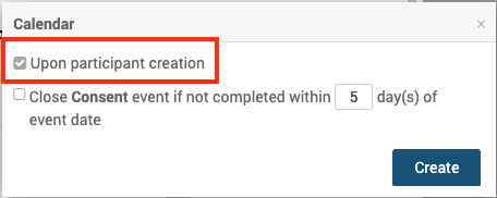
Schedule Subsequent Events
Subsequent events are scheduled relative to a prior event.
The events can be scheduled in two ways: On-demand or based on a specific date. Each event can only have one scheduling rule.
To configure scheduling:
- Click on the Event name
- Expand Calendar by clicking
- Select the event you want to base the schedule on from the dropdown (triggering event).
- Choose one of the following scheduling options:
- Define scheduling by status (On-demand) – Schedule the new event when the triggering event reaches a specific status (Scheduled, Data Entry Started, or Completed).
- Example: An Eligibility event will be created as soon as the Consent event reaches the status of “Scheduled.”
- Define scheduling by date – Schedule the new event a specific number of days before or after the triggering event’s date. This rule runs nightly at 12:00 a.m. in the site’s time zone.
- Example (after): Baseline Visit event record should be available for data entry 7 days after Screening Visit.
- Example (before): Baseline Visit event record should be available for data entry 3 days before Baseline Visit.
- Define scheduling by status (On-demand) – Schedule the new event when the triggering event reaches a specific status (Scheduled, Data Entry Started, or Completed).
- Click Create
ℹ️ Note: Each event can have only one scheduling rule.
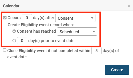
Automatically Close Events
You can configure events to close automatically if not completed on time. The scheduling rule runs at 11:00 p.m. in the site’s time zone.
To auto-close an event:
- Click on the Event name
- Expand Calendar by clicking
- Select Close if not completed within X days.
- Click Create
If an event has existed for [x] number of days, its status is updated automatically:
- Complete – The event moves to Complete if all required forms have a status of Complete and no forms have a status of Data Entry Started.
- Stopped – The event moves to Stopped if any required form has a non-complete status or if any form has a status of Data Entry Started.
- Skipped – If the event is still in Scheduled status, it moves to Skipped
ℹ️ Note: These statuses can be manually changed back if needed.
Notifications Based on Events
You can configure automated notifications by email or SMS for participants and study team members. Each event can include multiple notification rules.
- Notifications can be triggered upon Event creation, at specific time intervals, or upon completion.
- You can configure multiple notification rules for a single event (e.g., at different times or to different recipients)
⚠️ Limitation: Calendaring notifications cannot be used alongside legacy OC4 rules in the same study.
To configure notifications:
- Click on the Event name
- Expand Notifications by clicking
- Select the trigger you want to base the notification on.
- Upon event creation
- X days before the event date – Send the notification a set number of days before the event. You can define the time of day the notification is sent. Delivery is based on the participant site’s time zone.
- X days after the event date – Send the notification a set number of days after the event. You can define the time of day the notification is sent. Delivery is based on the participant site’s time zone.
- When the event is completed
- Enter Recipients
- One or more email addresses
- ${participant} (if the Participate module is enabled)
- Participants with both email and phone receive the notification through both channels.
- Enter Subject – Used for email notifications only. You can customize the subject line with variables.
- Enter Message – Used for the body of email or text notifications. You can customize the content with variables.
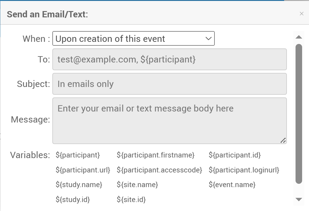
Supported Variables
The following Variables refer to specific study data and can be inserted into Subject and Message to customize the message.
| Parameter | Description | To | Message | Subject |
| ${participant.firstname} | Participant First Name | X | ||
| ${participant.loginurl} | Participant URL with Automatic Login | X | ||
| ${participant.url} | Participant URL without Automatic Login | X | ||
| ${study.name} | Name of the Study, as Defined in OpenClinica | X | X | |
| ${participant.accesscode} | Single-Use Code the Participant must use to access OpenClinica Participate | X | ||
| ${event.name} | Name of the Event, as specified in OpenClinica | X | X | |
| ${participant} | Participant Contact Information, as provided when the Participant was connected to the Study. (This could be a mobile number for SMS notification, an email address, or both); OpenClinica automatically sends the notification. | X | ||
| ${participant.id} | Participant ID | X | X | |
| ${site.id} | Site ID | X | X | |
| ${site.name} | Site Name | X | X | |
| ${study.id} | Study ID | X | X |
Reordering Events
If you reorder Events:
- Extended options applied to later Events are preserved.
- Moving an Event to the first position displays only limited options.
- If moved back, the saved extended options are restored.
⚠️ Always review Calendar after reordering Events to ensure it reflects your intended schedule.
2.4.7.2 Rules
Definition: A rule is a logical expression used to automate a task. |
Examples:
|
There are two main types of rules that Data Managers can create:
- EventAction rules automatically schedule events
- NotificationAction rules automatically send notifications by email or SMS
You can download the Rules Template and edit it to create a rule to perform either an EventAction or a NotificationAction.
Note: You can only write rules based on the statuses in the table below. You cannot be written based on an event being Removed or Archived.
| Event Status | Text for Rule (case sensitive) |
| Not Scheduled | not_scheduled |
| Scheduled | scheduled |
| Data Entry Started | data_entry_started |
| Completed | completed |
| Skipped | skipped |
| Stopped | stopped |
| Signed | signed |
| Locked | locked |
Despite the use of the new data model, with Statuses and Independent Status Attributes, rules that use the old data model will still work correctly.
Quick Start Guide
To Create a Rule:
Step 1: Access the Manage Rules screen.
- Click Tasks in the header bar of Study Runner.
- Select Rules.
- The Rules option does not display when logged in at the Site level. Change to Study level to see the Rules option.
Step 2: Download the Rules Template.
Click the Download Rules Template link at the top of the table.
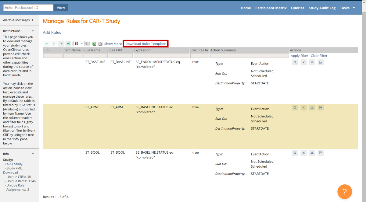
Step 3: Open the Rules Template in an XML editor, such as Notepad ++ for Windows or BBEdit for Mac.
Note: The Rules Template file contains instructions that are bracketed by “<!– ” and “–>“. These instructions can be left in in the file, as they will not affect the functionality of the rule. However, they can also be removed in order to make the file easier to read.
Step 4: Find and record OIDs to reference Events and Forms.
- Click Tasks in the header bar of Study Runner, and select View Study.
- Click the Download the Study Metadata link at top of the screen and record OIDs, or scroll down on the screen and record OIDs from there.
See Locate Object Identifiers in a Study for more information on finding OIDs.
Step 5: In the Rules Template, delete any actions you do not want the rule to perform.
- If you are making an EventAction rule, delete the lines starting from <NotificationAction > to </NotificationAction> tags.

- If you are making a NotificationAction rule, delete the lines starting from <EventAction> to </EventAction> tags.

Step 6: Define the Target.
The target is the trigger condition – any time a value changes, the rule evaluates the target. The two supported trigger conditions are as follows.
- Event Status: [SE_EVENTOID].STATUS
- Event Start Date: [SE_EVENTOID].STARTDATE
First, remove the text “Context=”OC_RULES_V1“.

Between the > and <, enter the trigger condition, including the actual Event OID for the event whose status or start date updates should trigger the rule:
- [SE_EVENTOID].STATUS if you want the rule to trigger when the [SE_EVENTOID] status changes
- [SE_EVENTOID].STARTDATE if you want the rule to trigger when the [SE_EVENTOID] start date changes.

(Optional): If you want the rule to run at a certain time, use the RunOnSchedule tag. Specify the time in 24-hour format UTC and remove the “<!– ” and “–>” text.

Step 7: Define an OID for the rule.
It must be entered in all capital letters within double quotes. You can include numbers and underscores. It must be unique within the study and can only be 40 characters long.

Step 8: Enter the expression.
Expressions are the conditions that cause the rule to run. There are two types of actions: Event Action and Notification Action.
- Event Action
- IfExpressionEvaluates: Define as “true” or “false”, meaning that if the rule action will only occur when the expression you define matches (“true”) or does not match (“false”).
- OID: Replace “Target_Event_OID” with the Study Event OID for the event that will be scheduled by this rule.
- RunOnStatus: If you want the rule to run only when the target event is at specific status, specify all of the statuses as true or false. For a repeating event, specify the ordinal in square brackets. For ex. SE_DAILYDIARY[1].
- For example, if it is a scheduling rule, you would likely only want the rule to run when the event has a status of “not_scheduled”.
- EventDestination: STARTDATE. Legacy rules can only schedule events, and not advance them through the workflow.
- ValueExpression: Remove Context=”OC_RULES_V1″ and enter the expression whose result should be entered into the EventDestination property of the event. For example, in the example below (SE_ENROLLMENT.STARTDATE +7. ), the EventDestination property that will be set to the start date of the Enrollment event plus 7 days.

- Note: See syntax below, in the tables
- NotificationAction:
- IfExpressionEvaluates: Define as “true” or “false”, meaning that if the notification will be sent only when the expression you define matches (“true”) or does not match (“false”).
- To: Specify the recipient(s) by replacing user1@openclinica.com with:
- A comma separated list of email recipients, if the notification always needs to be sent to the same individuals / group of individuals.
- ${participant}, if the notification needs to be sent to the email address and phone number that have been entered into OpenClinica for the Participant. Can only be used if OpenclinicaParticipate is active.
- Subject: Enter the subject line for the notification.
- Message: Define the message that will be sent to recipients.

- Note: For details of the parameters that can be used within the Subject and Message tags, see the table Notification Action Parameters table below.
Step 9: Enter the information about the rule itself.
- RuleDef: Enter the same Rule OID as you entered in the RuleRef tag above, and add a name for the rule as well.
- Description: Describe the rule in simple terms so that it is easy to understand what the rule is doing.
- Expression: Enter the condition that will trigger the rule to run.

- Note: See syntax below, in the tables.
Step 10: Make sure all tags are closed and save the file as an XML file.
Step 11: Click the Add Rules link at the top of the Manage Rules screen.
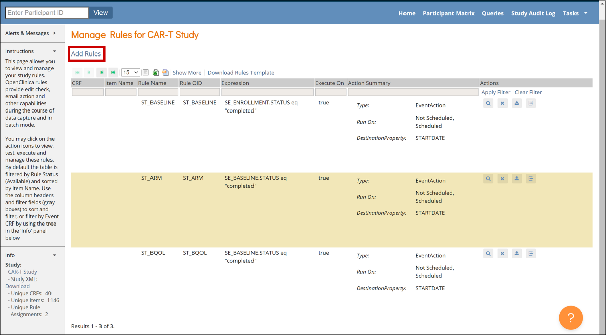
Step 12: Click Choose file, and select a file to upload. Then click the Continue button. If any errors are identified within the rule XML, address them and upload the file again.
To View a Rule:
Click the View button next to the rule you want to view.
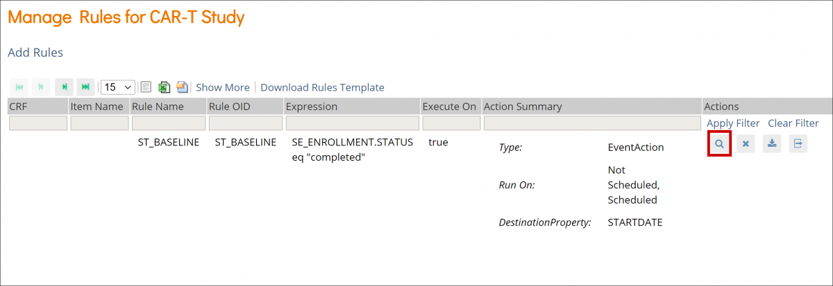
To Remove a Rule:
Click the Remove button next to the rule you want to remove.
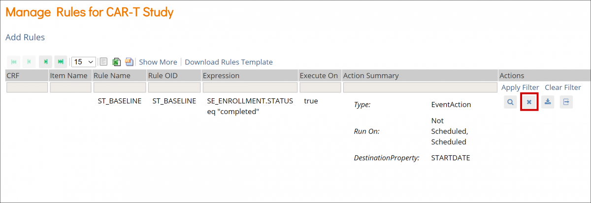
To Download a Rule:
Click the Download button next to the rule you want to download.
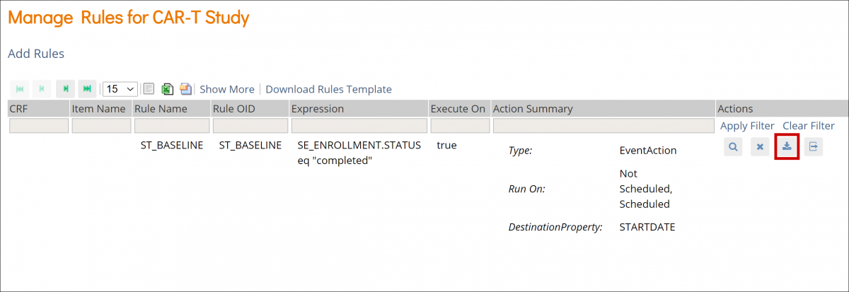
To Test a Rule:
- Click the Test button next to the rule you want to test.
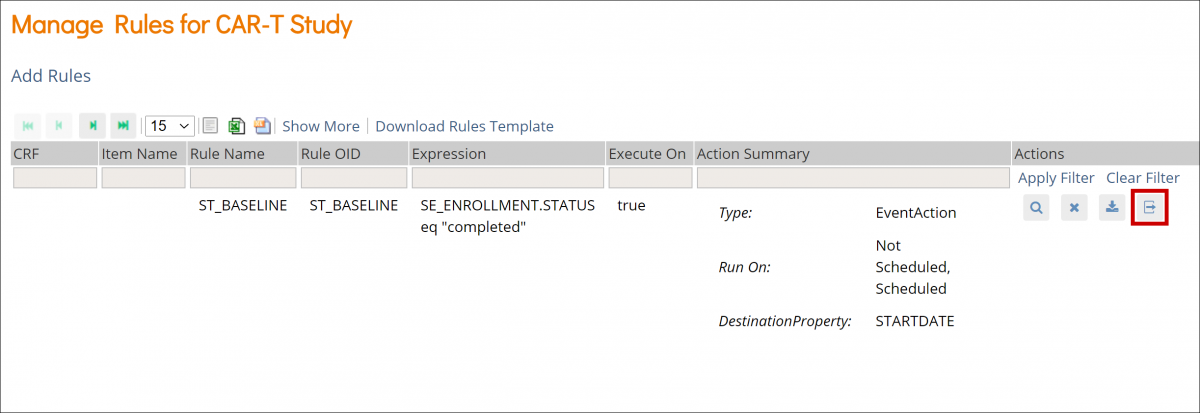
- Check that the Target, Rule Expression, and Actions are displayed correctly on the screen.
- Click the Validate & Test button.
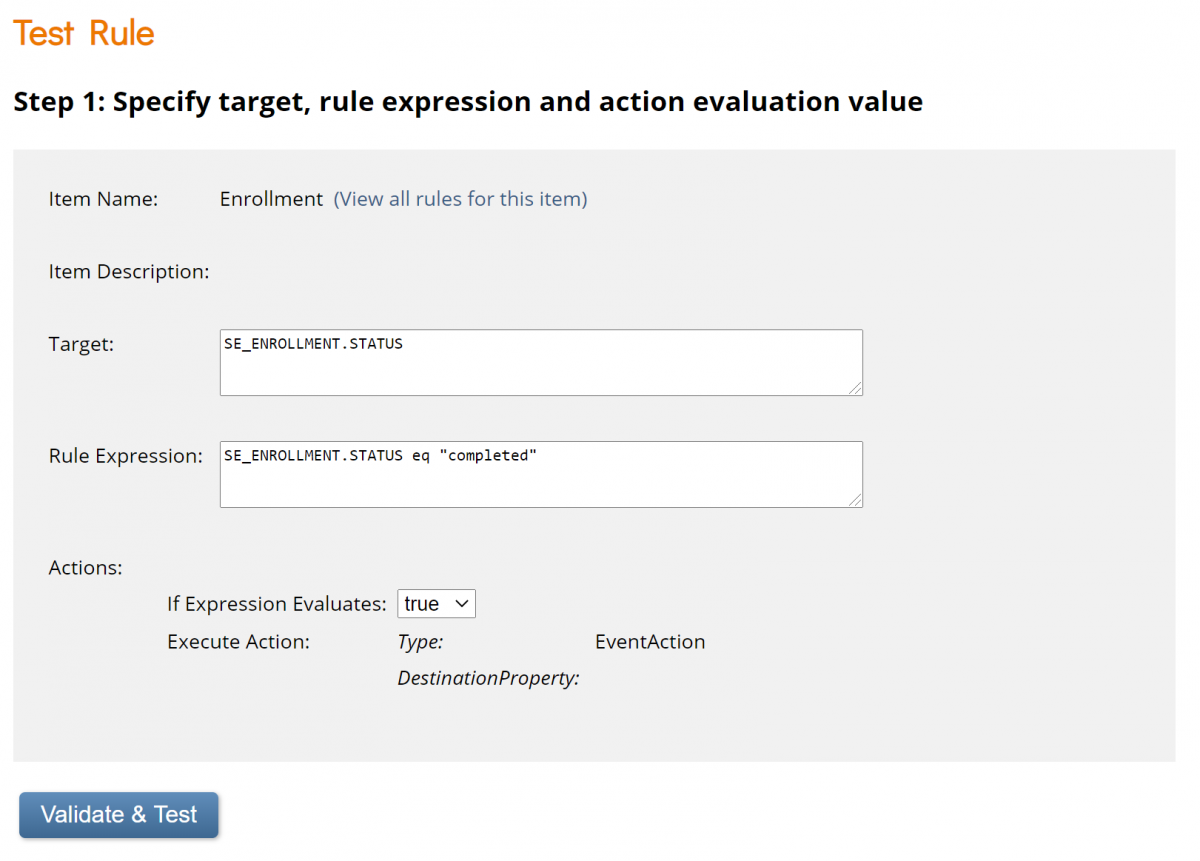
- Specify test values for variables in your rule expression.
- Click the Validate & Test button again.
- Review the results of the test. On the left-hand sidebar under Alerts & Messages, you will see a statement about whether the test was valid or invalid. Scroll down to Verify results for more details.
Actions
Icon | Action | Description |
 | View | View the rule information, such as Target OID, Study Event Definition, CRF Name, etc. |
 | Remove | Remove the rule |
 | Download | Download the rule |
 | Test | Test to ensure that the rule works |
Rule Components
Rule Component | Description |
| RuleDef | The rule definition, which includes the rule OID, name, description, and expression. This defines the rule, which is then assigned (referenced) in the RuleRef. |
| RuleRef | The rule definition/expression being used by the assignment is referred to in the RuleRef. This is an OID for the particular RuleDef. Each RuleRef may have multiple actions and ActionTypes. |
| RunOnStatus | For EventAction, the parameter that defines when the EventAction will execute. The current status values include not_scheduled, scheduled, data_entry_started, completed, skipped, and stopped. |
| Target | The target is the event that when changed, causes the rule to be evaluated. The legacy rule can be triggered on EVENT.STARTDATE or EVENT.STATUS. |
| RunOnSchedule | This will be evaluated and triggered the first time it becomes true based on a change of event status or other component of the expression. The rule will also be evaluated daily at the set hour in the UTC time zone and may trigger then if the expression is true. Notes:
|
| EventAction | Defines:
|
| EventDestination | Must be set to STARTDATE. |
| ValueExpression | A calculation or other expression that defines what will be populated in the EventDestination. |
| Expression | The expression that will trigger the rule to run. |
Expressions
Expression | Definition | Variable Type |
| eq | Equal to | Any |
| ne | Not Equal to | Any |
| ct | Contains | Any |
| gt | Greater Than | Number |
| gte | Greater Than or Equal to | Number |
| lt | Less Than | Number |
| lte | Less Than or Equal to | Number |
Example:
SE_ENROLLMENT.STATUS eq “completed”
Conditional Operators
Operator | Function | Description |
| and | And | Variables used with this operator should be of a boolean type |
| or | Or | Variables used with this operator should be of a boolean type |
Example:
SE_SCREENING.STARTDATE lte _CURRENT_DATE and SE_SCREENING.STATUS ne “completed”
Arithmetic Operators
Operator | Function | Description |
| + | Addition | Variables used with this operator should be of a number type |
| – | Subtraction | Variables used with this operator should be of a number type |
| * | Multiplication | Variables used with this operator should be of a number type |
| / | Division | Variables used with this operator should be of a number type |
Example:
SE_ENROLLMENT.STARTDATE + 7
Dates within Rules: Equality and Relational Operators
| Expression | Definition | Full Expression |
| eq | Equal to | SE_EVENTOID eq 2025-01-15 |
| ne | Not Equal to | SE_EVENTOID ne 2025-01-15 |
| gt | Greater Than | SE_EVENTOID gt 2025-01-15 |
| gte | Greater Than or Equal to | SE_EVENTOID gte 2025-01-15 |
| lt | Less Than | SE_EVENTOID lt 2025-01-15 |
| lte | Less Than or Equal to | SE_EVENTOID lte 2025-01-15 |
The format of the date included in an expression should be yyyy-MM-dd.
Example:
January 15, 2025 should be written as: 2025-01-15
You can also use _CURRENT_DATE to compare values against the current server date. This is treated as an exact time of day and will not match any date using the eq comparison operator. It should be used with gt/gte and/or lt/lte operators.
For example, to notify Participants of a Form that must be completed on the next day, you could use a NotificationAction with an expression such as:
<Expression>(SE_EVENTOID.STARTDATE lte (_CURRENT_DATE + 1) and SE_EVENTOID.STARTDATE gt _CURRENT_DATE and SE_EVENTOID.STATUS ne “complete”</Expression>
This would send a notification one day in advance of the expected event completion date as long as the event were not already completed by the Participant. It uses a pair of clauses using the lte and gt operators and _CURRENT_DATE to ensue that it is triggered as expected only when _CURRENT_DATE is within one day before the Event Start Date.
Notification Action Parameters
Parameter | Description | To | Message | Subject |
| ${participant.firstname} | The Participant First Name | X | ||
| ${participant.loginurl} | The Participant URL with Automatic Login Note: If the access code has not been previously created, triggering a notification with the ${participant.loginurl} variable will generate the access code for the participant. | X | ||
| ${participant.url} | The Participant URL without Automatic Login | X | ||
| ${study.name} | The Name of the Study, as Defined in OpenClinica | X | X | |
| ${participant.accessCode} | The Code the Participant Must Use to Access OpenClinica Participate. Note: If the access code has not been previously created, triggering a notification with the ${participant.accessCode} variable will generate the access code for the participant. | X | ||
| ${event.name} | The Name of the Event, as Specified in OpenClinica | X | X | |
| ${participant} | The Participant Contact Information, as Provided When the Participant was Connected to the Study. (This Could be a Mobile Number for SMS Notification, an Email Address, or Both); OpenClinica Automatically Sends the Notification | X | ||
| ${participant.id} | Participant ID | X | X | |
| ${site.id} | Site ID | X | X | |
| ${site.name} | Site Name | X | X | |
| ${study.id} | Study ID | X | X | |
| \n | Use at the End of a Line for a Line Break | X |
For example, the following rule will send a notification to any Participant who has an Event scheduled for the following day:

Rule Examples
Schedule Day 7 Questions event for 7 days after the Baseline Questions event is marked as complete.

Notify participant that the Baseline Questions event is available when the current date is equal to or past the event start date. The notification will be sent every day at 09:00 UTC until the event is marked as complete, skipped or stopped.

Notify participant that Day 7 Questions event is available when the current date is before or equal to STARTDATE and the event has been scheduled.

When the Baseline visit has been completed, schedule both Visit1 and Visit 2, as well as notify a user that Baseline has been completed.

2.4.8 Using the Content Library
The Content Library allows you to store commonly used items—such as vital signs or laboratory questions—and add them to forms as needed. Reusing library items saves time because you do not need to recreate the same content for each form.
Only users with the Administrator user type can access Library Management. Other user roles do not see this feature.
ℹ️ Note: The Content Library is shared across all users with access to Library Management within the same customer domain. Items previously added by any user in your domain are available to you. Otherwise, the Library Management page will be empty.
You can use the Content Library with Form Designer and Form Templates.
Access Library Management
To open Library Management:
In Study Designer, click Library Management in the header bar.

The Library Management screen displays all available library items.
ℹ️ Note: Version numbers apply only to templates. (see type below).
Content Library Item Types
Icons appear next to each item name to indicate the item type. The number shown on the icon represents the total number of items (including item groups) contained in the item.
| Icon | Item Type | Description |
 | Question | A single item |
 | Block | Multiple items without a style or version number |
 | Template | A complete form template that can either be created/edited in the form design studio or uploaded with a form |
Available Actions
Action icons appear on the right side of each item:
| Icon | Action |
 | Edit |
 | Label |
 | Clone |
 | Download XLS |
 | Manage Collection |
 | Delete |
Search and Filter Library Items
Enter text in the search field to find items by name.

Filter the list by item type: Question, Block, or Template.

Create New Content Library Items
You can create a single question, a block of questions, or a full Form Template to add to the library.

To Create Content Library Items in Form Designer:
- Click New in the upper-left corner of the Library Management screen.
- Select Question.
- Click the + icon.
- Enter the question text.
- Click +Add Question.
- Select a question type.
- (Optional) Complete additional question settings as you would in Form Designer.
- (Optional) Repeat steps 3–7 to add more questions. Multiple questions are saved as a single Block.
- Click Create.
Create a Form Template
- When you click the new button in step 1 select Template from the options
- Build a complete form as you would normally within the designer.
- Name your template and save.
Edit Library Items
To edit a question, block, or template:
- Click the Edit icon next to the item.
- Make your changes in the designer.
- Click Save Changes.
Delete Library Items
- Click the Delete icon next to the item you want to permanently delete.
- Click Delete to confirm that you want to permanently delete the item.
Use Labels
You can use labels to categorize items beyond collections. Labels appear on items when you click the Add from Library button in Form Designer.

Add a Label
- Click the Label icon next to the item.
- Click Add Label(s).
- Enter label text.
- Press Enter.
Remove a Label
- Click the Label icon next to the item you want to remove the label from.
- Click the X next to the label you want to remove.
Clone Items
- Click the Clone icon next to the item you want to duplicate.
- Click Ok to confirm that you want to duplicate the item.
Download or Upload XLS Files
Download an XLS File
Click Download XLS next to the item to download its .xls file.
Upload an XLS File
- In Library Management, click New.
- Select Upload.
- Choose the XLS file to upload.
ℹ️ Note: Uploaded XLS files are automatically added as templates, even if they contain only a single question.
Use Collections
Collections allow you to group related library items.
Create a Collection:
- Click New in the upper-left corner of Library Management.
- Select Collection.
- Enter a collection name.
- Click Create Collection.
Rename a Collection:
- Click the collection.
- Click the ellipsis (⋯).
- Select Rename.
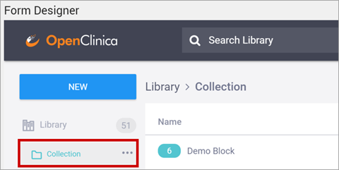
Delete a Collection:
- Click the collection.
- Click the ellipsis (⋯).
- Select Delete.
Add an Item to a Collection:
- Click the Manage Collection button next to an item you want to add to the collection.
- Select the collection you want to add the item to. If there are no available collections, the selection box will say none available.
ℹ️ Note: You can only add an item to a single collection.
Use the Content Library in Form Designer
When working in Form Designer, click Add from Library to access library items. You can search the library or select items from the list.
If available, items display their labels and the number of questions included in a block or template. You can also add new items to the Content Library while working in Form Designer.
Add Items from the Library to a Form
To add an existing item to a form:
- Click Add from Library.
- Select the question, block, or template.
- Drag the item onto the form and drop it when the dotted outline shows the placement location.

Add Items from a Form to the Library
To add items to the Content Library:
- Click Add Question to Library next to a question, or
- Select multiple items or groups and add them as a single block.
Add Groups or Multiple Items to the Library from a Form
When editing a form, you can add multiple selected items or groups to the Content Library in a single action.
- Selecting an entire group adds the group and all its contents as a single Block.
- Items are added to the block in the same order they appear on the form.
- Items do not need to be consecutive.
The resulting block appears in the Content Library the same way as blocks created directly in Library Management.
Use Library Items in an XLS Form Template
To use a library item in an XLS Form Template:
- Click Download XLS next to the item.
- Edit the XLS file as needed, or upload it without changes.
You can also download or upload XLS templates in Study Designer and then add the form template to the Content Library.
2.4.9 Locating Object Identifiers in a Study
Unique Object Identifiers (OIDs) are created for each of the following objects in any given study:
- Study
- Site
- Participant
- Event
- Form
- Item Group (bind::oc:itemgroup as defined in your forms)
- Item
You may need to reference these OIDs in the process of designing your study (such as when using cross-form data in a form definition or when using Web Services).
Find Your OIDs:
There are three options for locating OIDs in OpenClinica. You can use the Data Dictionary in Study Designer, use the OpenClinica interface to drill down through each object, or download the study metadata and locate the OIDs within the XML metadata.
Using the Data Dictionary in Study Designer:
The Data Dictionary gives you form-specific information including form metadata, form properties, and item metadata (such as Item OID, Item Group Name, Item Group OID, Item Type, and Insight Table). The Data Dictionary is available via a link on each form card in Study Designer and can be downloaded as a CSV file to view outside of Study Designer.
- Open the form in Study Designer and click the Data Dictionary link.
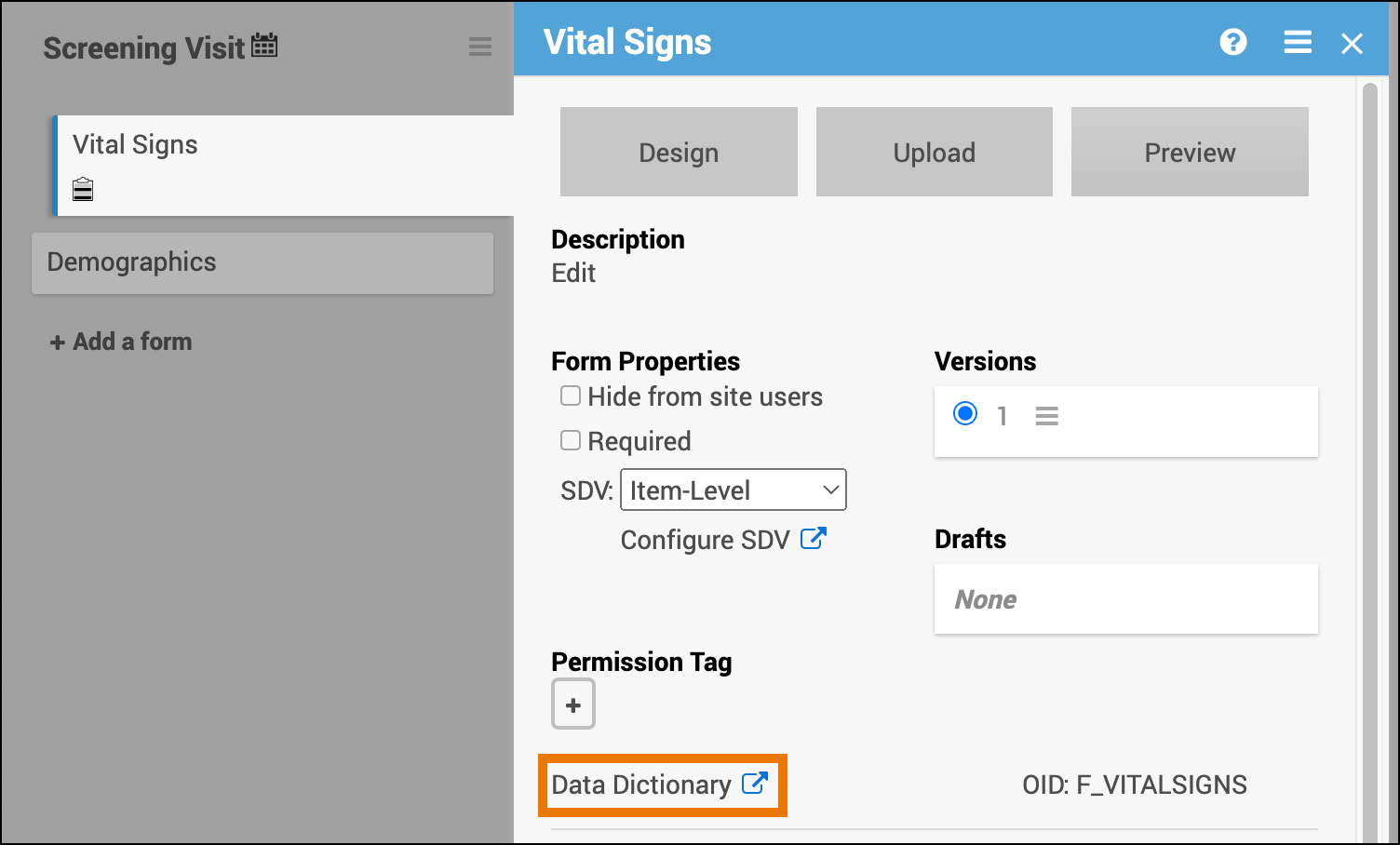
- Review and/or copy the information you need from this window, or click the Download icon to download the CSV file.
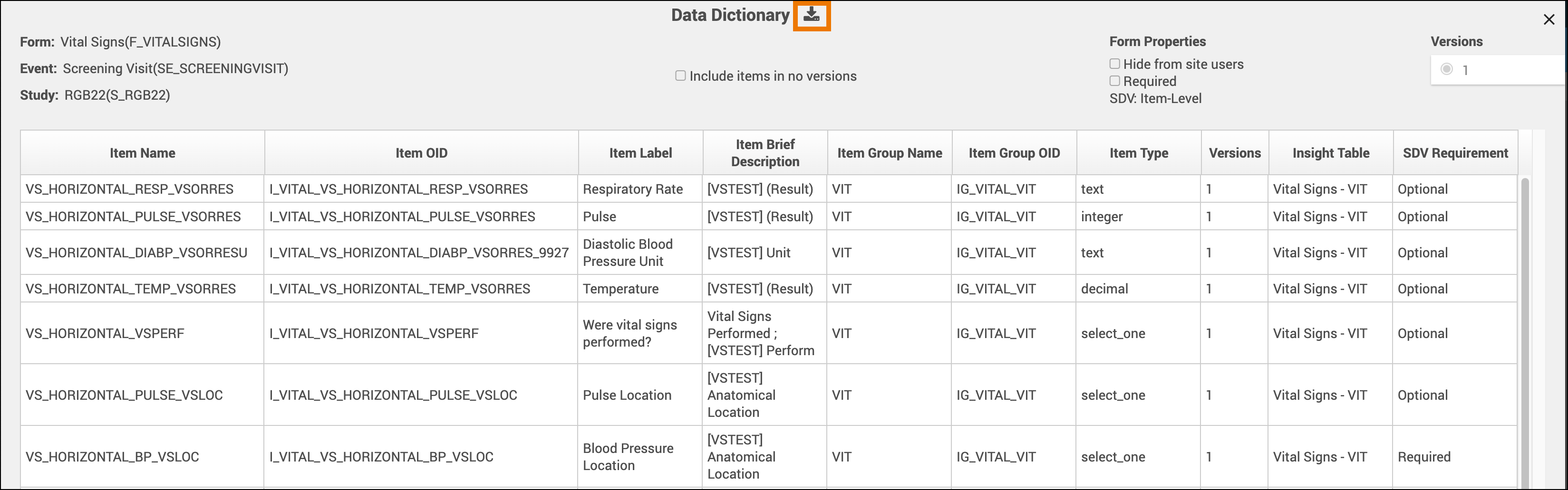
Note: Uploading the same version of a form multiple times can lead to some removed items not being present on any form version. These items with no versions are filtered out of the Data Dictionary by default but can be shown by selecting the Include items in no versions checkbox.
Using the OpenClinica Interface:
- Go to your study in either the Test or Production environment by using the Go menu (Study and Site OIDs will end in TEST or PROD depending on which environment you choose).
- Select Tasks ⇨ View Study or click on your study name in the upper left corner of the title bar.
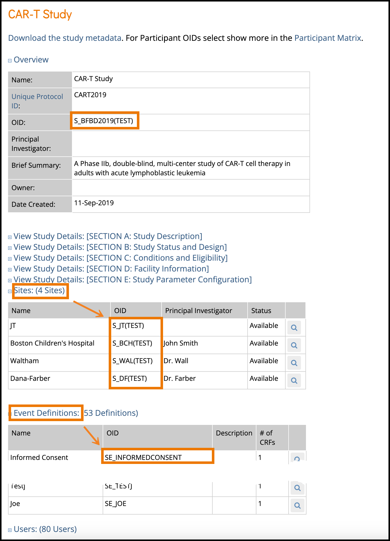
- The Overview section of the study details page displays the study’s OID.
- S_BFBD2019(TEST) in the case shown.
- The Sites section of the study details page shows the Site OID(s).
- In the example above:
- S_JT(TEST)
- S_BCH for Boston Children’s Hospital
- S_DF for Dana-Farber
- S_WAL for Waltham
- In the example above:
- In the Event Definitions section, each event will have its corresponding OID.
- SE_INFORMEDCONSENT as highlighted above in this example.
- To access the CRF OIDs, you will need to open the event definition. Click the View icon for the event you’re interested in. This will open the event definition screen as shown below.
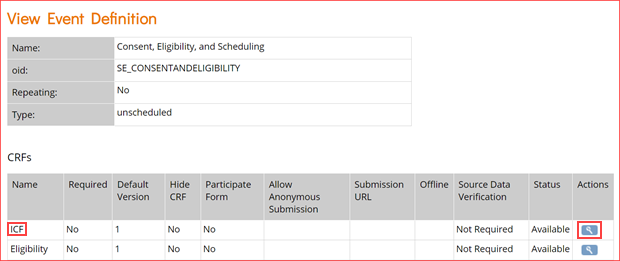
- In the CRFs table, click the view icon for the CRF whose OIDs you want as highlighted in the image above for the first event.
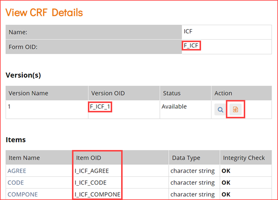
- In the View CRF Details table (above), record the OID for the Form.
- Clicking the icon highlighted in the Actions column above will access the page for the CRF.
- For the CRF version you want, click the metadata icon (Item name link).
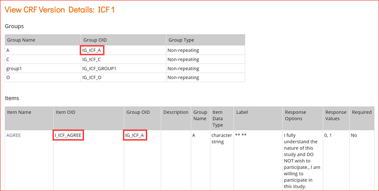
- In the View CRF Version Details page, record the OIDs for the Group(s) and Item(s) (in that order).
Study XML File:
You can locate OIDs directly in the Study XML metadata file.
- On the Study Details screen, click the Download the study metadata link.
- Open the Study metadata file in a browser or text editor.
- Scroll through the file to locate the OIDs.
- Continue to scroll through the metadata or collapse sections as needed to locate the Item Group and Item OIDs.
2.4.10 Create and Configure Data Review Tables
Definition:
Potential Uses:
User Roles:
|
Data Review Tables are first created and configured within Study Designer by a Data Manager. After the table is configured and the study is published, the table can be accessed from the Tasks menu in Study Runner.
Create a Data Review Table:
- Within Study Designer, click Table Design, then select the + Add a New Data Review Table link.
2. Add the table details including the table name and description (optional). Then select the primary form (and optional event) to use.
a. The Primary form is the form on which your table is based. Information based off of the Primary form will be displayed in the default columns on the table (Event Start Date, Form Status, Event Name, Event Status, Form Last Modified By, and Form Last Modified Date). The Primary form is the form which is removed when you click Remove Forms (the forms with additional items displaying on the table will retain their status).
b. Many forms are used for multiple events (Vital Signs can be used for the Baseline, Follow Up, and Treatment events). When an event is selected for the form, this means that only forms within the selected event will display.
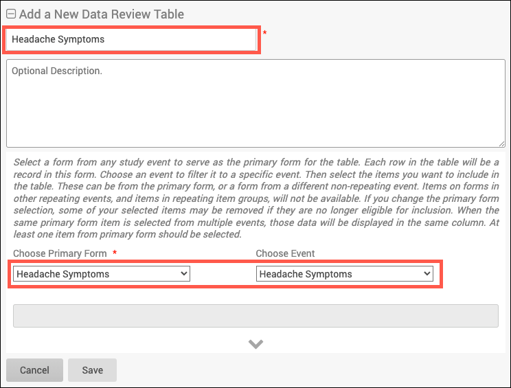
3. Click into the grey box and select which items to display in the table. Only items that can be added to the table will be displayed. This list includes all items from the chosen form that are not in a repeating group, and all items from forms in non-repeating events that are not in repeating groups. Items in archived forms or archived events as well as items in repeating groups will not be able to be selected.
a. The items in the dropdown will be listed as a string in the form of “ItemName (EventName -> FormName)” and will be displayed in alphabetical order based on that string.
b. Type a key word in the grey box and press Enter to filter the list.
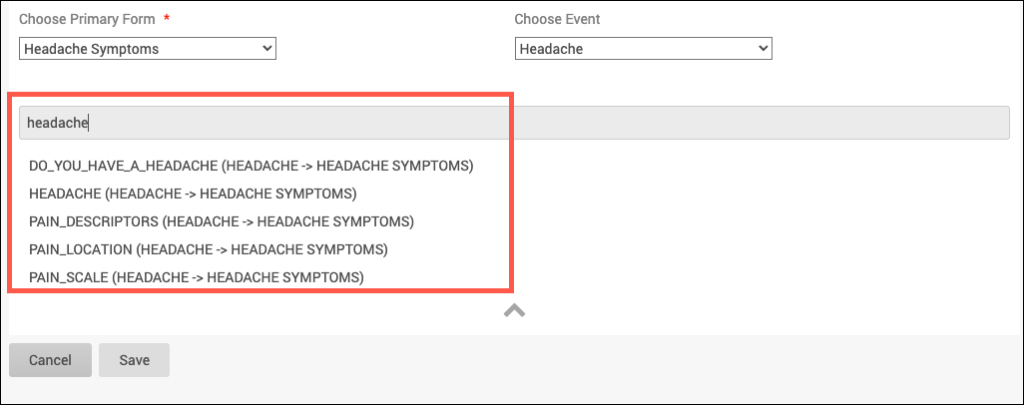
4. If needed, drag and drop the selected items to rearrange the order in which the corresponding table columns will appear, then click Save.
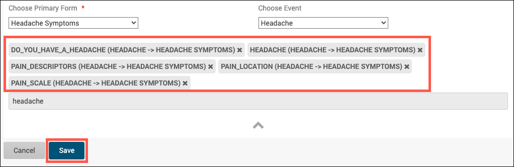
a. After the table is saved, Publish the study to see the table within Study Runner.
Note: If you edit a review table that has Archived items in it, the items will remain in the table (unless manually removed from the table) and the table can still be resaved. However, if the Archived items are removed from the table, these items cannot be added back.
Use the Data Review Tables page for information on accessing and using Data Review Tables within Study Runner.