The form template is an Excel spreadsheet (compatible with most modern spreadsheet programs: Microsoft Excel, Open Office, Numbers, etc.) that can be used to create form definitions in OpenClinica. It is best practice to download the latest form template from OpenClinica (see steps below). The form template can also be found here: form_template.
Note: Form creation is usually easiest using the drag-and-drop Form Designer, but sometimes it is helpful to use the Form Template for forms with more form logic or specific features. See Using Form Designer for information on Form Designer.
As a general rule, the more complicated the form, and its logic, the more likely you’ll have to use Form Template. While Form Designer accommodates skip logic (on relevant fields) and validation criteria (constraints), it does not support features such as cascading selects, hard edit checks, etc.
Definitions
- Original Form Template: The blank spreadsheet file downloaded from OpenClinica.
- Form Template: A pre-formatted spreadsheet downloaded from OpenClinica. This could be blank for a new form, or a form you download to edit or copy an exiting form that would already rows filled in.
- Form Definition File: A completed spreadsheet uploaded, or ready to load, into OpenClinica.
Good Advice: Keep in mind that loading times for end-users are affected by the number of items on the form and the amount of form logic you use, OpenClinica recommends having no more than 100-200 items on a form and no more than 50 items on a Participate form, specifically when it is likely to be accessed from a mobile device.
The Excel Spreadsheet Contains Five Sheets:
- Settings
- Choices
- Survey
- Cross-Checking Examples
- Other Examples
The first three are the primary pages (Settings, Choices, and Survey sheets) you will utilize.
Quick-Start Guide
To Download the Form Template:
Click the Download Form Template button in the header bar of Study Designer.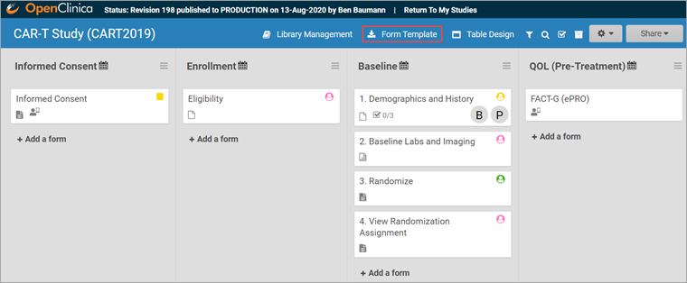
To Create the Form:
- Open the downloaded template.
- Enter a name for the form in the form_title column.
- Create a unique form id in the column form_id that will be used to identify your form internally (i.e., will not be visible to end-users).
To Add an Item to the Form:
- Click the survey tab to move to the survey spreadsheet.
- Enter the type of item you want in the type column (For example, text, integer, date, etc.).
- Enter the item text in the label column.
- Enter a unique alphanumeric string for the item in the name column.
- Enter text into the label column that will be displayed on the form as the question text.
If your item type is select_one or select_multiple, you must enter choices.
To Enter Choices for Select One or Select Multiple items:
- Click the choices tab in the Form Template spreadsheet.
- Enter the text for the option in the label column.
- Enter a unique alphanumeric string for the option in the name column. Do not include commas, spaces, or other non-alphanumeric characters in the choice name.
- Enter the unique id you entered for the question on the Survey tab (in the name column) to link options in the list_name column.
- Continue to add options as needed (by repeating steps 2-4).
- Click the survey tab in the Form Template spreadsheet.
- In the type column next to select_one or select_multiple, enter the list name from the choices sheet (For example, if the list name is YN, the type cell contents would be select_one YN)
Important: The spacing and underscores in select_one [listname] and select_multiple [listname] need to be exact.
To Create a Group of Items:
- Click the survey tab in the form template.
- Enter begin group in the type column at the top of all the items you want to put into a group.
- Enter end group in the type column at the bottom of all of the items you want to put into a group.
- In the bind::oc:itemgroup column, across from begin group and end group, enter an internal name for the group of items.
Note: If you want to make a repeating group, instead of begin group and end group, enter begin repeat and end repeat.
Best Practice: In the bind::oc:itemgroup column, you are using repeating groups, which must be kept separate, it is ideal to keep items in the same group. These groups do not have to correspond to the begin/end groups. Keeping items in the same group allows for better data visualization in Insight because participant data is displayed on tables by item group, not by form.
To Upload a Form Template in Study Designer:
- Click the name of the Form in Study Designer.
- Click the Upload button.
- Select the Form Template/Form Definition File you want to upload for that given form.
- Click the open button in the dialogue box.
Note: You can download a blank copy of the form template from within study designer (as shown above), or you can download a Form Definition File for several existing forms in the Form Library (CDASH) and modify it to suit your needs.
For helpful hints in completing the form template, hover your mouse over a column heading to read how its used, and be sure to read the example worksheets at the end (Cross-Form Examples, Custom Annotation Examples, Contact Info Examples, eConsent Examples, and Hard Checks Examples) for documentation on creating edit checks and other advanced template features.
Form Template Exclusive Features
Annotated CRFs
Annotated CRFs are useful for statisticians because they specify where in the system the data was taken from. For example, an annotated CRF might specify the dataset where the data exists.
Annotated CRFs are also a requirement for FDA data submissions and CDISC Standards.
Cascading Selects
Cascading Selects (or Choice Filters) are a way of organizing hierarchical questions and filtering possible choices based on the prior selection. For Example, You Could Use Cascading Selects for the Following Set of Questions:
- Type of Cancer
- Subtype of Cancer
- Specific Cancer
When a participant responds to Type of Cancer, the choices listed for Subtype of Cancer are filtered based on that response. The responses for Specific Cancer will then by filtered by the Subtype of Cancer response. Responses for select_one and select_multiple questions can be filtered based on values of any items on the form.
To Add a Cascading Select:
- On the choices sheet, create columns for each filter you will use. For example, filter1 and filter2.
- Enter a value in a filter column to assign the choice in that row to a specific filter group. For example, filter1 might have 4 filter groups that contain different sets of choices. Use the numbers 1 through 4 to assign each choice to a distinct filter group.
- On the survey sheet, add a choice_filter column.
- In the choice_filter column, enter an expression for an item that must be true for a choice for that item in order to show that choice. Filter values are referred to by the title of the filter column. For example, filter1 = ${cascade1} would show a choice only if the value for that choice in column filter1 were equal to the value of item cascade1. If item cascade1 were 1, only choices with filter1 = 1 would be displayed on the form.
Crossform References
Using Crossform References optimizes loading forms by specifying the events that the system needs to reference for cross-checks. Instead of the system loading all of a participant’s information, it only loads the information necessary for the cross-check. This enhances form performance and data privacy.
Add the necessary OIDs in the crossform_references column of the settings sheet. See “Crossform References” below.
Referencing Long Lists
The choices worksheet of the form template restricts the combination of labels and names to a maximum of 4,000 characters. If you have a long list of choices to reference in a form, you can maintain that list in a separate CSV file where the number of characters is not restricted.
Best Practice: OpenClinica recommends that any items that reference long lists are defined with minimal autocomplete in the appearance column. In the form, this filters list choices in the dropdown list as you type.
E.g. instead of uploading a normal Form Definition File with a medications list, the medications were entered into a separate spreadsheet and saved as a CSV file named medication_list.csv. This file has more than 14,000 rows of entries.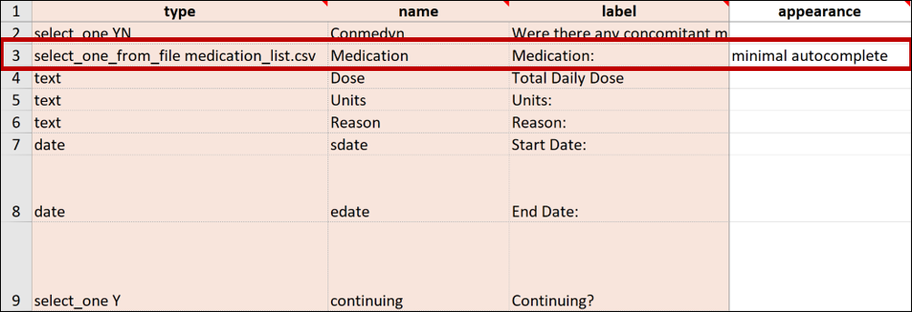
Note: To reflect any changes in the list of choices made in the .csv file, you must upload it again. If this occurs on a study that has been published to the Production environment, you must also update the version of the form on the settings page of the Form Definition File.
Repeat Count
If you enter begin repeat and end repeat in the type column, you can use the repeat_count column to specify the number of times the group of questions can be answered. If you specify the number of repeats available to the user, they cannot add or remove any of the repeating groups.
Note: If the repeat_count value decreases due changes on the form, any existing repeat instances exceeding the new repeat_count value will be deleted from the end of the repeating group.
To Add a Repeat Count:
- Click the survey tab in the form template.
- Add a repeat_count column.
- In the repeat_count column, across from begin_repeat and end_repeat, enter the number of repeats to allow.
Select_One From File
You can upload a CSV file with the Form Template for items that have a long list of choices that you can create with various external spreadsheet programs (consult the program’s documentation for assistance with this step).
To Reference the CSV File in the Form Template:
In the form template, on the survey sheet, enter select_one_from_file filename.csv in the type column. For example, if the name of the CSV file is painlocation, enter select_one_from_file painlocation.csv.
To Upload a Form Template with a CSV File:
In Study Designer, upload the Form Template and the CSV file at the same time by selecting both files (PC: ctrl+click; Mac: cmd+click) and clicking open.
Languages and Translations
You can add multiple languages to your form by adding language columns to the choices and/or survey sheet, each with the title label::language (locale code), into your Excel spreadsheet. It is vital that the column header is correct, otherwise the system may not be able to determine the correct language to use for a given participant.
For example, if you want to add Spanish language support to the form content, add a label column(s) label::Spanish (es).
You can define languages for items, including the following:
Survey Sheet:
- label
- hint
- constraint_message
- required_message
- image (file name)
- audio (file name)
- video (file name)
Choices Sheet:
- label
- image (file name)
Enter translated text for every field you want to be translated. If you leave any text blank for a language, users in that language will not see any text for it.
Note: The only text-based item you cannot define language(s) for is the Form Title.

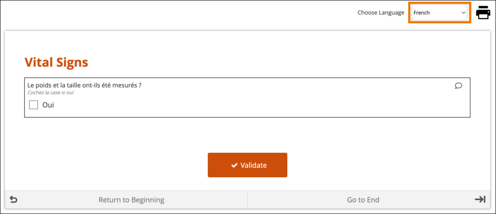
If the translations are labeled correctly and the user’s system language in Study Runner or the Participant Dashboard is a valid option for the form, the form initially loads using the user’s browser language selection. If there are additional languages for the form, they will be available to change between in the dropdown menu as needed.
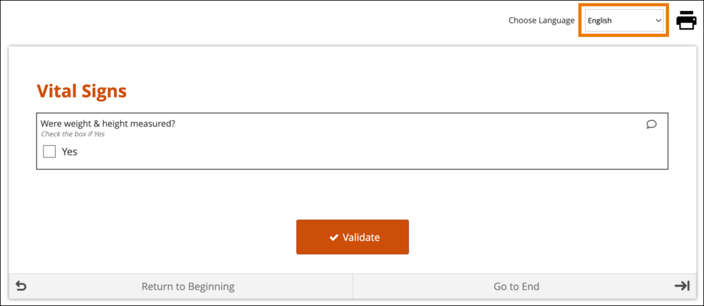
System-Level Language Packs:
The Study Runner interface (outside of your forms) can also be displayed in multiple languages that have already been professionally translated. To learn which languages are supported by OpenClinica, see Language Support. To have OpenClinica enable a language pack for your study, please reach out to your Customer Success Manager, or contact support.
The form’s user interface (buttons and text set by OpenClinica rather than configured on the form template) will only display in supported languages. Other languages will only display the text that was configured on the form template for that language and will otherwise display the user interface in English (en). For example, when using German (de) as a language on the Form Template, the user interface remains in English (Close, Complete, Return to Beginning, Go to End, etc.) unless the study has had German language support enabled.
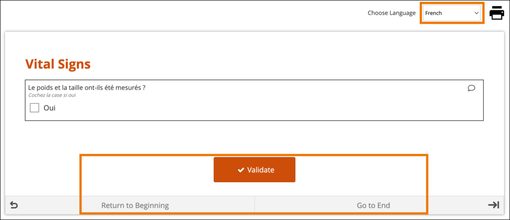
When a system-level language pack is installed for your study, the language presented to your users is based on their web browser’s settings.
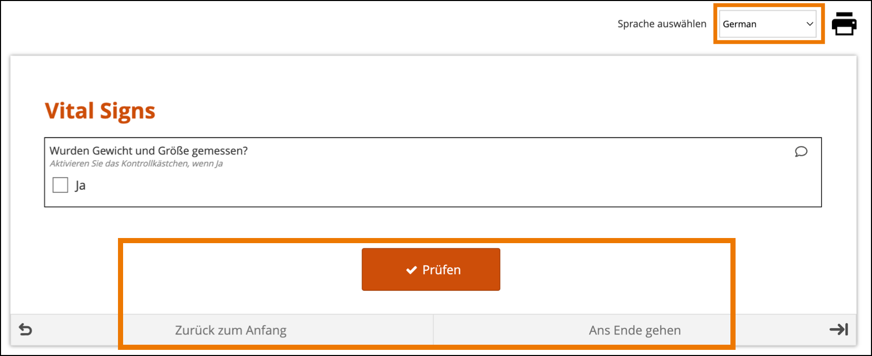
Limitations with Study Runner Translations (set at the Study level by OpenClinica):
- Areas of Study Runner that display an Item Label or Brief Description (including custom columns in the Participant Matrix, Queries Table, and PDP common events tables, Data Review Table columns, and Item-Level SDV rows) will always display the Item Label or Brief Description only in the default language, regardless of the language a user is utilizing in a multi-language study.
- Areas of Study Runner that display single select or multi-select item values as choice labels (same component list as the above bullet plus the Audit Log) will always display the choice labels in the same language regardless of the user’s browser’s language settings.
For more information on Language Support, see Language Support.
Image Maps
OpenClinica also has a feature that allows you to upload vector graphics (SVG images) and select areas in the image that correspond to responses to a query. Instead of selecting from a drop-down list, you can select an area in the image. For example, instead of looking through a list of potential pain locations to find the correct one, users can select the location on a picture of the human body.
To Set Up Image Links in an SVG File:
- Open the spreadsheet for your form.
- On the Survey tab, add a row with the following values in the specified columns:
- Type: Enter select_one listname, for example, select_one armregion
- Appearance: Enter image-map.
- Image: Enter the name of the SVG file you are using as your image map, for example, armregions.svg
- In the Choices tab, add rows with the following values in the specified columns:
- List_name: Enter a name for your list of codes in each cell for the number of regions in your image.
- Label: Enter labels for each region you want to be able to select. These are the labels you see when you hover over a region in the image.
- Name: Enter an ID for each label. These are the path IDs you will use in Step 4.
- Open the SVG file in a text editor. Next to <path, for each region, enter a path id you chose in step 3c, for example, id=path10 When you have added an id for each path, save the file.
- In OpenClinica, click +Add a form on the event to which you want to add the image.
- Enter a name for the form.
- Select the form card, and click Upload.
- Select BOTH the Excel file AND the SVG file at the same time, and click Open.
- Once the image has loaded, click Preview. Hover over regions to view labels or click on a region to select it.
Custom Annotations
This feature allows custom annotations to appear alongside standard item annotations in Annotated Form and Annotated Casebook PDFs. Standard annotations are automatically included for all item configurations defined on the survey worksheet. Custom annotations can be added to items as needed. Custom annotations do not have any effect in OpenClinica other than to appear on Annotated Form and Annotated Casebook PDFs.
If you want to add a custom annotation, add a column to the Survey tab and enter the column heading text as “bind::oc:oc_annotation_CUSTOMANNOTATIONLABEL“; where “CUSTOMANNOTATIONLABEL” is the text you would like to be displayed on the form as the custom annotation label. It can only contain uppercase letters, lowercase letters, digits, hyphens, and underscores, but the first character must be a letter or digit. Underscores will be converted to spaces for display on the annotated form.
The text entered for a row in the bind::oc:oc_annotation_CUSTOMANNOTATIONLABEL will be the custom annotation text on the Annotated Form and Casebook. There is no restriction on the characters that can be used in custom annotation text.
Ex: If a column is added called “bind::oc:oc_annotation_Data_Manager_Comment” and an item has “Reused on follow-up form” in that column, then that item will have the following annotation “[Data Manager Comment: Reused on follow-up form]“

Each custom annotation can have text defined per item or be left unused per item as needed. If a custom annotation is not used for a particular item, the custom annotation will not be displayed on the annotated form for that item.
Multiple custom item annotations can be defined within a form definition spreadsheet. They will be displayed on the Annotated Form and Annotated Casebook PDFs in the order the custom annotation columns are listed on the survey worksheet.
Form Template Fields with No Form Designer Equivalent
Due to the nature of a form template, some fields will only exist in one or the other. Here are all the form template fields that don’t exist inside the form designer and any special instructions.
Namespace
The value in this field should remain as it is. If you inadvertently delete the value, it should be as follows (the quotes and spaces are required):
- oc=”http://openclinica.org/xforms”
- OpenClinica=”http://openclinica.com/odm”
Crossform References
As noted earlier you can use this column to decrease the form’s loading time by specifying a list of events to be used in the form’s cross-form logic. If the form does not use cross-form logic, then this column should be left blank in which case this column will have no effect.
If the form uses cross-form logic, and this is left blank, then all data for a given participant will be available for the form to access. The form will open more slowly as the full participant record is processed through the browser.
To improve form performance and enhance data privacy, you can include a comma-separated list of Event OIDs. Only data from these events will be processed through the browser and made available to the form’s cross-form logic. This can improve form loading times significantly. You must, however, ensure that all events referenced in the cross-form logic are listed here or the desired values will not be pulled in as expected. You can also include “current_event” in the list. That will allow the form to access data from the event occurrence it is in. This is useful for forms that are used in multiple events. It allows the form to access data that is relevant based on its event context when it is opened.
Example:
If you want to allow your form to access data from Baseline event (OID “SE_BASELINE”), Visit 2 event (OID “SE_VISIT2”), and the current event occurrence (“current_event”), you would put the following value in this cell: SE_BASELINE,SE_VISIT2,current_event
Note: If you enter an invalid value in this cell, it will act as if you hadn’t entered a value, thus all data for the current participant will be available for the form to access. This will ensure that the logic works as expected, but performance will not be optimized.
Required Message
If the item is required, you can include a message that explains why the answer is needed. This can include a helpful hint to the data entry user as to why the item is required such as noting that an item is a primary data point, or that an item is required due to a prior response. If this field is left blank on a required item, the default message, This field is required, will be used.
Required Type
This field determines whether a data entry user can override a required field and save the form as-is. To prevent this you must add a column to the survey sheet with the heading bind::oc::required-type and type strict on the field for that item. If left blank or not included, the user can override the requirement. For more information refer to the form logic section under “Hard Edit Checks”.
Image (Choices)
Allows you to display an image in your form. You must upload the valid image file (e.g., files with an extension of .png or .jpg) at the same time that you upload the Form Definition File or you can add it to a draft using the Upload Media & External Lists option. For example, Wong-Baker face images for pain scale choices.
Choice Filter
An expression for using filters for cascading selects (i.e. items are filtered based on responses to other items) see the section on Cascading Selects for more information.
List Name
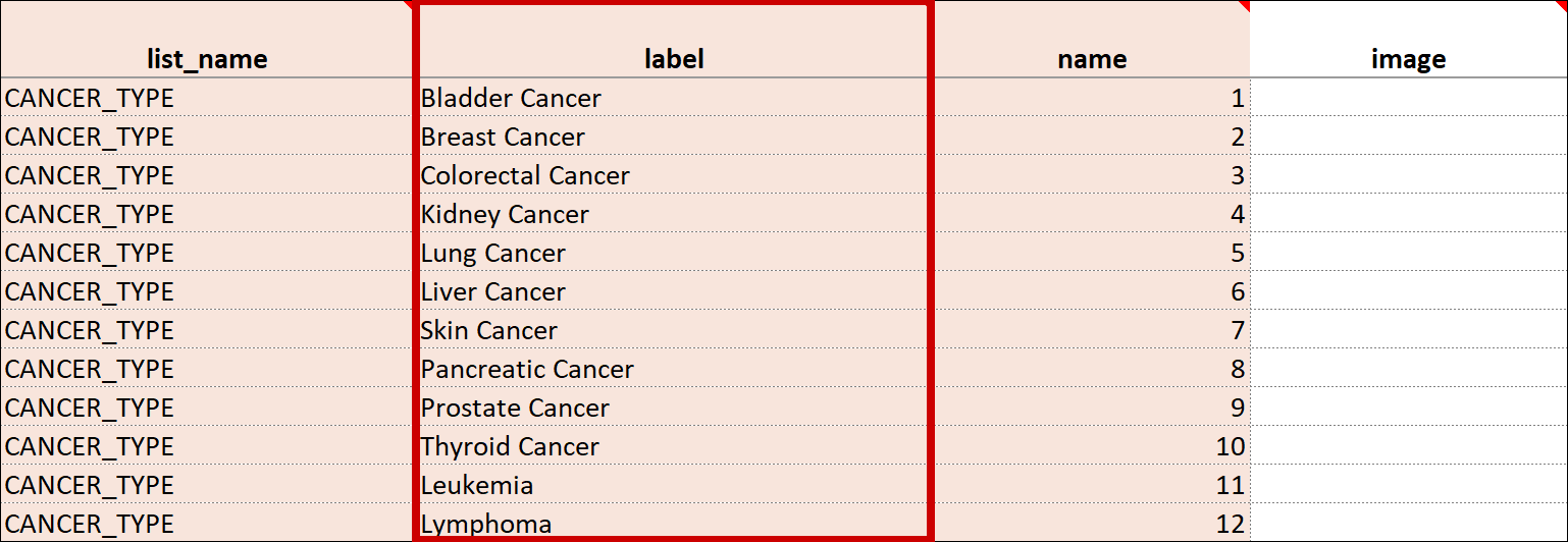
The name of your code list. The same name is used for each value combination of a list (alphanumeric characters and underscores are permitted; no spaces). If you have a yes/no codelist and name it YN, there would be two rows referencing the same list_name:
| list_name | label | name |
|---|---|---|
| YN | Yes | 1 |
| YN | No | 2 |
Repeat Count
When added to a begin_repeat type, this allows you to specify an exact number of repeats available to users. If used, the option to add or remove entries is not available.
Constraint Type
Determines whether a data entry user can override the constraint. To prevent this you must add a column to the survey sheet with the heading bind::oc::constraint-type and type strict on the field for that item If left blank or not included, the user can override the requirement.
Form Template and Form Designer Fields
| Field | Form Designer | Form Template |
| Form Title The form title appears at the top of the data entry page. | You can use alphanumeric characters, special characters (e.g. & # $ ^ _), and spaces | You can use alphanumeric characters, special characters (e.g. & # $ ^ _), and spaces. |
| Form ID A unique identifier used as an internal reference when the form is uploaded. This value is not visible to end-users. | Alphanumeric characters and underscores are permitted; no spaces. | >Alphanumeric characters and underscores are permitted; no spaces. |
| Form Version A unique identifier for an iteration of a given form (including changes to items, form logic, etc.). | You must change the version number if you want to create a new version of your form. Otherwise, in the TEST environment, the new version overwrites the existing version except for changes to the item types, the item groups, or moving an item in or out of a repeating group. In the PRODUCTION environment, you can not overwrite a version of a form and must have a unique identifier for each version. Saving your form as a draft does not create a new version, but you can later promote a draft to a version using the Add to Study menu option on the form card in Study Designer. | In the Test environment you can overwrite versions for changes to anything except the following features (these require a new form or a new item name):
In the Production environment, you must have a unique version identifier each time you upload a modification to the form. |
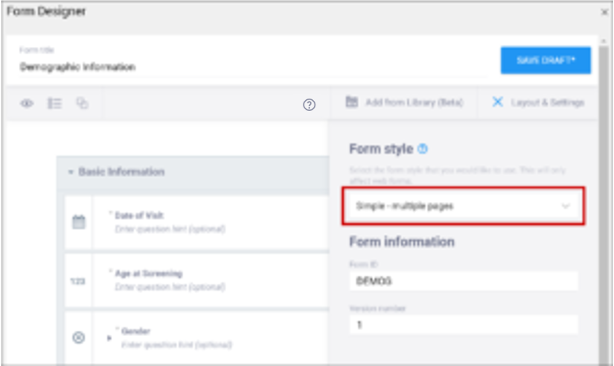
| Form Style This specifies the layout and appearance of the form, primarily dealing with how the items are displayed (each question on a separate line, or a grid, and whether on a single page or multiple pages by groups). | There are four styles to choose from:
Note: If you group items together and click the “Show all questions in this group on the same screen” check box, items in the group appear on the same page, overriding a multiple pages setting. | You can leave this column blank or select from three options: If left blank: Each question is on a separate line on the same page. [Simple – single page]
Note: When using Form Template, question groups (referenced above) are defined on the survey worksheet. When combined with the field-list option of the appearance column on the survey worksheet, you can control the display of questions and the structure of grids. See the entry on appearance below for more information. |
| Question Text/Label | This is the text that appears in the Form for an item/question. | The name of your code list. The same name is used for each value combination of a list. Alphanumeric characters and underscores are permitted; no spaces. If you have a yes/no codelist and name it YN, there would be two rows referencing the same list_name: list_name label name |
| Enter Question Hint/Hint | Informative text that appears on the Form to help the user. For example, “Please provide weight in kilograms.” Hints appear in italics under the question label.
| Informative text displayed on the form to help the user. For example, Please provide weight in kilograms. Hints display in italics under the question label. |
| Item Name/Name | The internal name of the item, as used in the database. This is used to generate the item object identifier (OID)This does not appear during data entry. Alphanumeric characters and underscores are allowed. | The unique name of the item. This is not displayed during data entry, but is how the data is referenced in the database. Allows alphanumeric characters and underscores; spaces are not allowed. It is recommended that only lowercase letters, digits, and underscores are used in item names. Once an item name is defined in this spreadsheet and the form is uploaded into OpenClinica, the name should not be changed to use different letter case when the form is uploaded again. For example, if item1 is part of the first form upload, this name should not be changed to ITEM1 or Item1 when the form is subsequently uploaded. Any change from/to upper/lower case in an item name will result in a form or publish error. |
| Item Group | The internal name of the group that the item is in, as used in the database. This is used to generate the item object identifier (OID). Alphanumeric characters and underscores are allowed; spaces are not allowed. | The name of the group to which you are assigning the item in the underlying database. This becomes the item group object identifier (OID). Alphanumeric characters and underscores are allowed; spaces are not allowed. It is recommended that only lowercase letters, digits, and underscores are used in itemgroup names. The itemgroup name does not have to correspond to the begin/end group names defined in the type column. Begin group/repeat, end group/repeat, and note types should not have a value in the bind::oc:itemgroup cell. All items in a repeating group must have the same itemgroup name. That itemgroup name cannot be used by other items that are outside that repeating group. Once an itemgroup name is defined in this spreadsheet and the form is uploaded into OpenClinica, the itemgroup name should not be changed to use different letter case when the form is uploaded again. For example, if group1 is part of the first form upload, this should not be changed to GROUP1 or Group1 when the form is subsequently uploaded. Any change from/to upper/lower case in an itemgroup name will result in a form or publish error. |
| Type | The data type of the item (e.g. select one, select multiple, etc.)
| The data type of the item (e.g. select one, select multiple, etc.)
|
| Item Brief Description | A short description of the item that can be used to reference it in tables. This description can be up to 40 characters. You cannot use special characters. If this is not defined for an item in a table, the Item Name appears instead. | A short description of the item that can be used to reference it in tables. This description can be up to 40 characters. You cannot use special characters. If this is not defined for an item in a table, the Item Name appears instead. |
| Item Description | A long description of the item that can be used to define the data that the item/question contains. This is not displayed on the Form during data data entry. The text can be up to 3,999 characters. You cannot use special characters. The description is included in some data extract formats. | A long description of the item that can be used to define the data that the item/question contains. This is not displayed on the Form during data data entry. The text can be up to 3,999 characters. You cannot use special characters. The description is included in some data extract formats. |
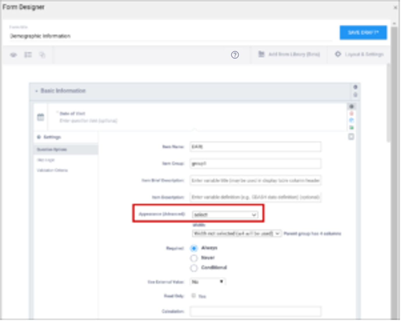
| Appearance | This determines how each item appears based on its Type. Items do not have a specific appearance by default. This setting is optional. Note: the type, other indicates that instead of selecting the option, other, you can enter the appearance directly in the field. other also appears as an option for the item types indicated. You can specify width for any item. (See Width) Single select / Multi-select
text
integer
decimal
calculate
Date
note
file
image
audio
video
Layout groups
Note: Items with no label or hint are treated as background calculations.
| This determines how each item appears based on its Type. Items do not have a specific appearance by default. This setting is optional. Note: the type, other indicates that instead of selecting the option, other, you can enter the appearance directly in the field. other also appears as an option for the item types indicated. You can specify width for any item. (See Width) Single select / Multi-select
text
integer
decimal
calculate
Date
note
file
image
audio
video
Layout groups
Note: Items with no label or hint are treated as background calculations. |
| Width | For an item or group of items on a grid form, you can control how many columns appear on each row by specifying the width w#. If you specified a width of w6 for a layout group, it takes up the entire width of the grid. If you specified w1 for a single item in the group, there would be one small column (1) and another large column (5). | For an item or group of items on a grid form, you can control how many columns appear on each row by specifying the width w#. If you specified a width of w6 for a layout group, it takes up the entire width of the grid. If you specified w1 for a single item in the group, there would be one small column (1) and another large column (5). |
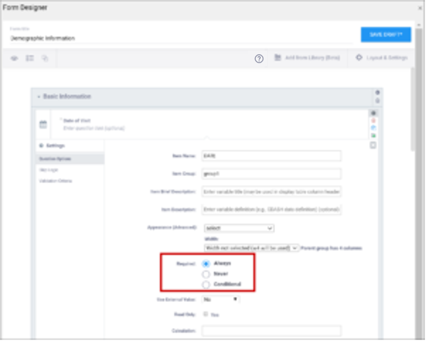
| Required | This specifies whether a user is required to enter a response to the item to proceed with data entry. Select Always, Never, or Conditional to specify whether/when a response to this item/question is required. If you select Conditional, you must enter a conditional value. | This specifies whether a user is required to enter a response to the item to proceed with data entry. For required fields, type yes in the required column on the survey sheet. For conditionally required fields, enter a condition, as defined in the relevant column of the survey sheet. For example, if Number of packs per day is required if Does the subject smoke? is answered yes, enter: ${smoke} = 1 Note: This column supports the syntax as defined in the calculation, constraint, or relevant columns of this worksheet. Refer to those column comments for additional examples. |
| Use External Value | This item is a value used for logic or calculations. clinicaldata is used for cross-Form, cross-event, or event level calculations. contactdata displays contact data on a form. If you enter contactdata, you must add a column called instance::oc:contactdata. That column must contain one of the following values to indicate which contact information it is collecting: firstname, lastname, email, mobilenumber, secondaryid. | This item is a value used for logic or calculations. clinicaldata is used for cross-Form, cross-event, or event level calculations. contactdata displays contact data on a form. If you enter contactdata, you must add a column called instance::oc:contactdata. That column must contain one of the following values to indicate which contact information it is collecting: firstname, middlename, lastname, email, mobilenumber, streetaddress1, streetaddress2, country, city, state, postalcode, fulldob, secondaryid, hospitalnumber.
|
| Read Only | This specifies that you cannot enter data for an item. This can be used for the types of text, calculations, etc.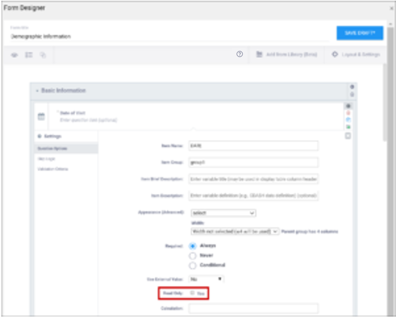 | This specifies that you cannot enter data for an item. This can be used for the types of text, calculations, etc. |
| Calculation | An expression used to calculate a value, usually using the values of preceding questions on the current Form. This can also be used for Cross-form calculations. . is used to represent the current field’s value. ${name} is used to reference a different item value on this Form, where name is the name of the other item. You can use parentheses. The following operators can be used:
For example, to calculate Mean Arterial blood Pressure (MAP) based on the items systolic and diastolic: (systolic + (2*diastolic)) div 3 Calculations cannot be used for items with type of note. If calculation is used for any type except calculate, that field must have Read Only set to yes. | An expression used to calculate a value, usually using the values of preceding questions on the current Form. This can also be used for Cross-form calculations. . is used to represent the current field’s value. ${name} is used to reference a different item value on this Form, where name is the name of the other item. You can use parentheses. The following operators can be used:
For example, to calculate Mean Arterial blood Pressure (MAP) based on the items systolic and diastolic: (systolic + (2*diastolic)) div 3 Calculations cannot be used for items with type of note. If calculation is used for any type except calculate, that field must have Read Only set to yes. |
| Response Text/Label | The question text to be displayed on the data entry form. This field allows alphanumeric characters. Add a line break where you want using Ctrl-Enter or Ctrl-Alt-Enter (Windows) Option+Enter (Mac). Styling prompts can be added to format your text as follows: *text* displays as italics **text** displays as bold ***text*** displays as bold italics Increase font size by preceding the text with one to six hash tags. # makes the text the largest possible size, ## makes the text the smallest possible size. Sizes that display may vary for note vs. item vs. group labels. Colors can be added as follows: < span style=”color:red” > text < /span > for red text. You can use the hex code for the color of your choice. (You can look up hex codes by searching for css codes on the internet.) | The question text to be displayed on the data entry form. This field allows alphanumeric characters. Add a line break where you want using Ctrl-Enter or Ctrl-Alt-Enter (Windows) Option+Enter (Mac). Styling prompts can be added to format your text as follows: *text* displays as italics **text** displays as bold ***text*** displays as bold italics Increase font size by preceding the text with one to six hash tags. # makes the text the largest possible size, ## makes the text the smallest possible size. Sizes that display may vary for note vs. item vs. group labels. Colors can be added as follows: < span style=”color:red” > text < /span > for red text. You can use the hex code for the color of your choice. (You can look up hex codes by searching for css codes on the internet.) |
| Value/Name | The unique code value stored in the database that corresponds to each answer choice (e.g. 1=Yes). These codes are generated automatically but can be changed. | The unique code value stored in the database that corresponds to each answer choice (e.g. 1=Yes).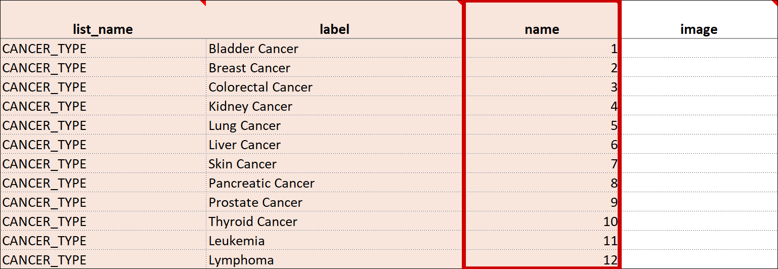 |
| Item Name/Name | The unique internal name of the layout group used in the database. This is not displayed during data entry. Alphanumeric characters and underscores are allowed.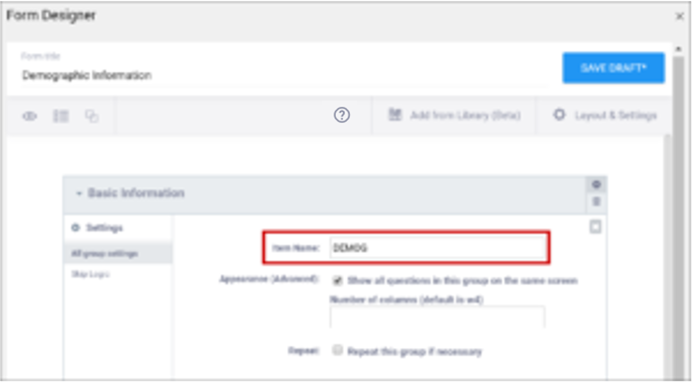 | The unique internal name of the layout group used in the database. This is not displayed during data entry. Alphanumeric characters and underscores are allowed. |
| Show All Questions in this Group on the Same Screen/Appearance | Click this check box to make all items appear on the same screen (regardless of your layout selection.)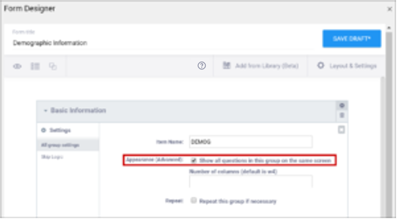 | N/A |
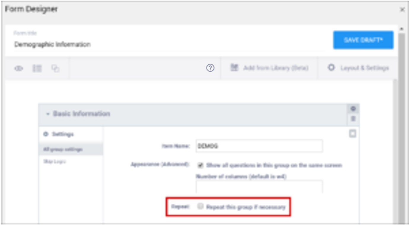
| Repeat this group if Necessary | This specifies that the group of items should be repeated. Click this check box to make the selected group of questions a repeating group. | This uses begin repeat and end repeat in the Type column to specify that the group of items should be repeated. |
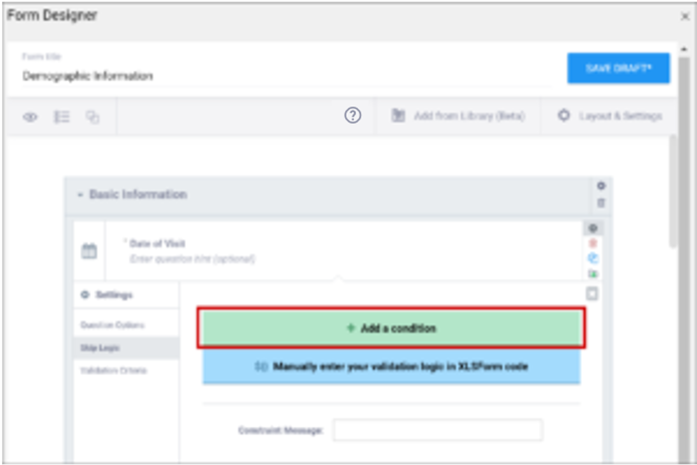
| Skip Logic / Relevant | This is a condition under which an item is skipped. Enter a condition under which this item/question appears or is required. | This is a condition under which an item is skipped (as defined in the relevant column). The item or group is only displayed if the provided expression evaluates to TRUE. Use the following syntax: ${other question name} = value (for a numeric value) or ${other question name} = ‘value’ (for a character value) If the lead-in question uses a code list defined in the choices worksheet, use what is in the name column for that code list as the value. For example, if you have two questions: Does the subject smoke? (item name = smoke) and How many packs per day? (item name=packs), the second question should only display if the answer to the first question is Yes. If the first question (smoke) uses a code list defined in the choices worksheet as: list_name label name The relevant syntax for How many packs per day would be: ${smoke} = 1 For multi_select items, use the following syntax: selected(${question name},value) (for a numeric value) selected(${question name},’value’) (for a character string) Note: This column supports the syntax as defined in the required, calculations, or relevant columns. |
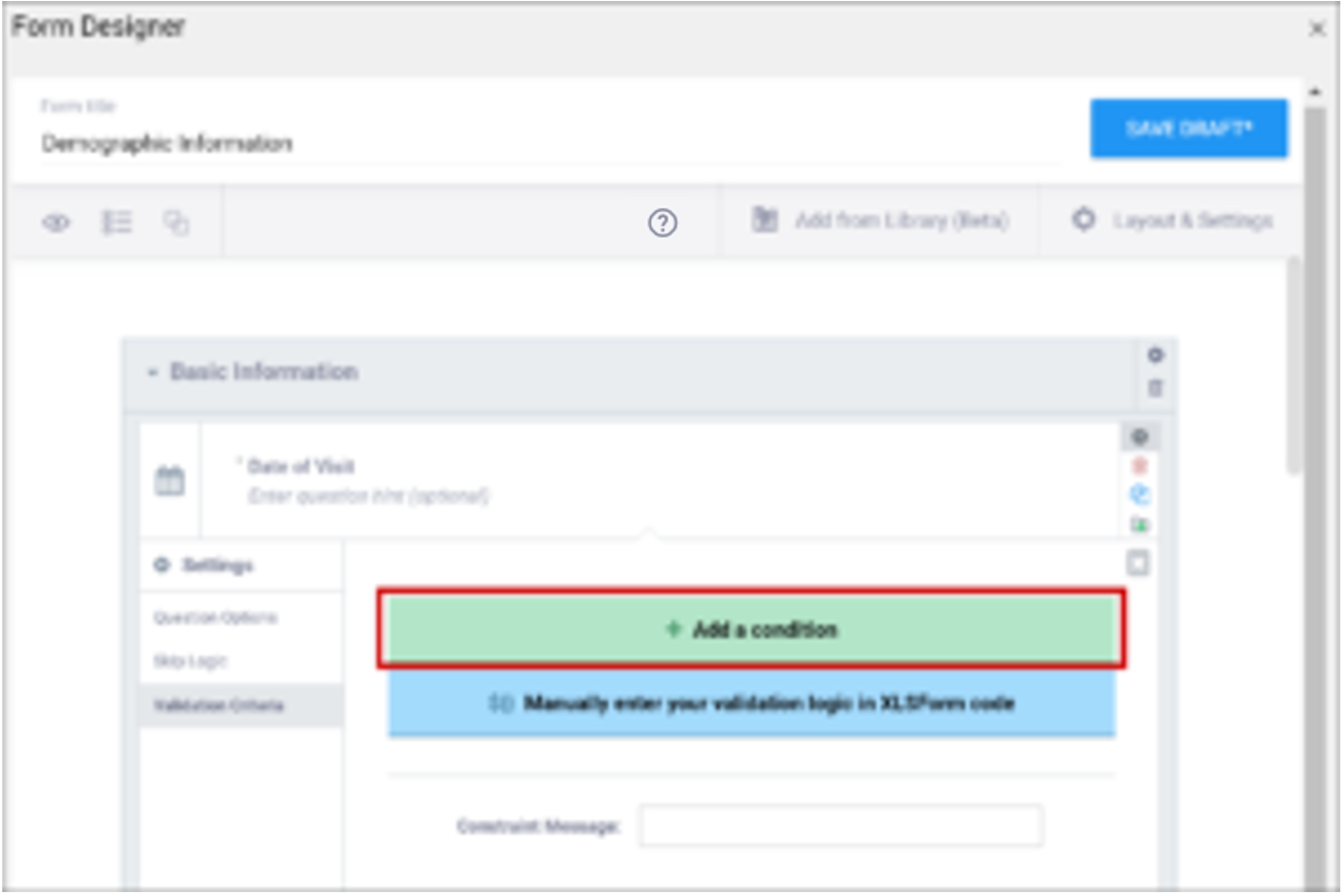
| Validation Criteria / Constraint | This is a condition under which an a response is considered invalid. Validation Criteria prevents users from entering invalid data. (e.g. “a Participant’s pulse must be >=60 and <=100.”) Note: You can also manually add skip logic or validation logic in Excel Form Code.
| This is a condition under which an a response is considered invalid (as defined in the constraint column). Validation Criteria determines whether data is valid. This allows for edit checks, which you can define as soft checks or hard checks. If the expression provided in this cell is FALSE, the constraint_message displays. For example, if this item value must be between 10 and 60, enter the following (in expressions, . (dot) represents the current item value): . >= 10 and . <= 60 To reference other item values, use the following syntax: ${item_name} operator value Use and/or logic as needed. For example: ${sysbp} >=130 and . >= 10 and . <= 60 You can also compare date fields against today(). For example, to display a message if the date of an adverse event (AEDATE) is in the future, the constraint on the AEDATE field would be: .<=today() Note: This column supports the syntax as defined in the required, calculations, or relevant columns. |
| Constraint Message | A message stating that data is invalid and/or explaining why it is invalid (e.g. “Pulse is outside normal range.”) If you provide a constraint, you can include a message that explains why the answer provided is not acceptable. The message displays if the constraint expression is FALSE. For example, If you had the following constraint on the Pulse item: .>= 60 and .<=100 and a constraint_message of: Pulse is outside of the normal range. If someone entered a Pulse of 40, Pulse is outside of the normal range. would display on the form. | A message stating that data is invalid and/or explaining why it is invalid (e.g. “Pulse is outside normal range.”) If you provide a constraint, you can include a message that explains why the answer provided is not acceptable. The message displays if the constraint expression is FALSE. For example, If you had the following constraint on the Pulse item: .>= 60 and .<=100 and a constraint_message of: Pulse is outside of the normal range. If someone entered a Pulse of 40, Pulse is outside of the normal range. would display on the form. |
| Contact Data | Displays contact data on Form. In the Use as External Value field, select contactdata. Save your draft and exit. Then re-enter Form Designer, and select the types of contact data you want to display.
Note: If any version of the form, has a contact data item, the form will be considered to have contact data and will only be visible to users who can view contact data. | bind::oc:contactdata Displays contact data on Form.
Note: If any version of the form, has a contact data item, the form will be considered to have contact data and will only be visible to users who can view contact data. |


